Bluwer’s metamorphosis
-
Services
- Brand Positioning
- Visual Identity Design
- Industrial Design
- Packaging Design
-
Industry
- Consumer Goods
- Food and Beverage
- Wines and Spirits
-
Client
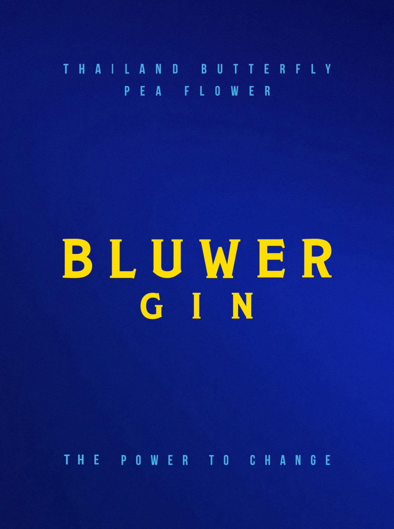
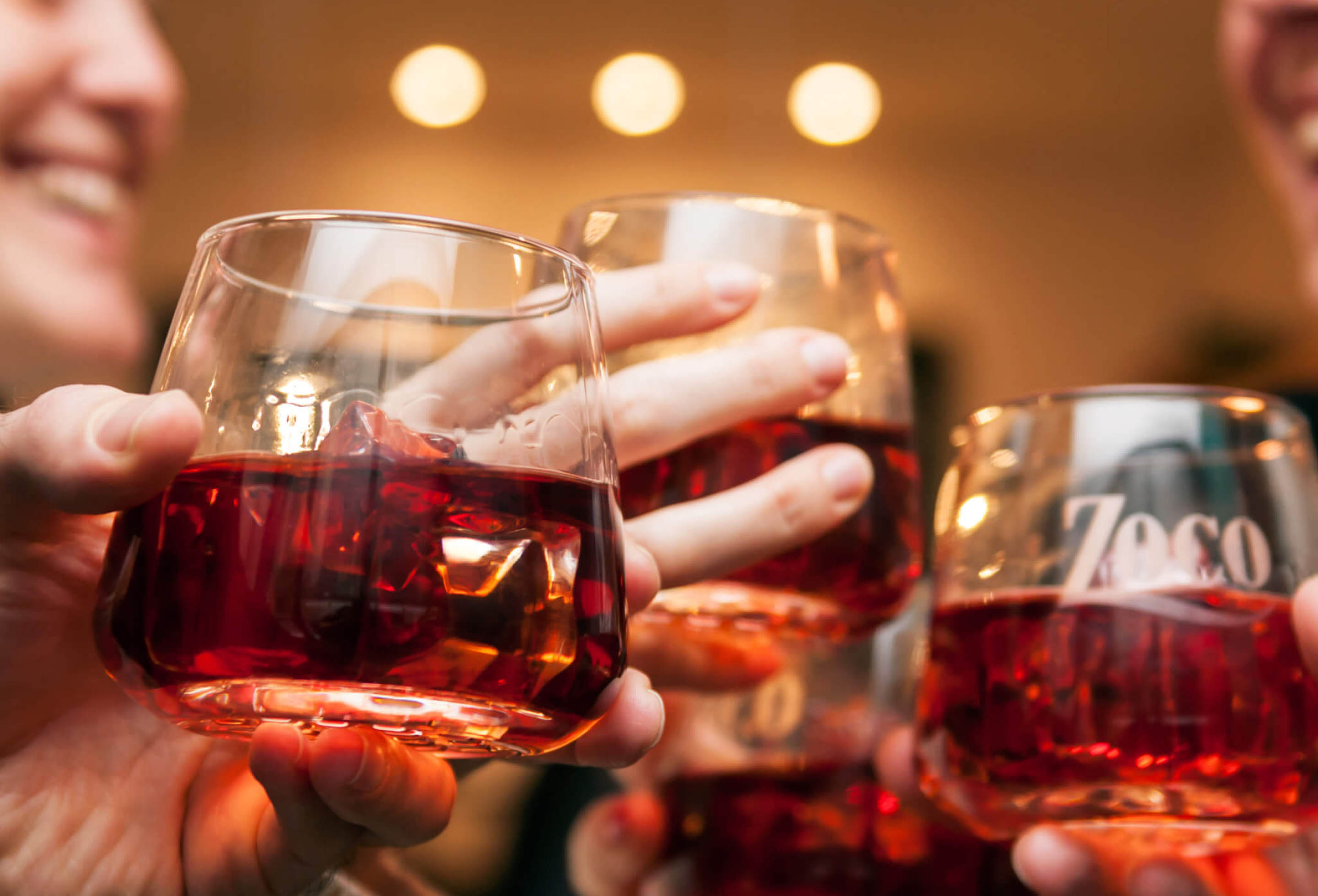
Bluwer Gin
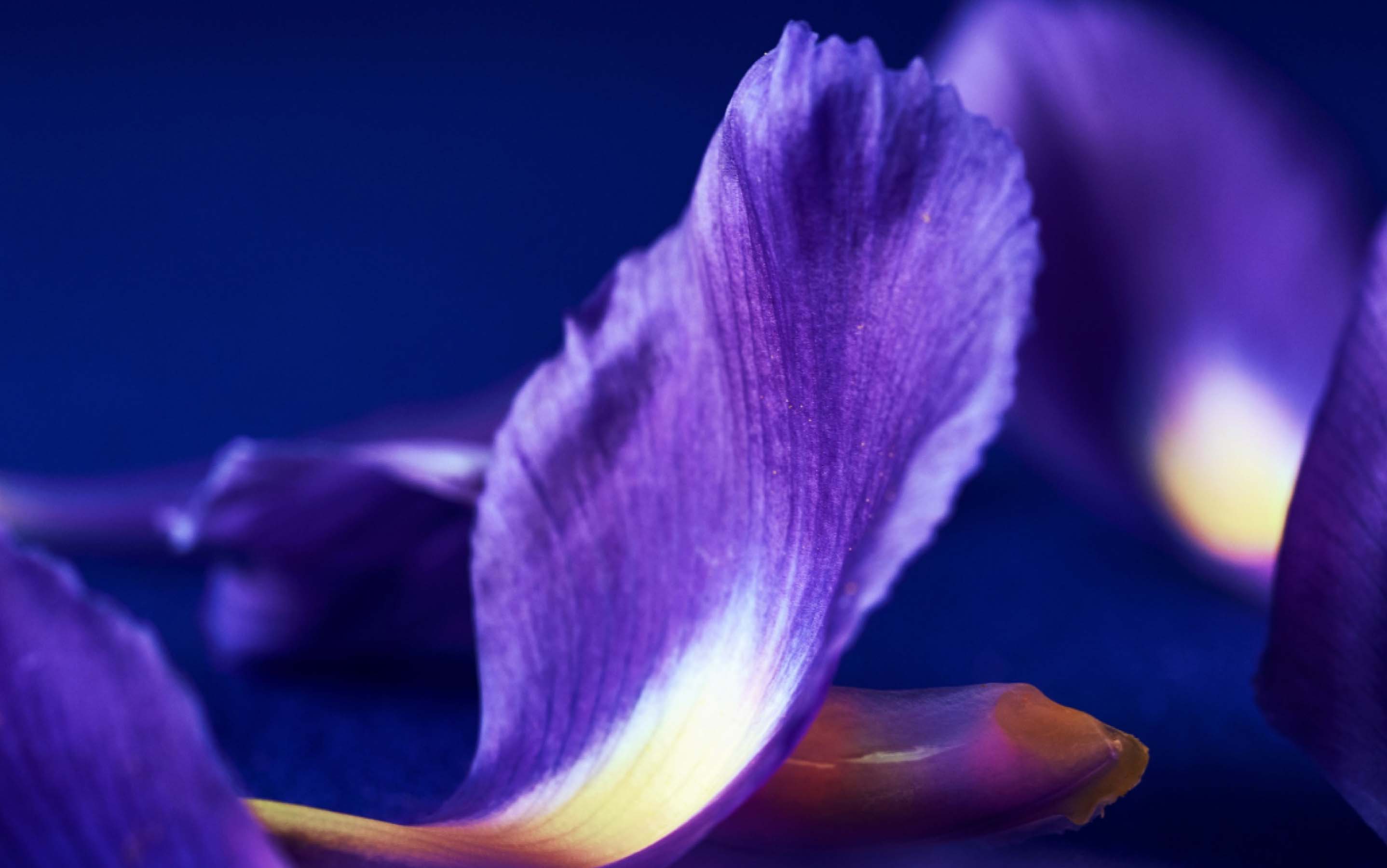
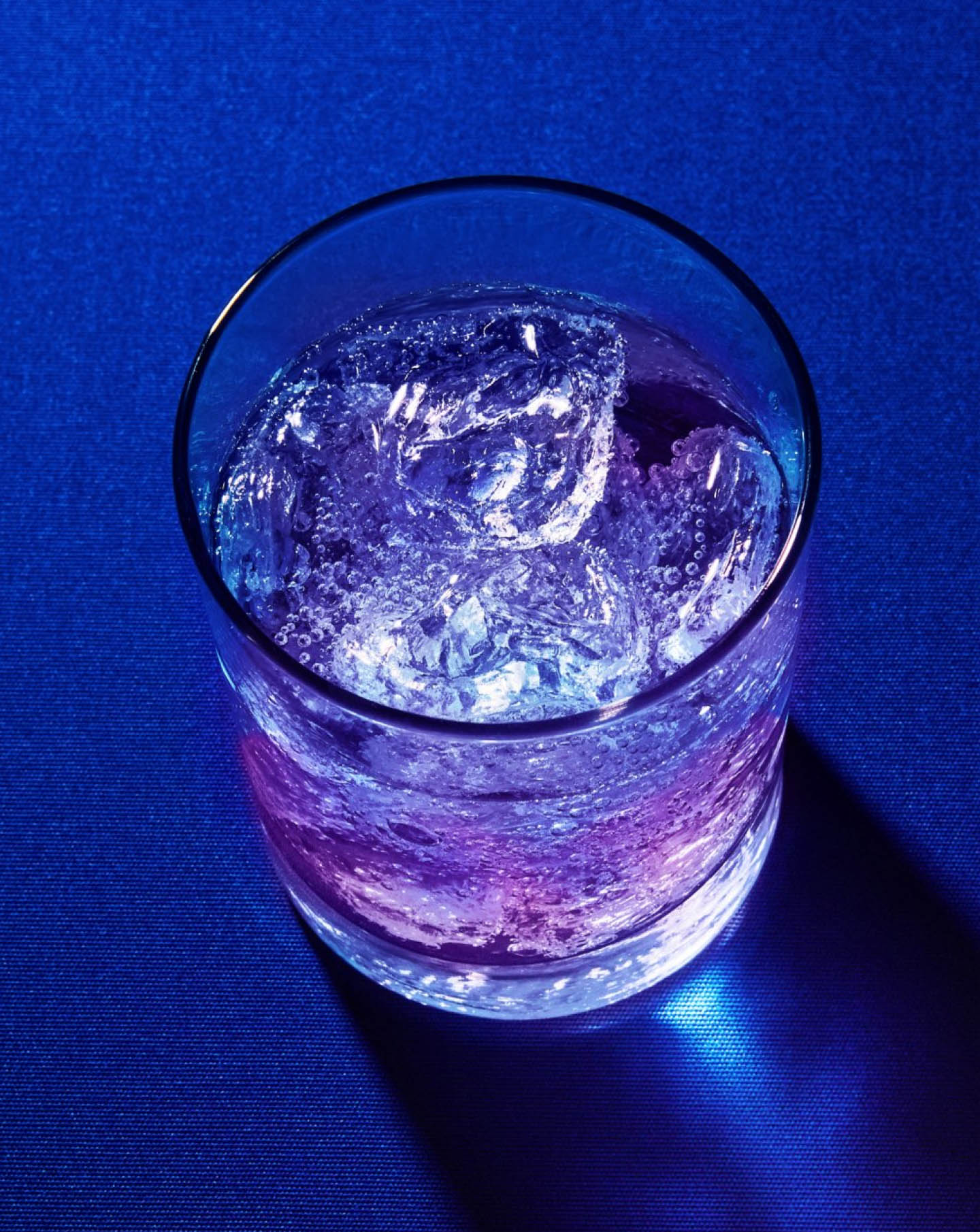
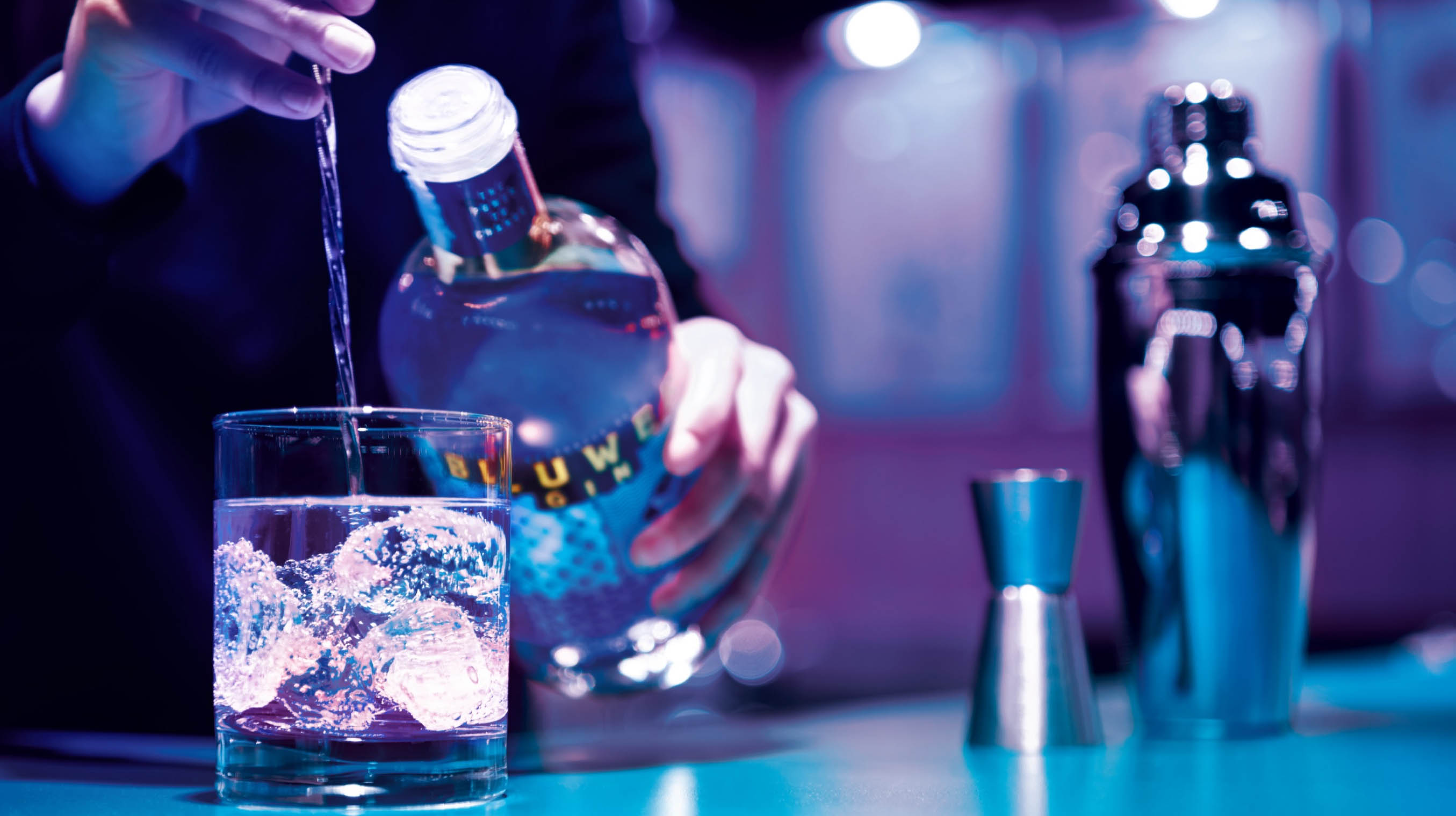
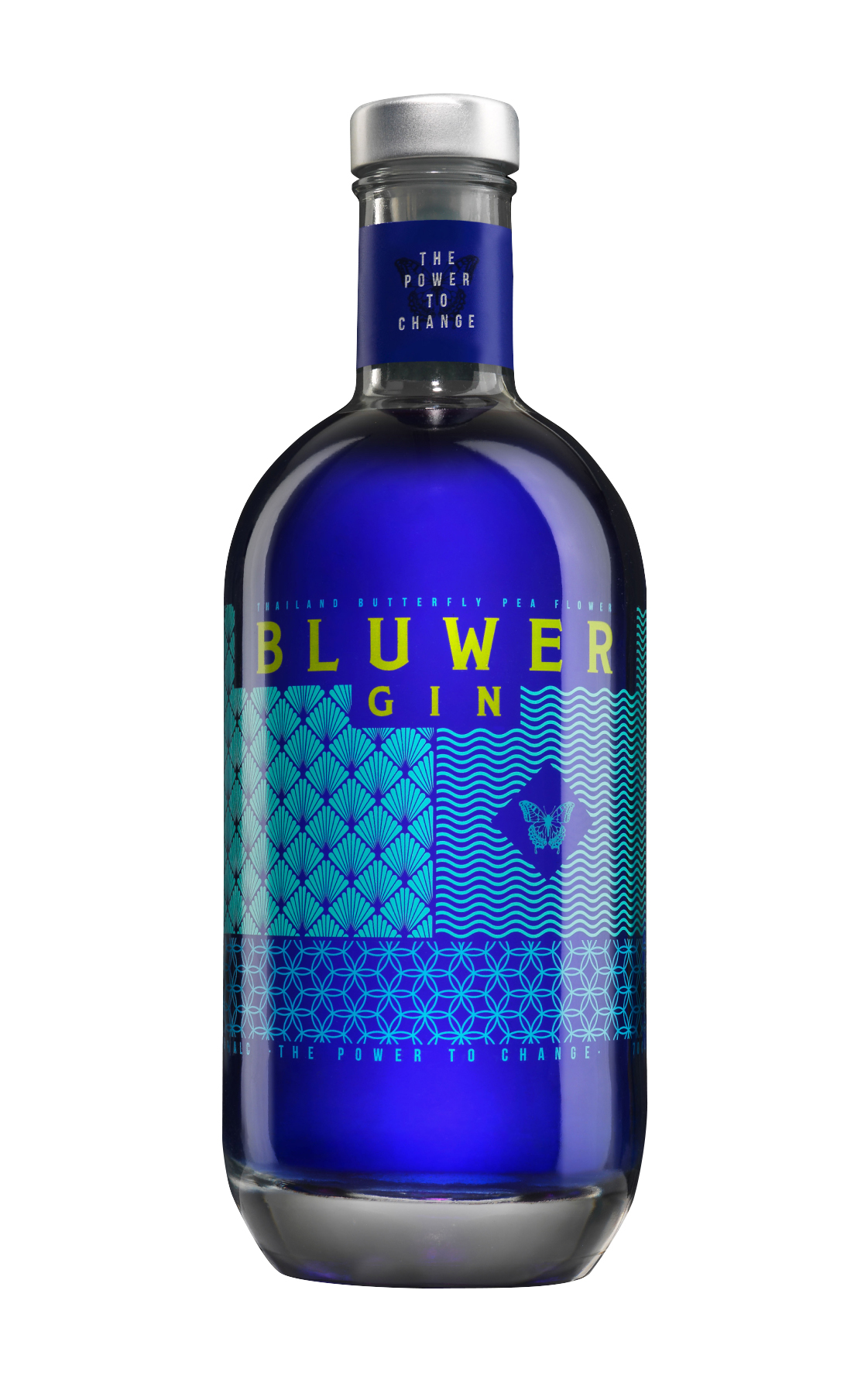
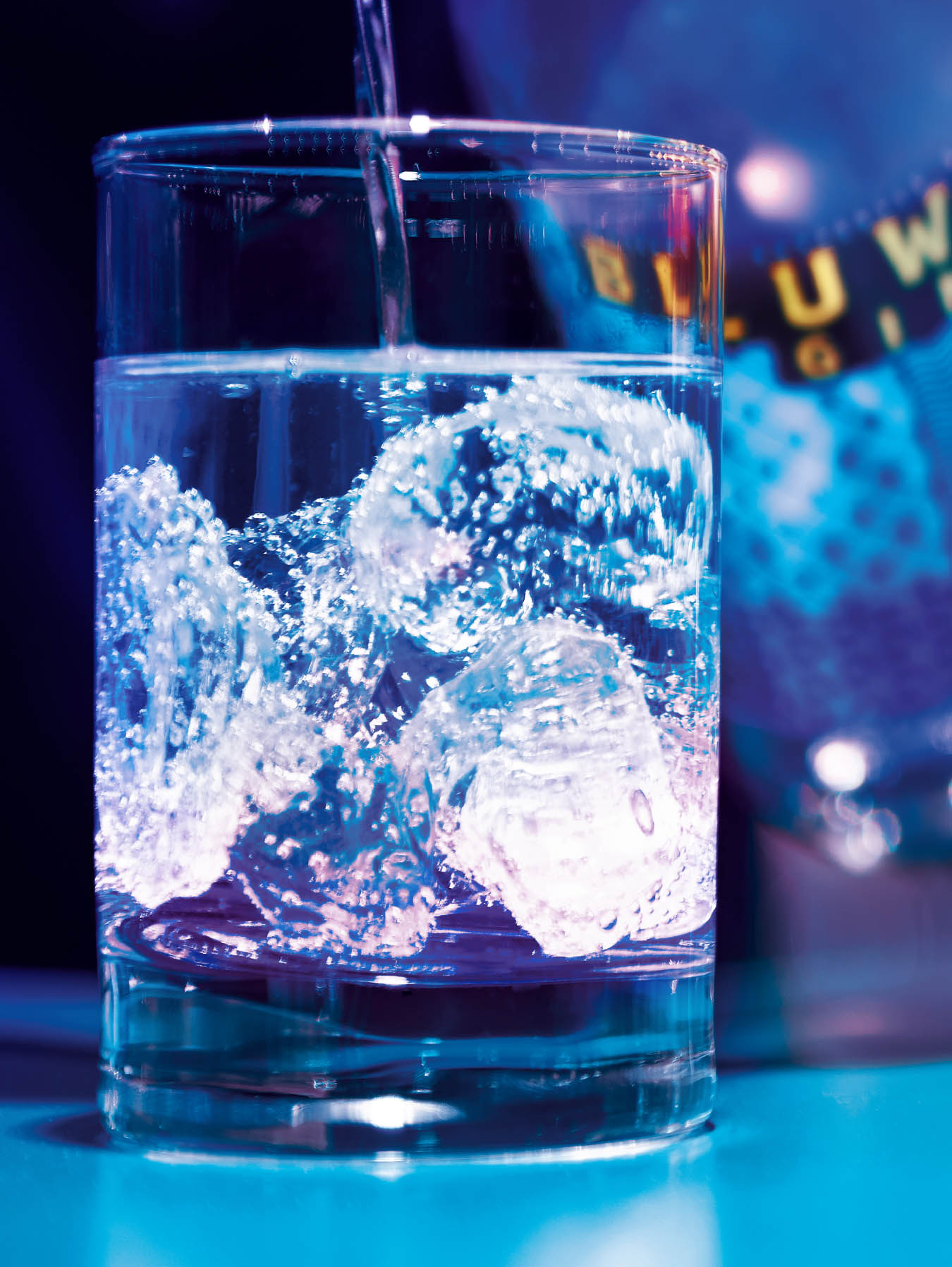
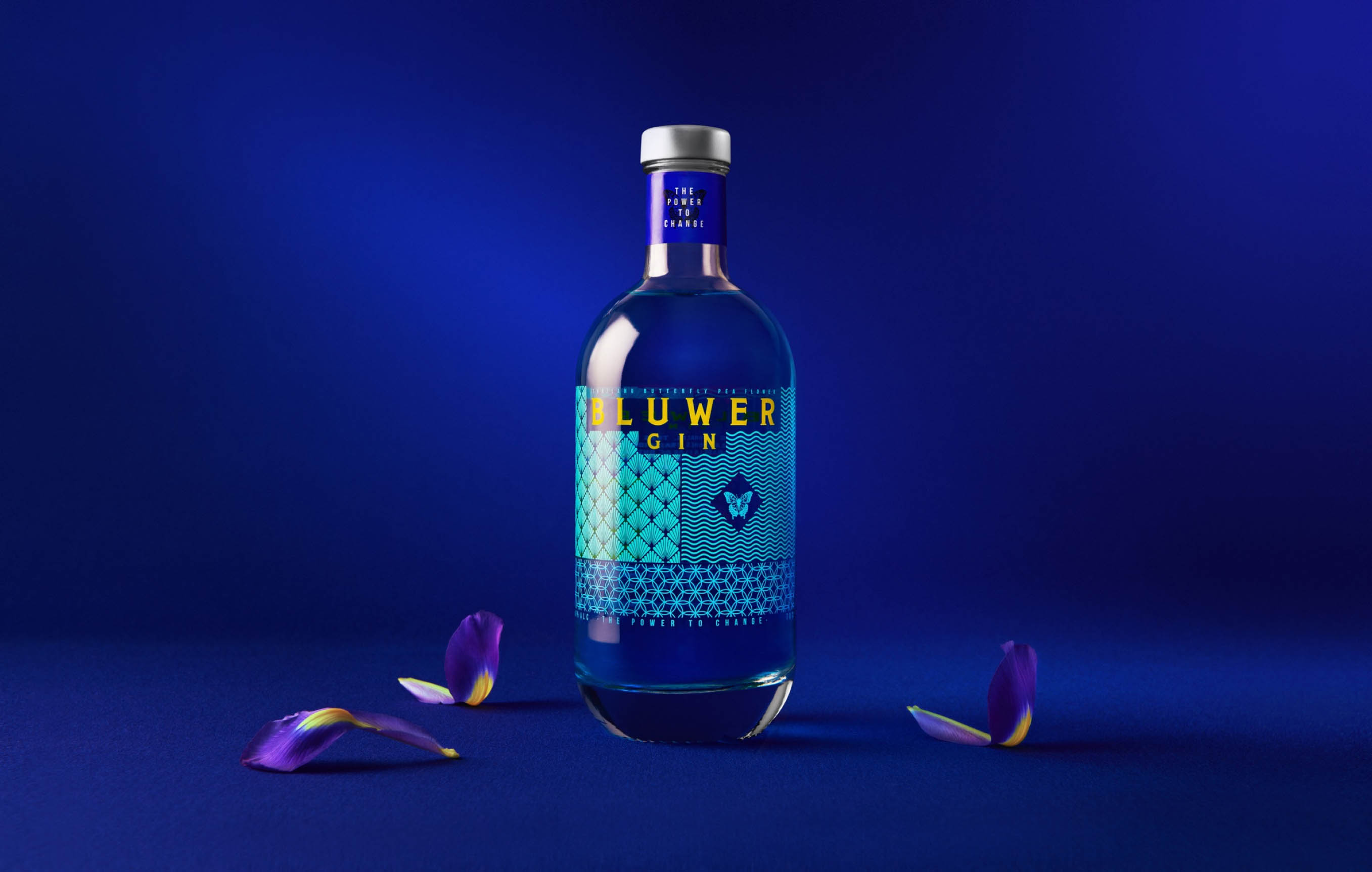
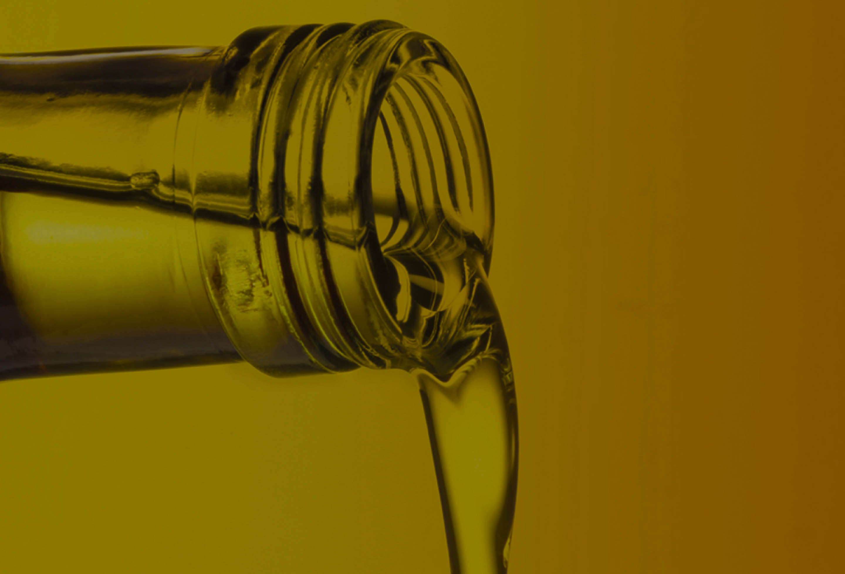
Bluwer is a gin born from uniqueness; from the peculiarity of being a blue-coloured gin that, on contact with citric acid, such as tonic or lemon, changes to a bright pink colour.

Challenge
The taste of the unexpected
The brand challenged us to lead the experiential gin sector, to capitalize on the power of change, and communicate the distinctive elements of a different, handcrafted and 100% natural gin, the only one capable of turning the ordinary into the exciting.


Solution
A transformative experience
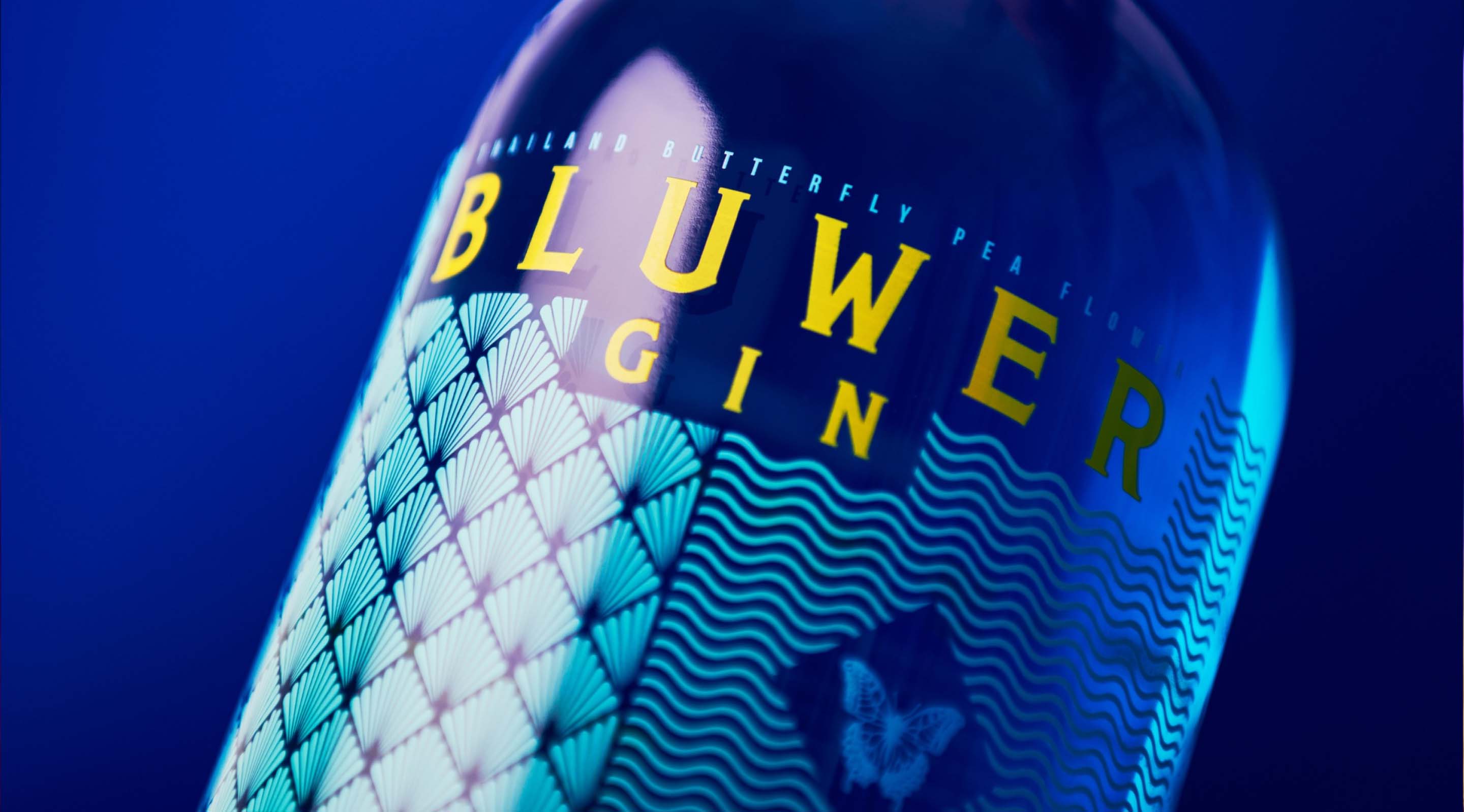
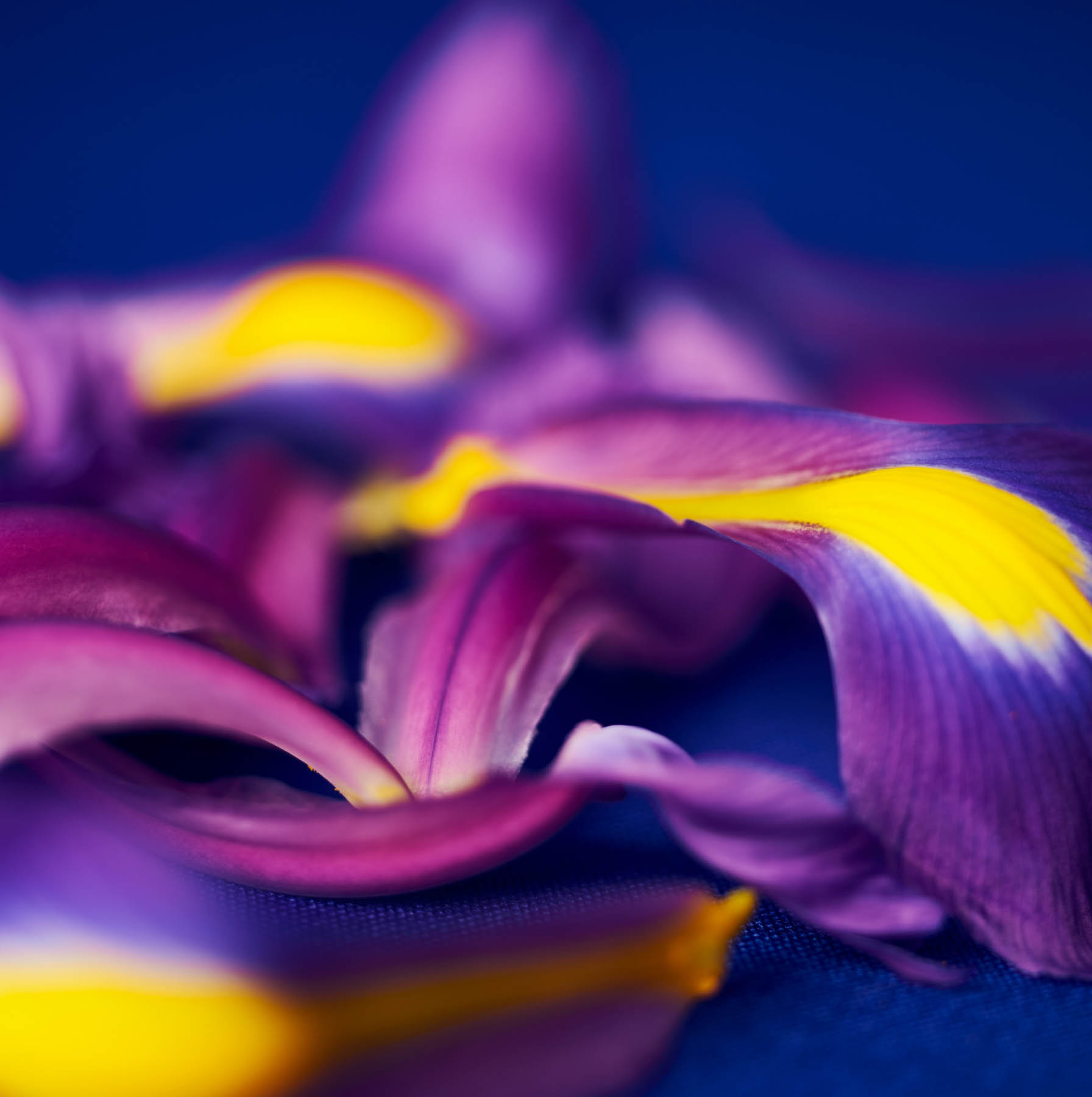
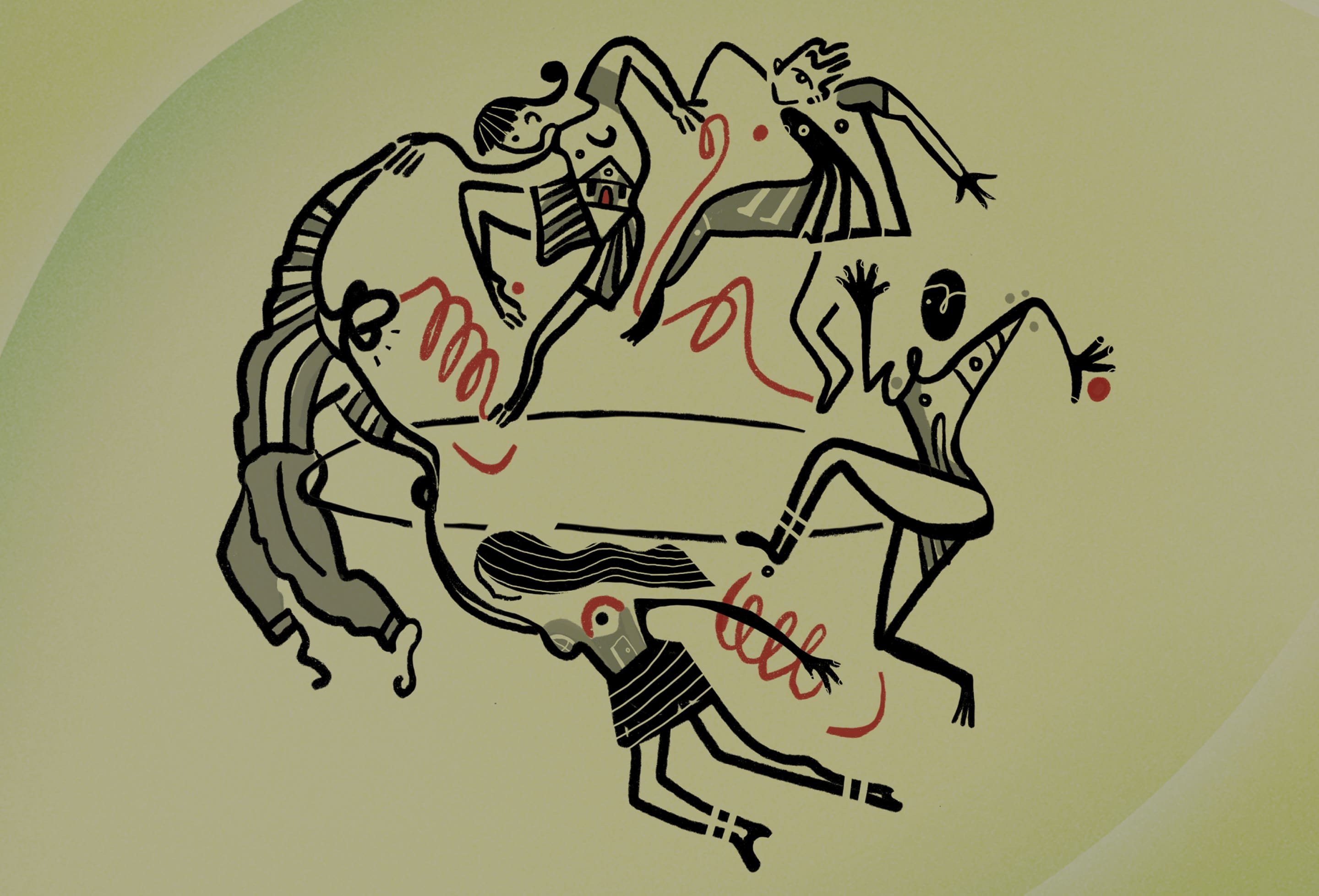
This extraordinary handcrafted gin, composed of 15 botanicals, contains the Thai butterfly pea flower: the crucial element that brings the power of metamorphosis and enables the colour change of a characterful gin. Taking the power of metamorphosis as a symbolic element of the brand, we worked on a strategy that revolved around transformation.
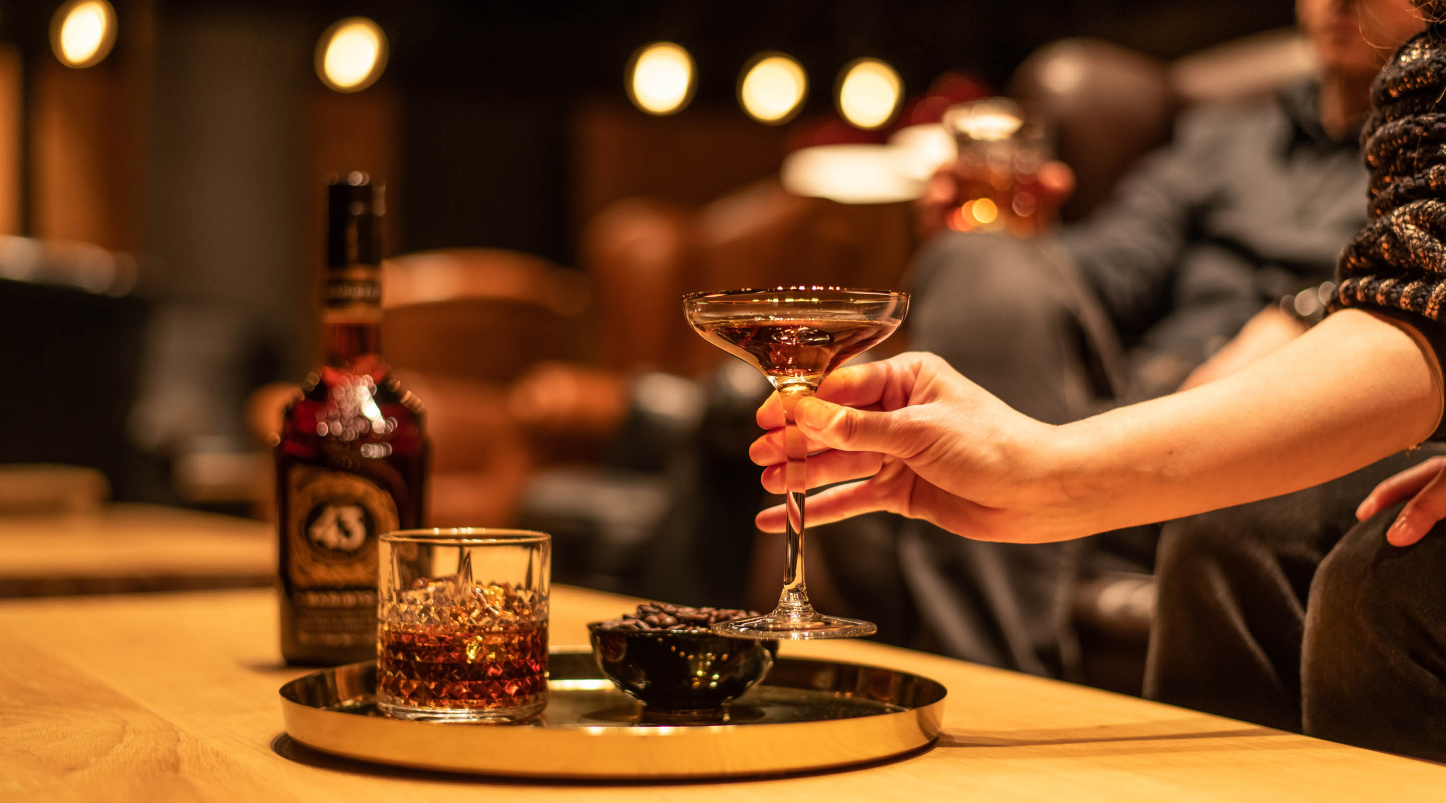
Rich in freshness, intense in colour and also made with ginseng, Bluwer is positioned as an energizing gin, an energy that is neither created nor destroyed, but transformed. A metaphor that represents both the changing reality of the product and the transforming energy of the night.

‘Change is the essence of life’ – Reinhold Niebuhr

Transgressing the visual standards of the category
A groundbreaking spirit, with a nod to the classicism of gin to represent the duality of a renewed classic, while distilling the concept of change.
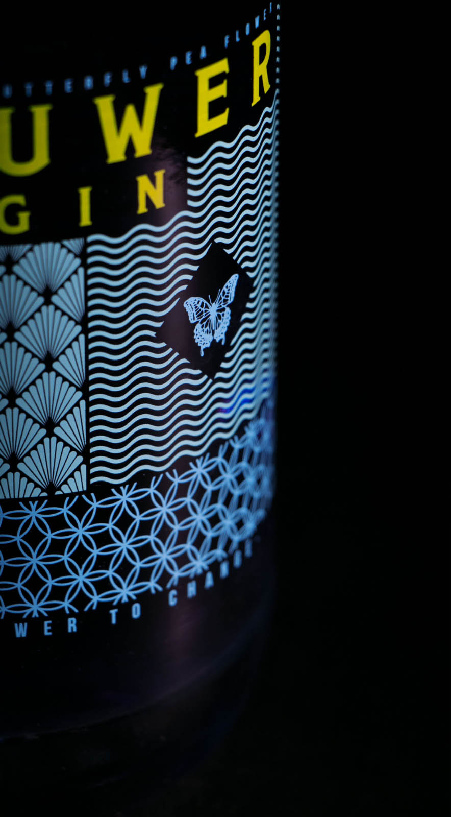
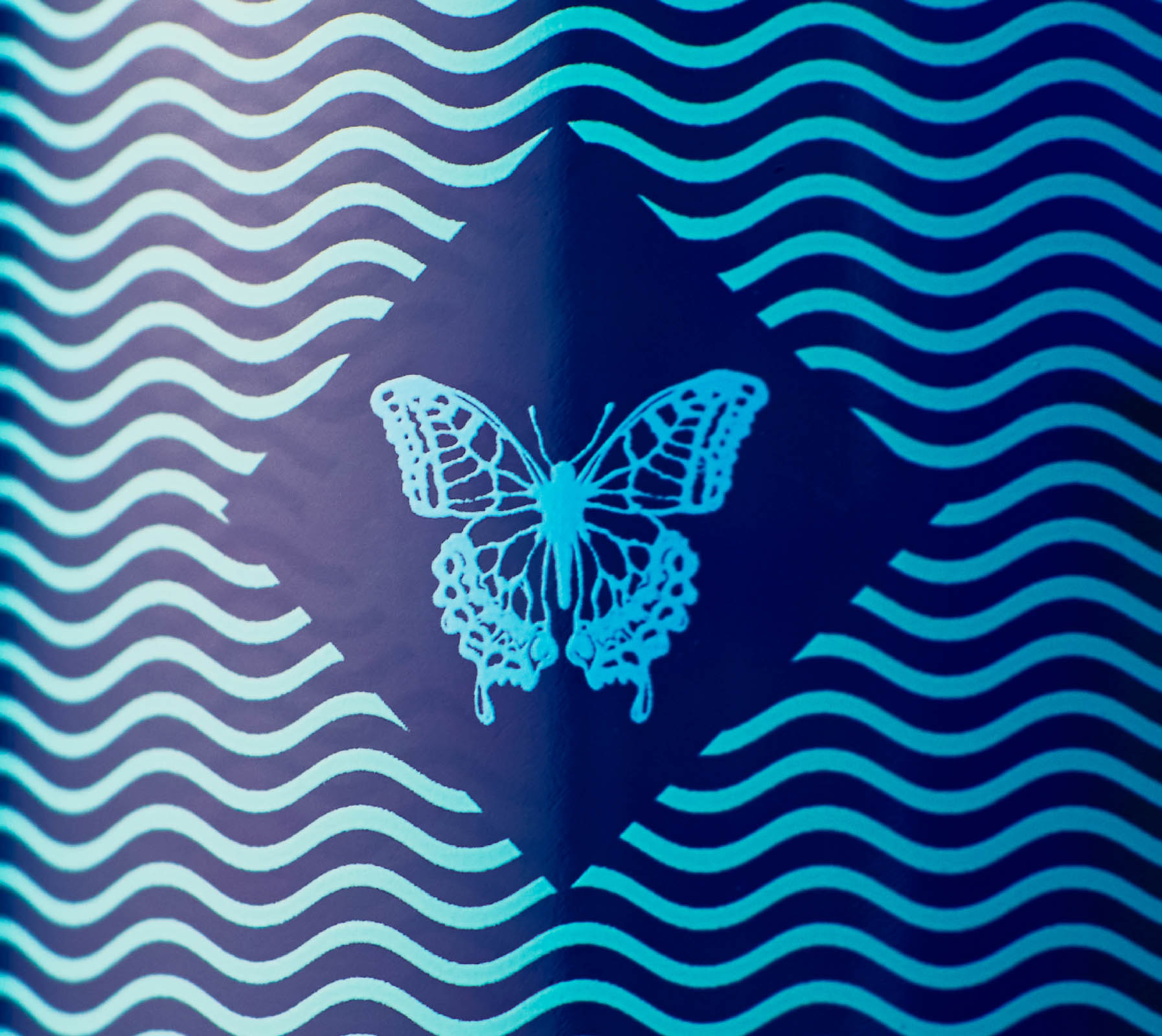
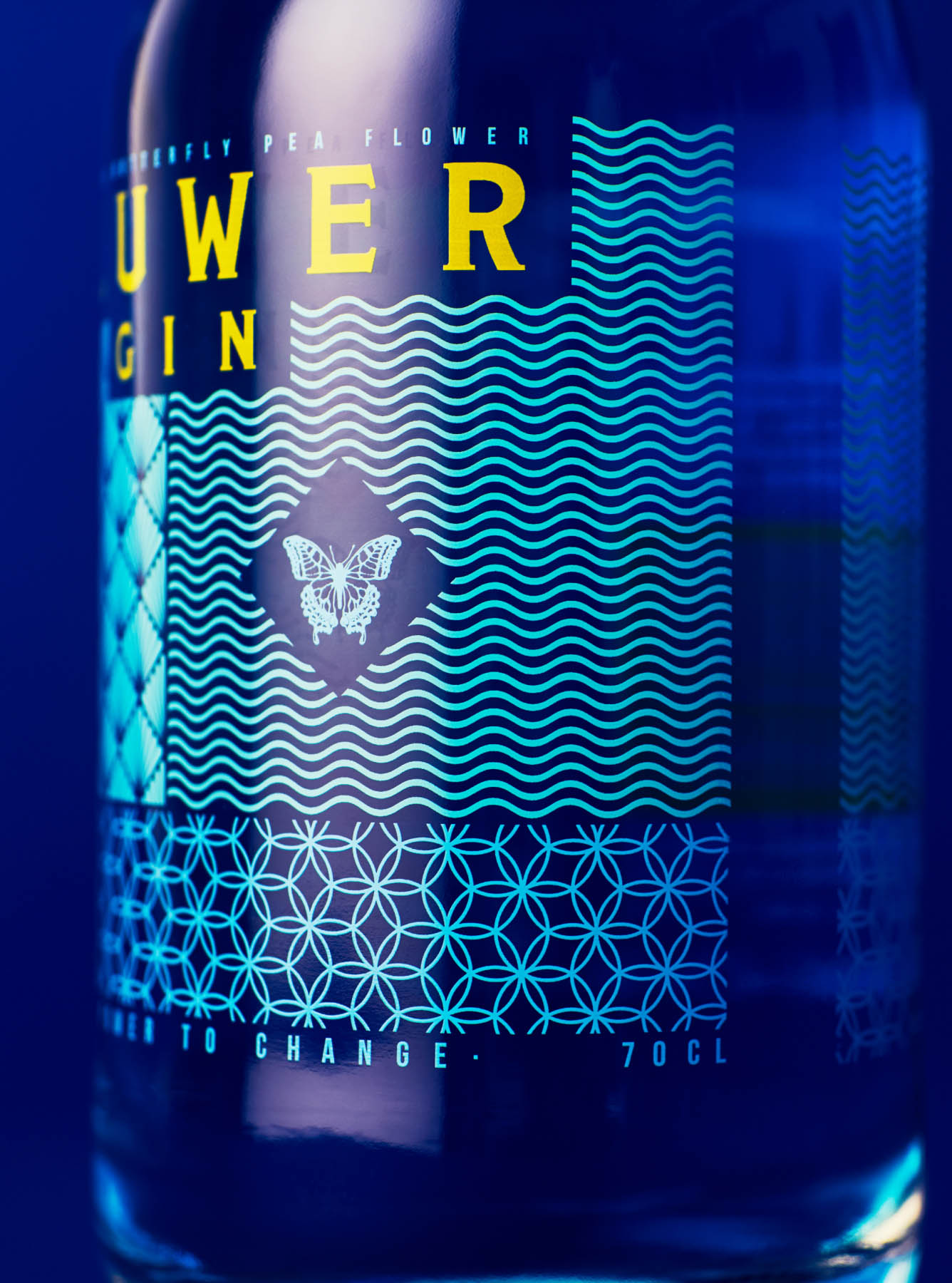
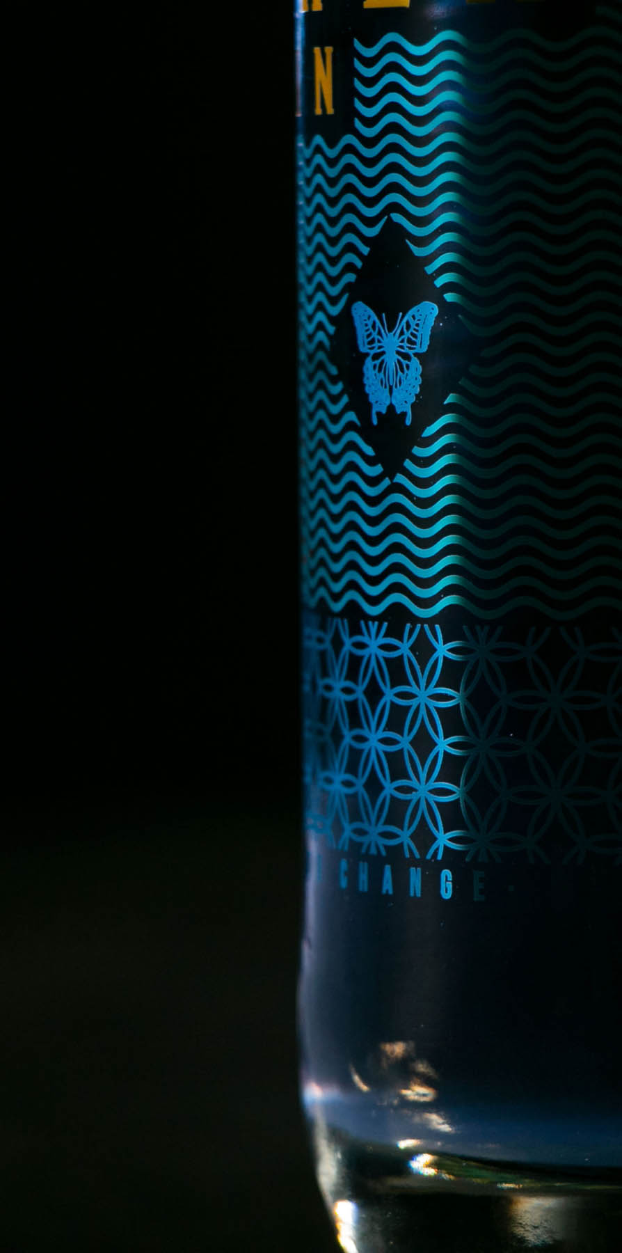
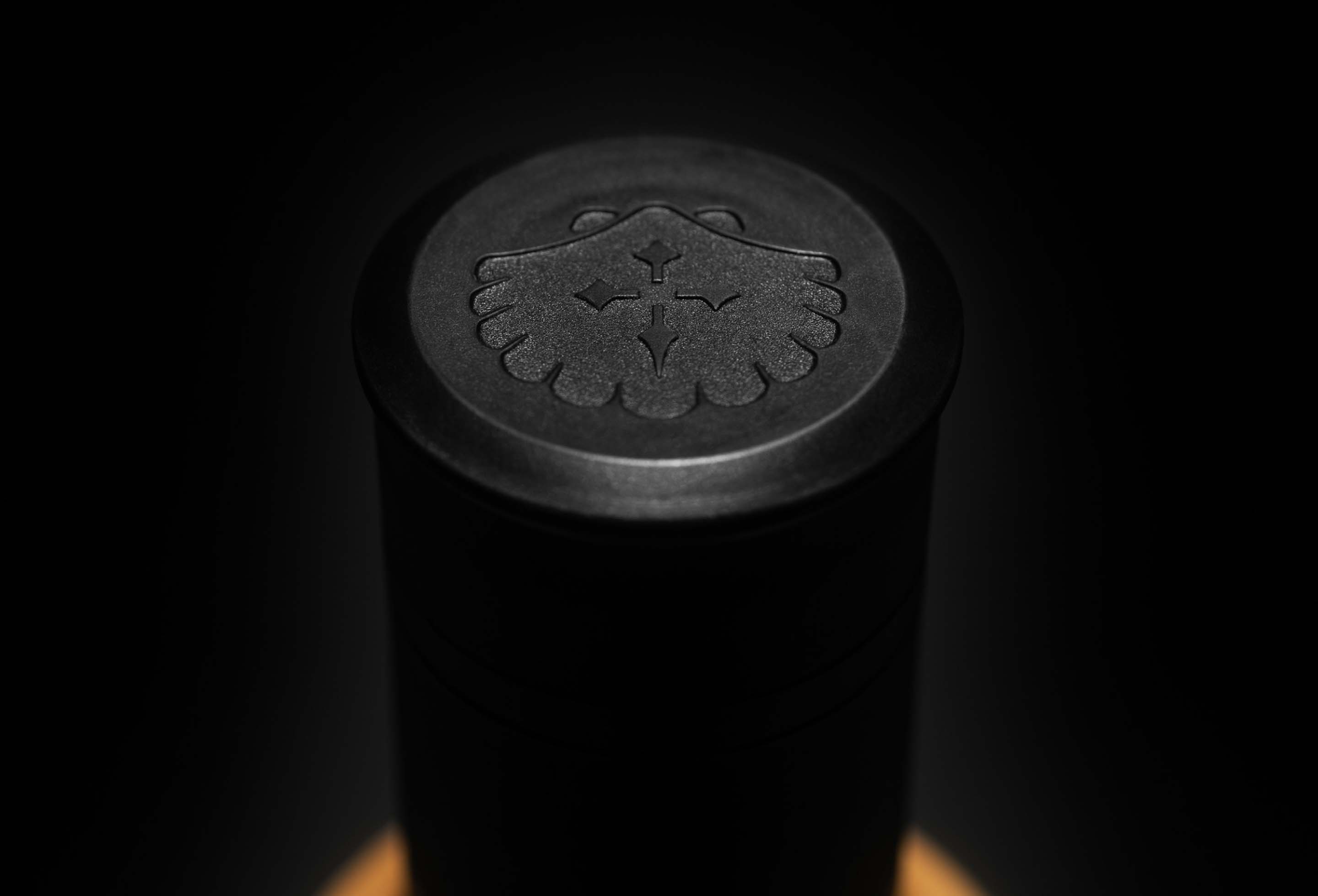
Inspired by the power of transformation, we created a distinctive packaging design that departs from the typical codes of experimental gins on the market. We created a pattern system that reflects Bluwer's personality, with the waves symbolizing the freshness of a new generation gin, the herbal shape reflecting the essence of the botanicals, and the signature butterfly pea flower underlining the handcrafted nature of the drink.


At the heart of the bottle is Bluwer's symbol: the butterfly, prominent among the graphics, all using the silkscreen printing technique. To anchor it to the gin codes, we used a serif typeface with an unexpected twist... After all, isn't a gin that changes colour a bit surprising?

See also


Let's talk
Together, we can create something extraordinary
We will collaborate to find the right answer and bring progress to your business and to the world.