B3TTER
Cracking the Healthy Snacks Category
Scroll down
Discover the new visual identity for a brand whose mission is to build a better food industry and offer healthy, authentic and tasty products as an alternative to ultra-processed products.
Challenge
In a world where people are actively seeking alternatives for living in a healthier and more conscious way, the brand B3TTER was born. Created by the Boisset brothers, Mikel and Alex, this company specialises in making snacks that stand out from the conventional crowd for being 100% natural and are sweetened only with dates. B3TTER FOODS is a new way to enjoy eating healthy: "Your cheat pleasure made healthy".
Morillas was set the challenge of creating a striking visual identity and packaging, highlighting the health and quality of life they offer, from the authenticity of the flavour and with a casual and rebellious tone, to strike a chord with today's young adults.
Approach
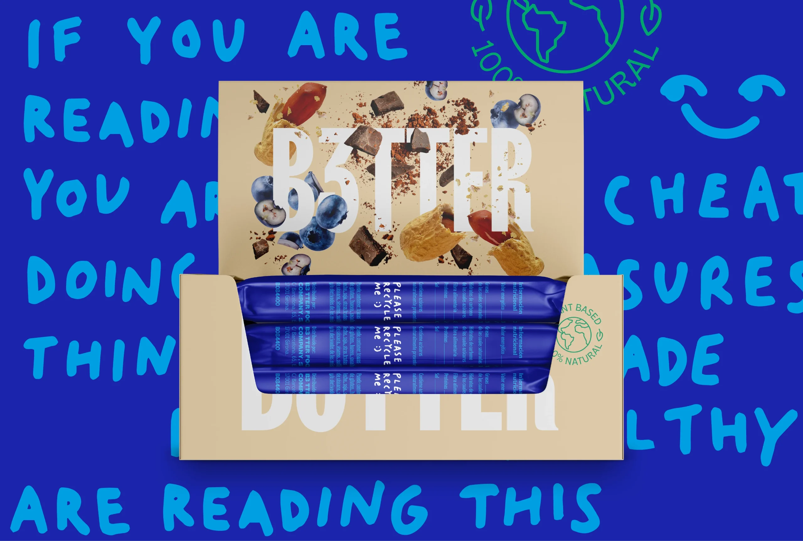
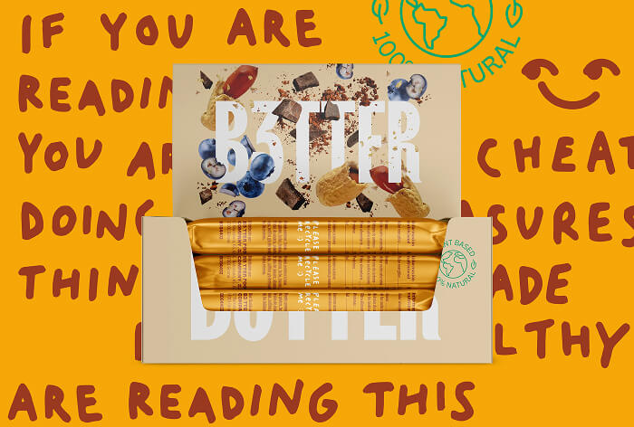
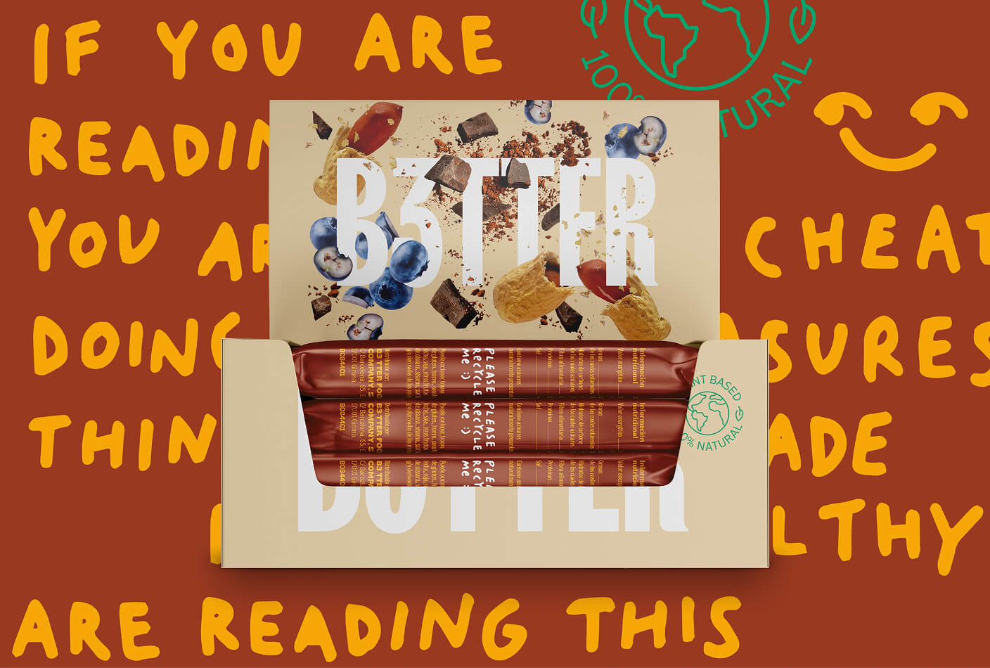
B3TTER is on a mission to build a better food industry and offer healthy, authentic and tasty products as an alternative to ultra-processed products. Our approach was based on sidestepping the typical discourse and graphic codes of this healthy category, creating a disruptive, dynamic and desirable image. Factoring in its distinguishing element: the joy of taste, the design semiotically communicates the irresistibility and naturalness of the product, building a graphic language around crunchiness.
Solution
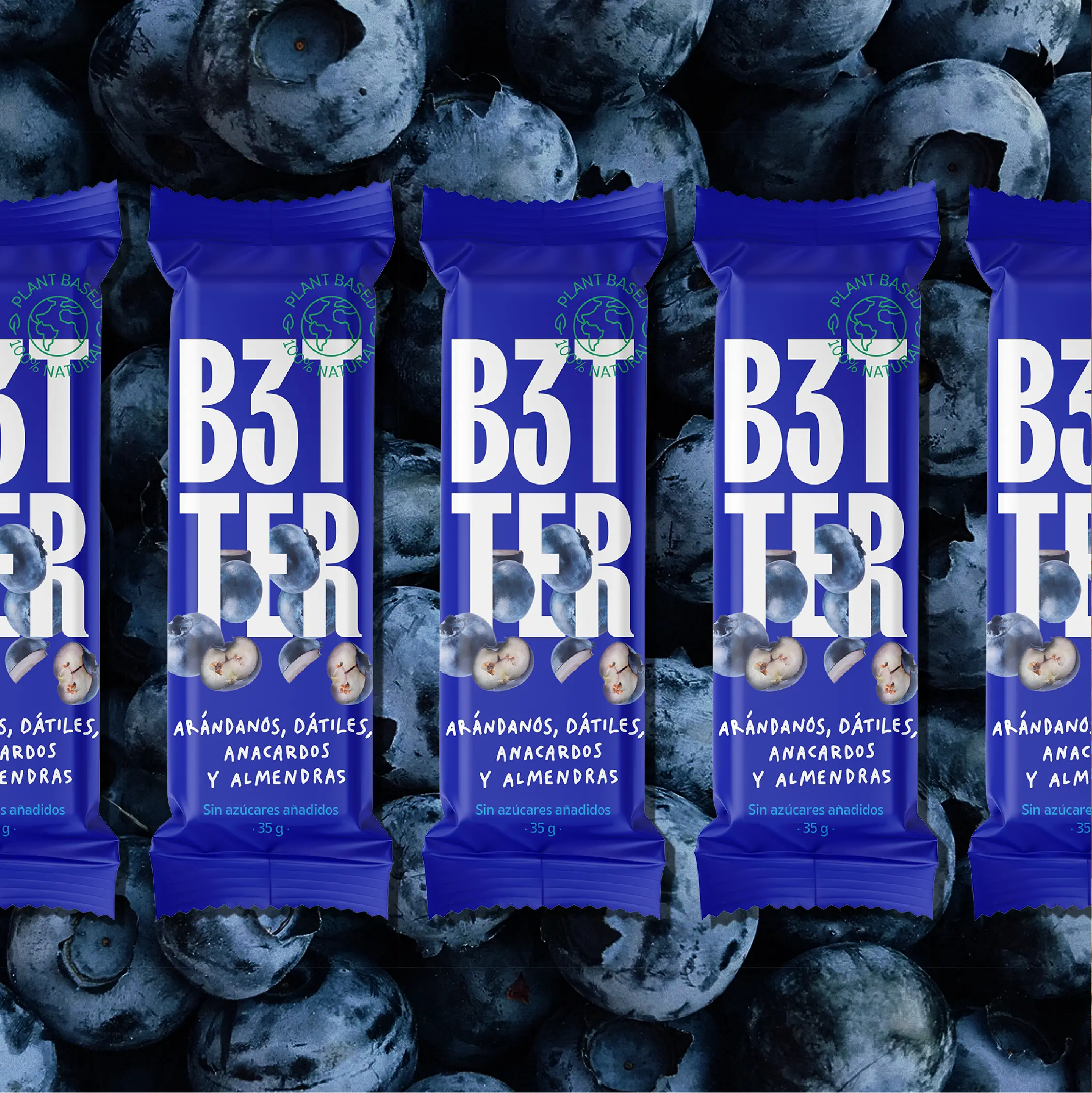
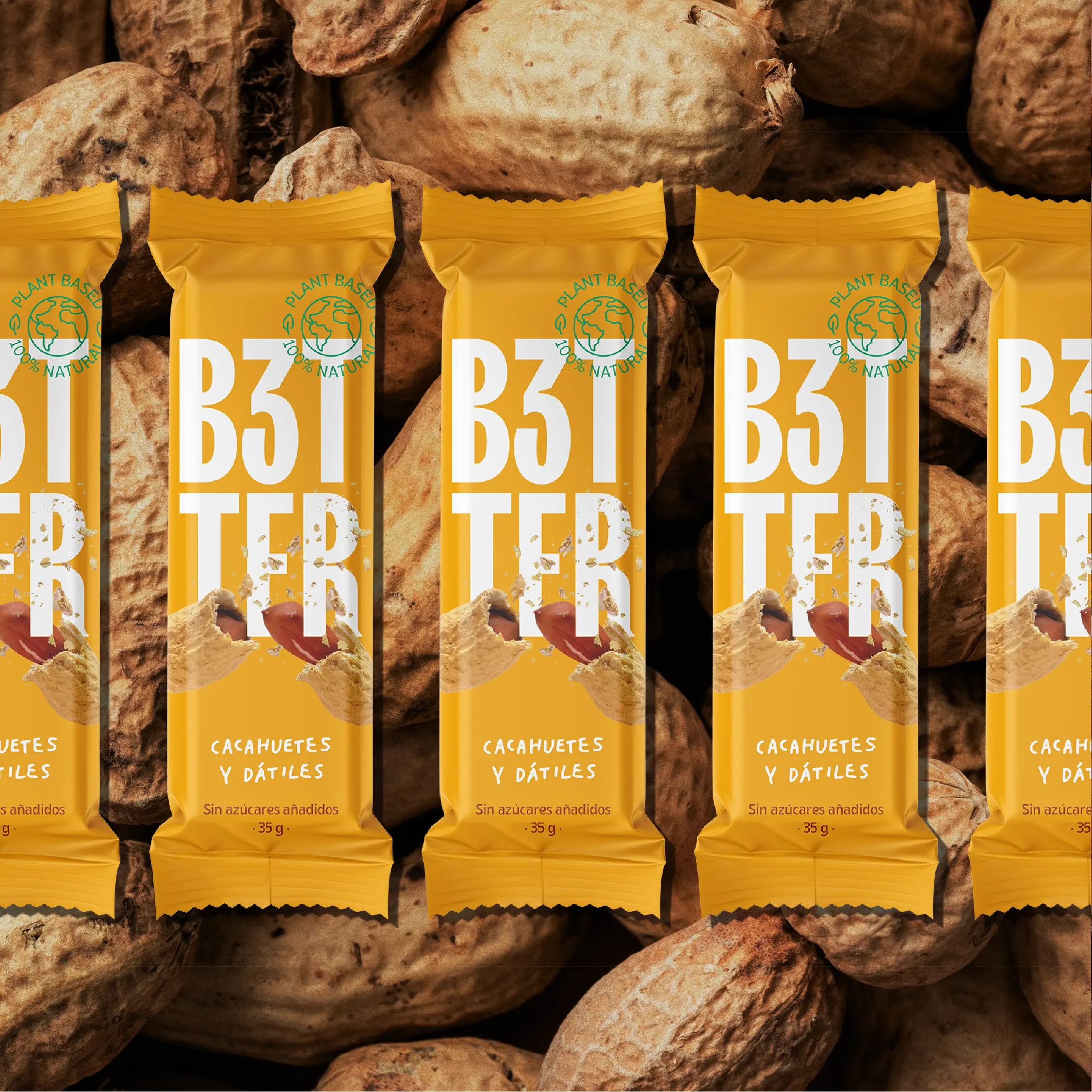
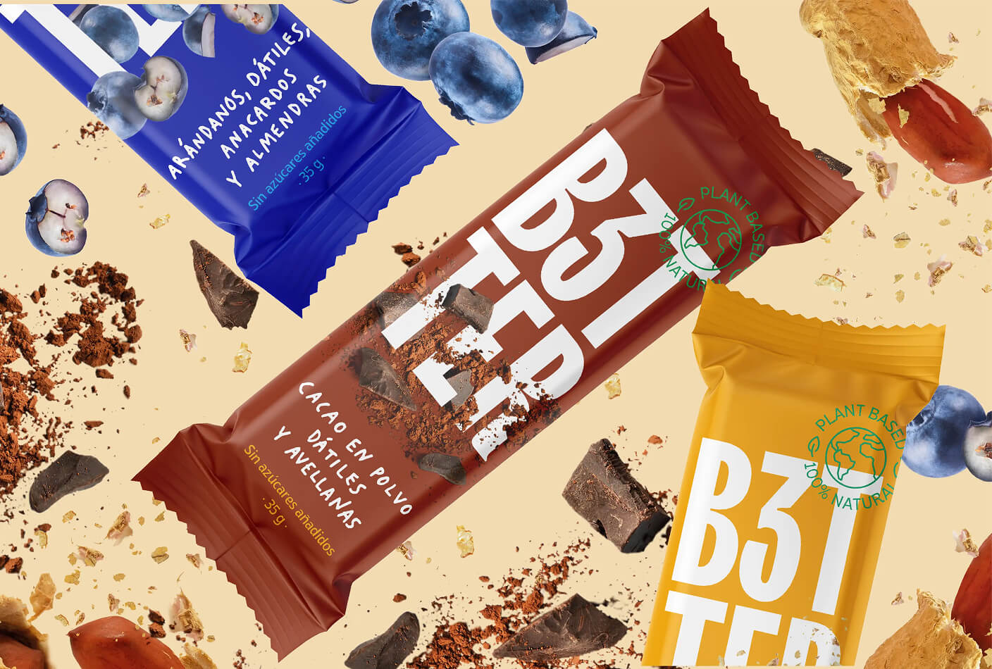
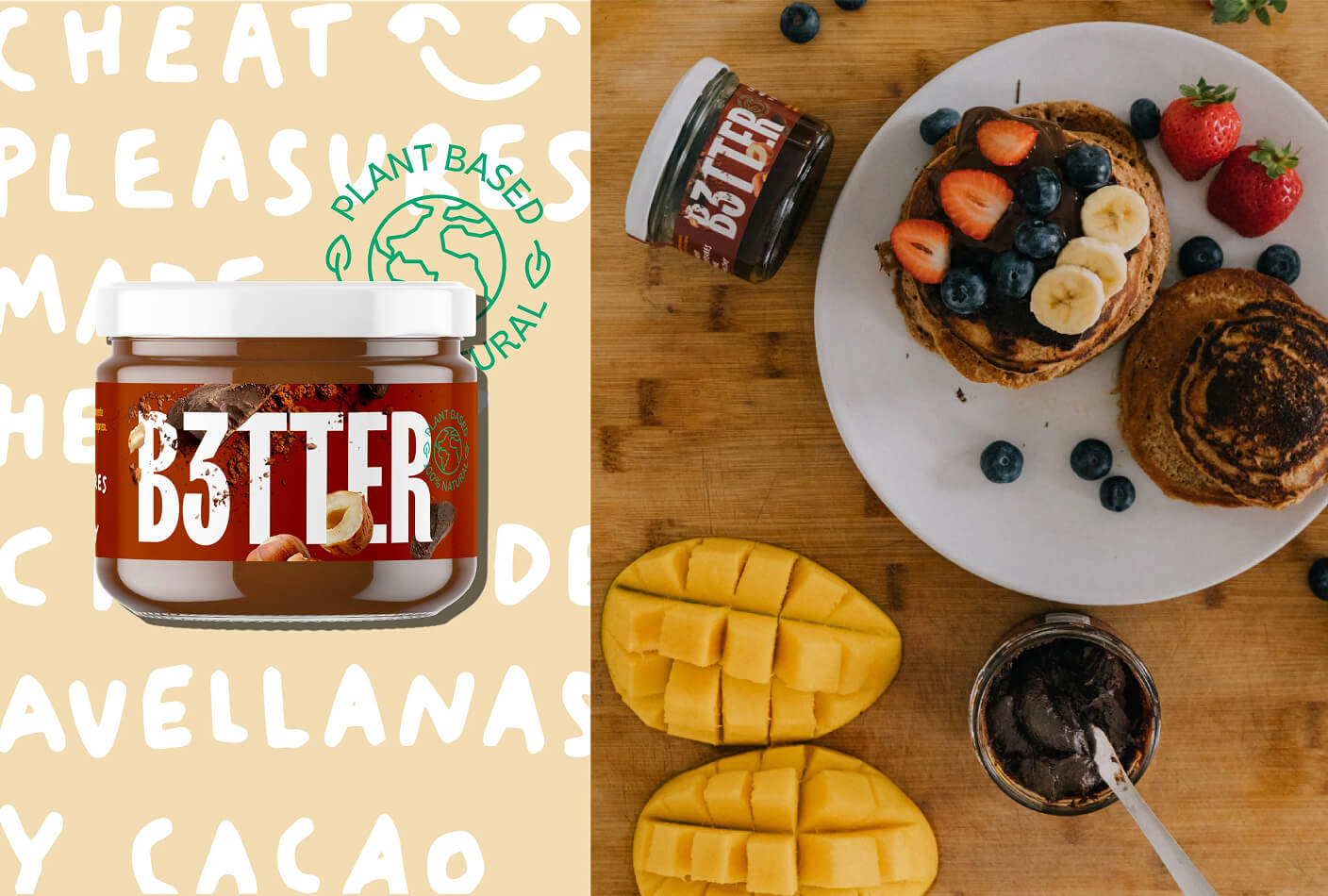
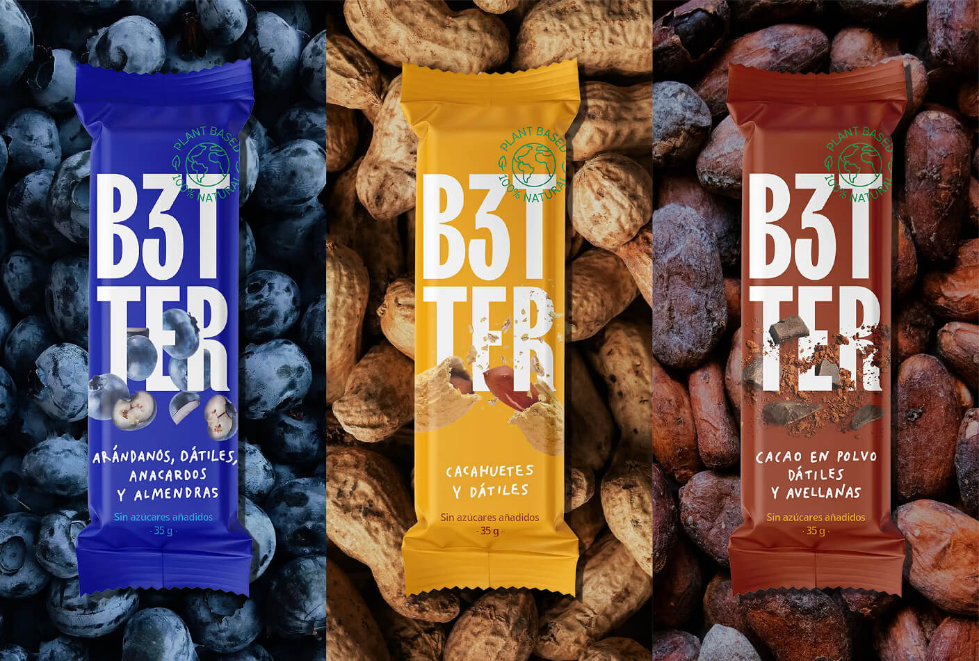
The logo was created with condensed, neo-grotesque typography and gestures that add flavour, fluidity and sweetness. To give the brand a touch of spontaneity, some of the pack's messages were developed with a handwritten typography – designed by Marion Cardona – in line with the illustrations used on social networks and on cereal and granola boxes. For the visual universe, still lifes were created with real images of the main ingredients, generating a composition that transmits an explosion of flavour on the packaging, achieving a greater impact on the shelf at the point of sale. And to round off, as a categorisation strategy, various creamy and bright colours were used for each product range.
Binomial
Less drama, more skincare
Scroll down