FC Barcelona
125 years with a unique, unmistakable style
Scroll down
FC Barcelona celebrates 125 years of history by reiterating its unique playing style with an identity that highlights its essence and values, putting the ball at the heart of everything.
Challenge
After developing the Espai Barça identity, FC Barcelona challenged us to create a visual identity to celebrate the club’s 125-year history. The goal was to reflect the pride of having been, and continuing to be, one of the world’s most iconic sports clubs, while staying true to its unmistakable playing style. This celebration not only looked to the past, but also played to the future.
Approach
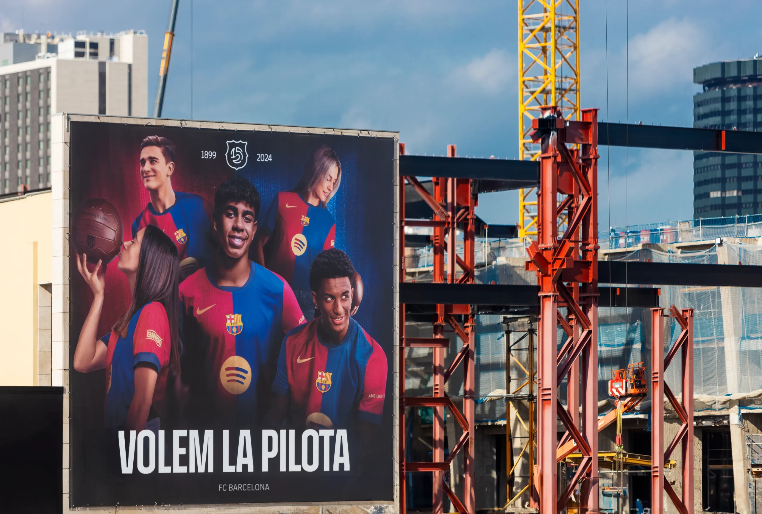
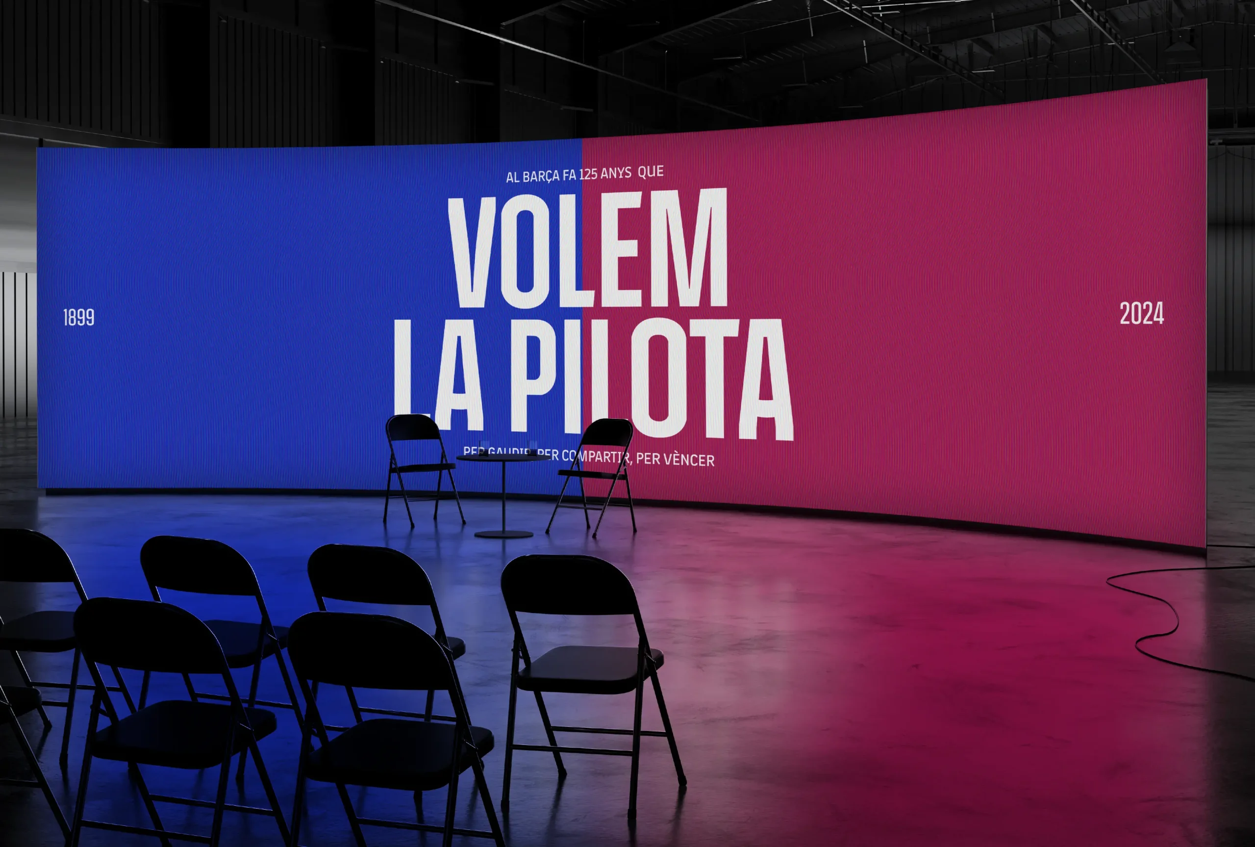
The 125th anniversary curatorship focused on the club's impact on both local and global football culture. We shaped this through a narrative and identity reflecting its distinct style of play and the iconic ball, present in the original crest. We emphasized 125 years of ball possession and a unique playing style, representing a blend of passion and "seny" (wisdom), respect, and collaboration—values central to Catalan culture and key to the club’s ongoing success—encapsulated in the club’s slogan: "Volem la pilota" (We want the ball).
Solution
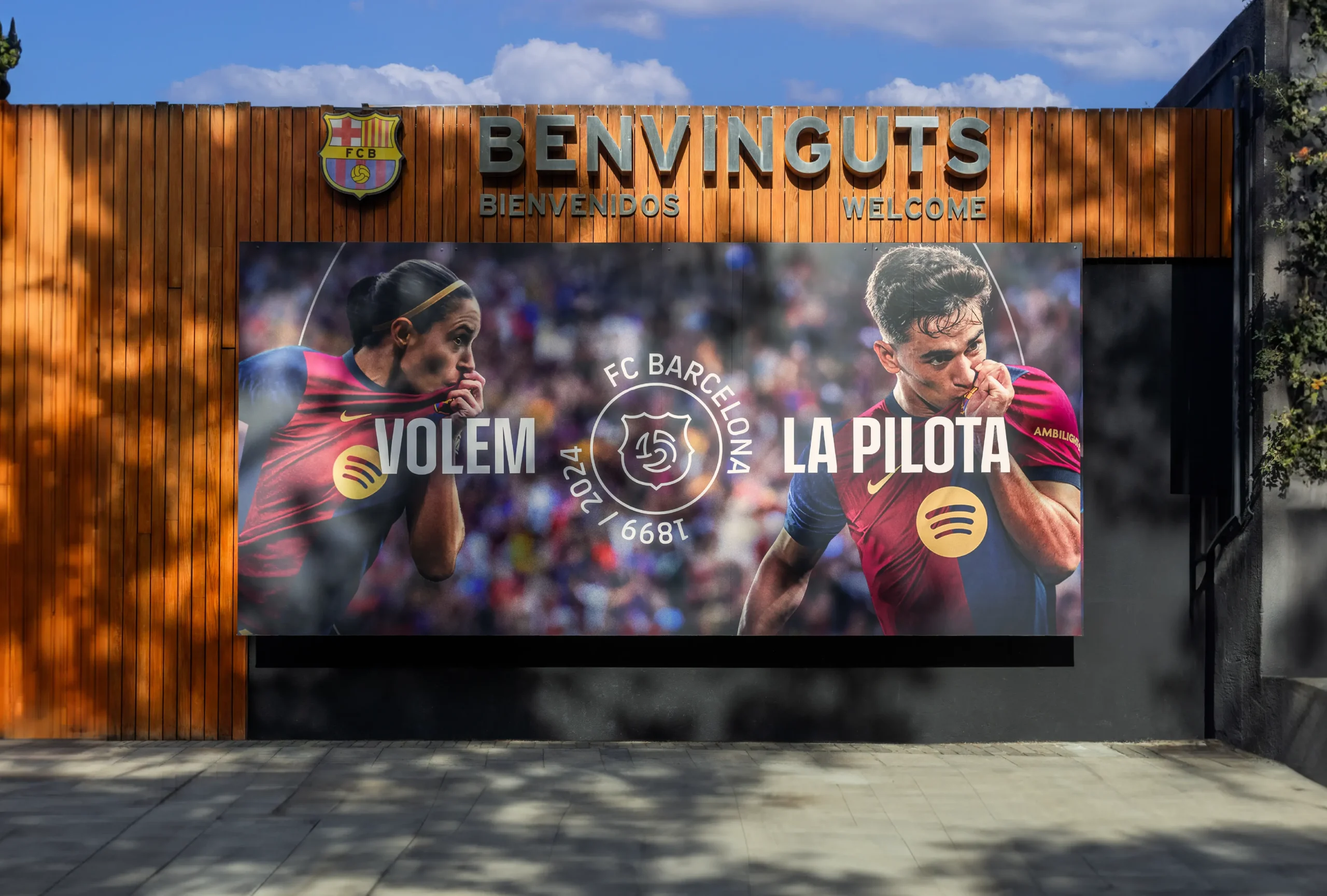
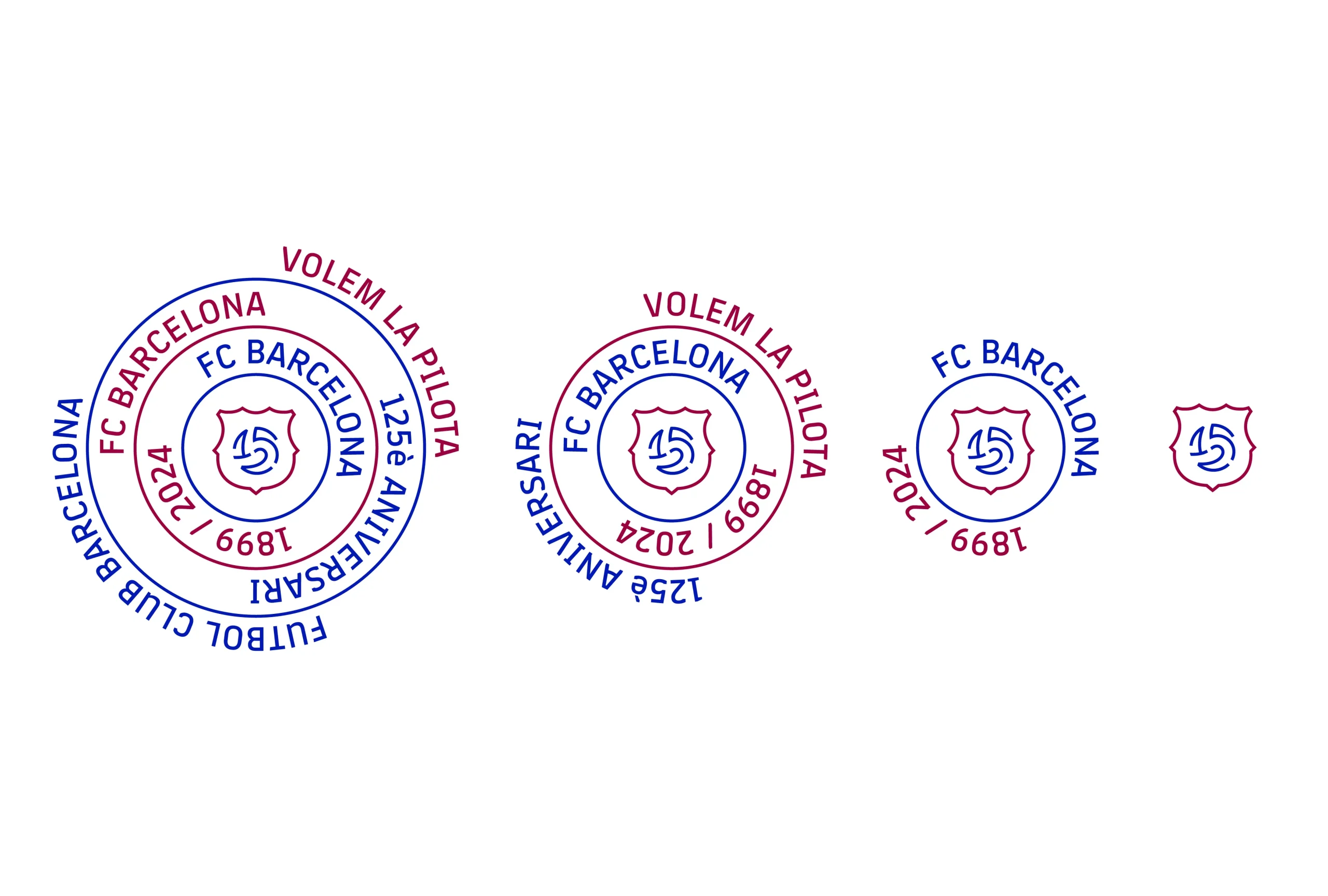
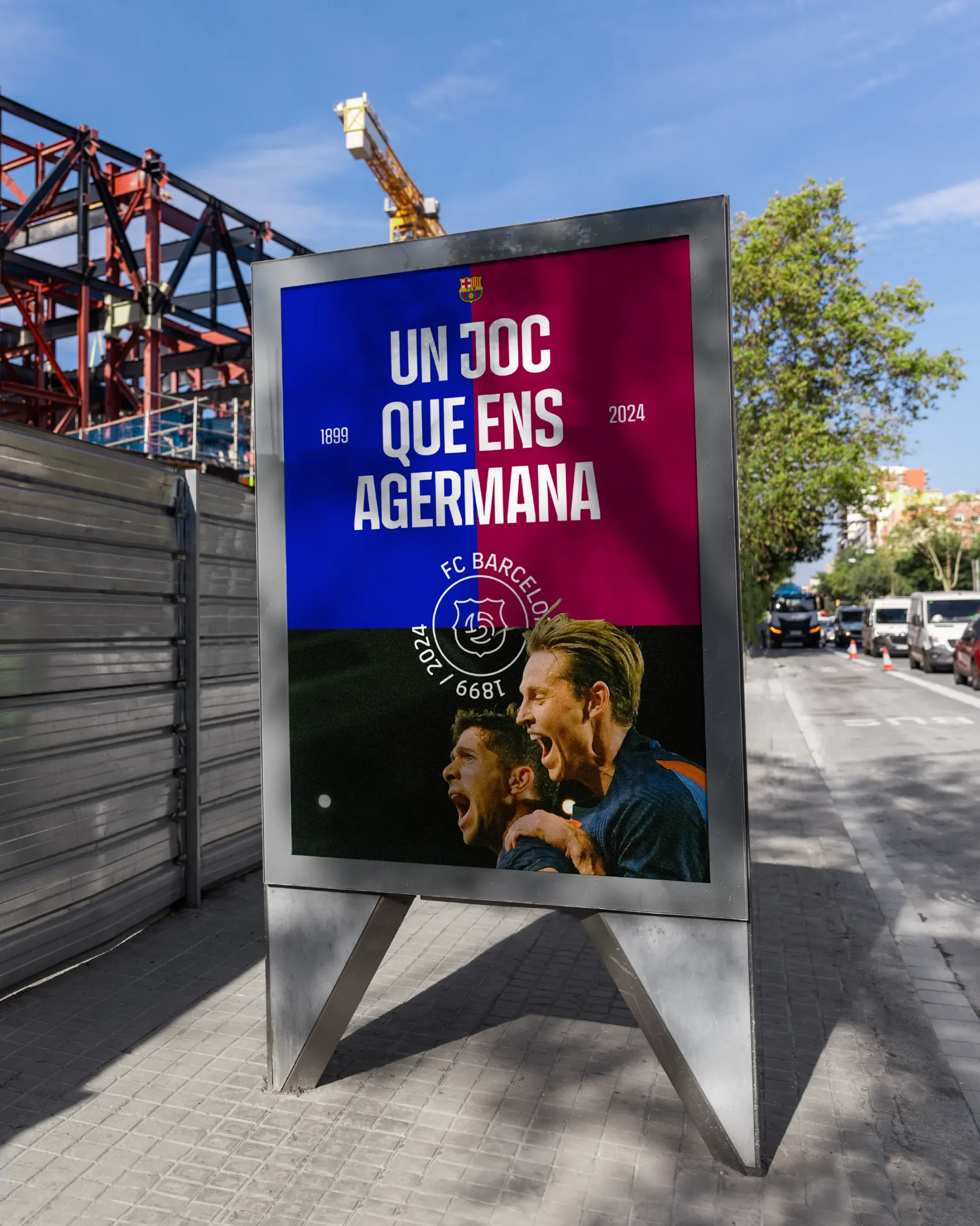
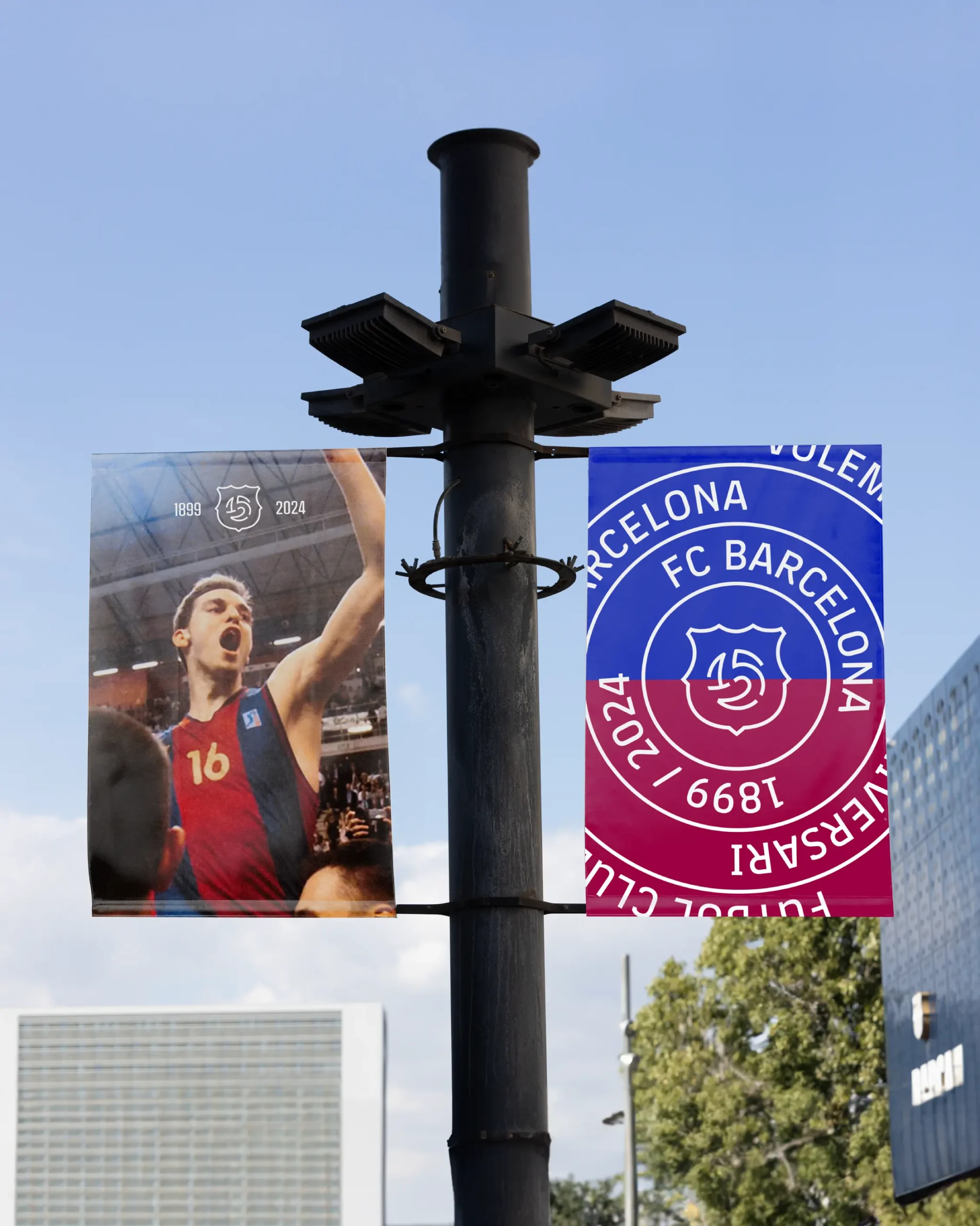
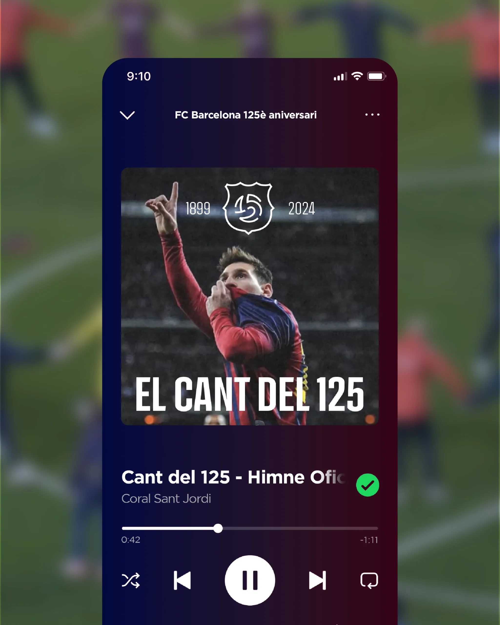
The identity is designed to celebrate 125 years of emotions surrounding the ball. To highlight possession and the unity of the community around it, the key visual element is the circle—symbolizing control of the ball and the field, as well as being inherent to Catalan culture, reflected in the sardanas dances and the "castellers" human towers.
The logo’s core element is the ball, which takes center stage, surrounded by the club’s iconic crest, transforming into a "125" for this special celebration. The result is a brand identity that places the ball at the center, embodying community, camaraderie, and equality. This graphic system pays tribute to Barça’s 125 years of history and celebrates their continued commitment to their essence—keeping the ball, maintaining their style, and staying true to their core.
El elemento central del logotipo es la pelota, que cobra todo el peso y protagonismo, y, envuelta por el emblemático escudo del Club, se transforma en un "125" para esta conmemoración especial. El resultado es una identidad de marca que pone la pelota en el centro, representando colectividad, hermandad e igualdad. Este sistema gráfico es un homenaje a los 125 años de historia del Barça y una celebración de seguir siendo como son. Manteniendo la pelota, manteniendo su estilo, manteniendo su esencia.
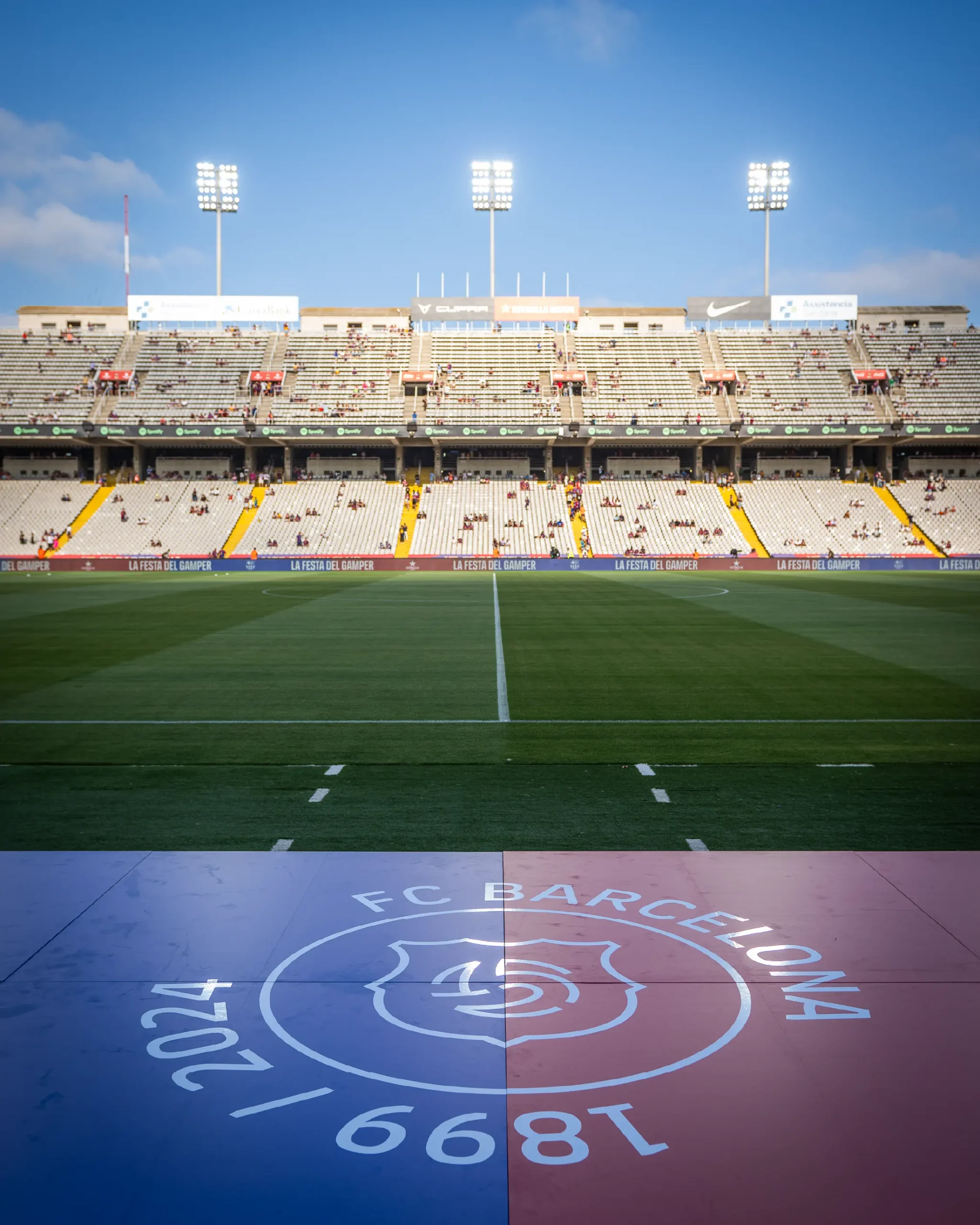
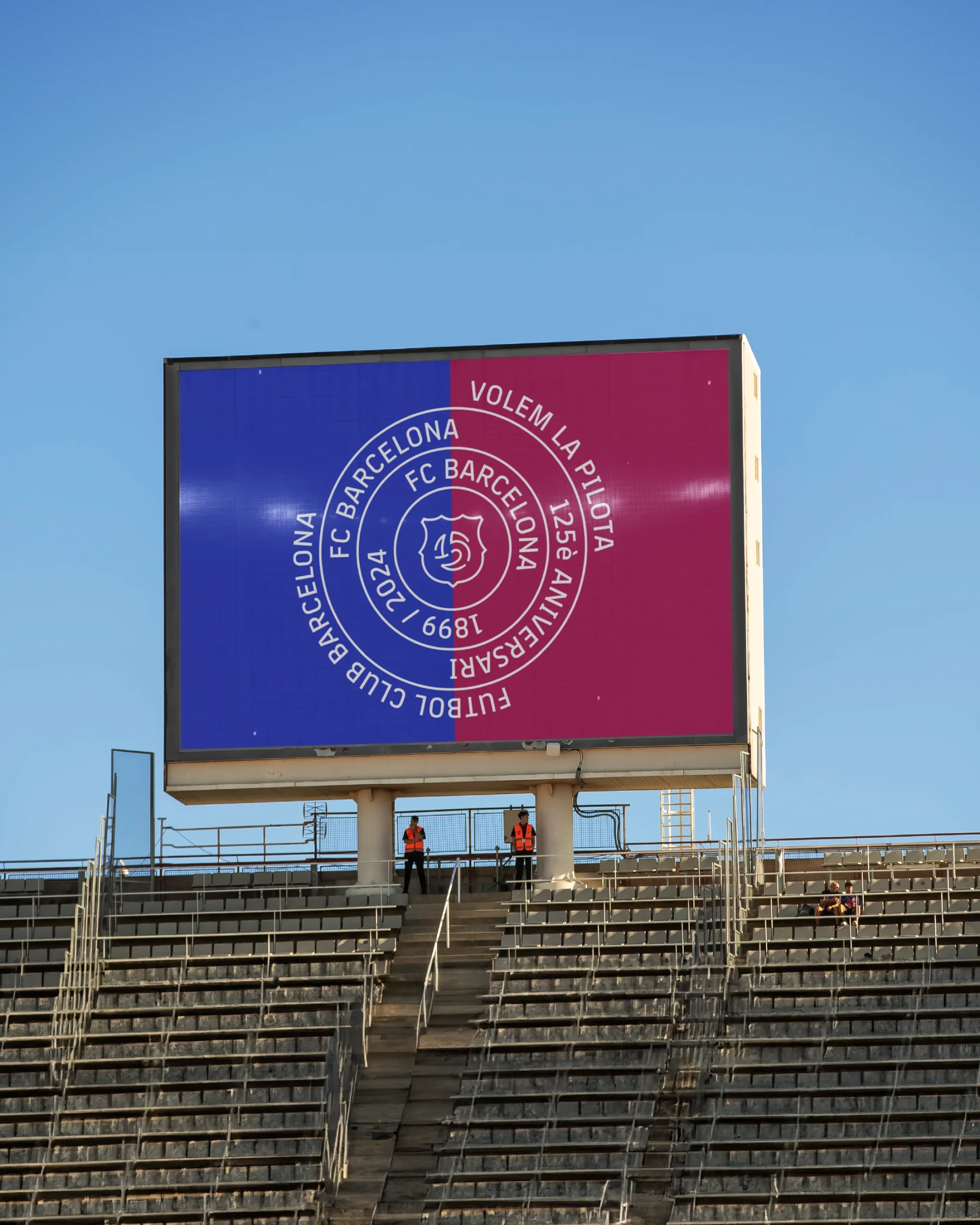
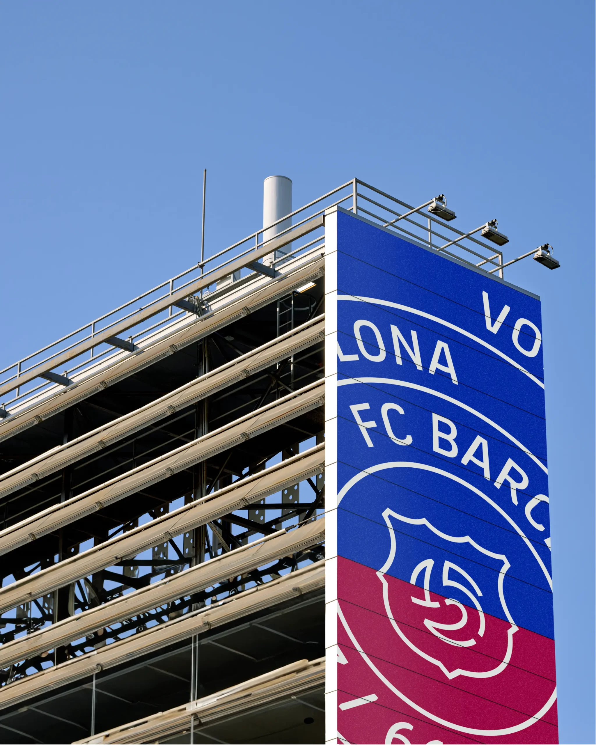
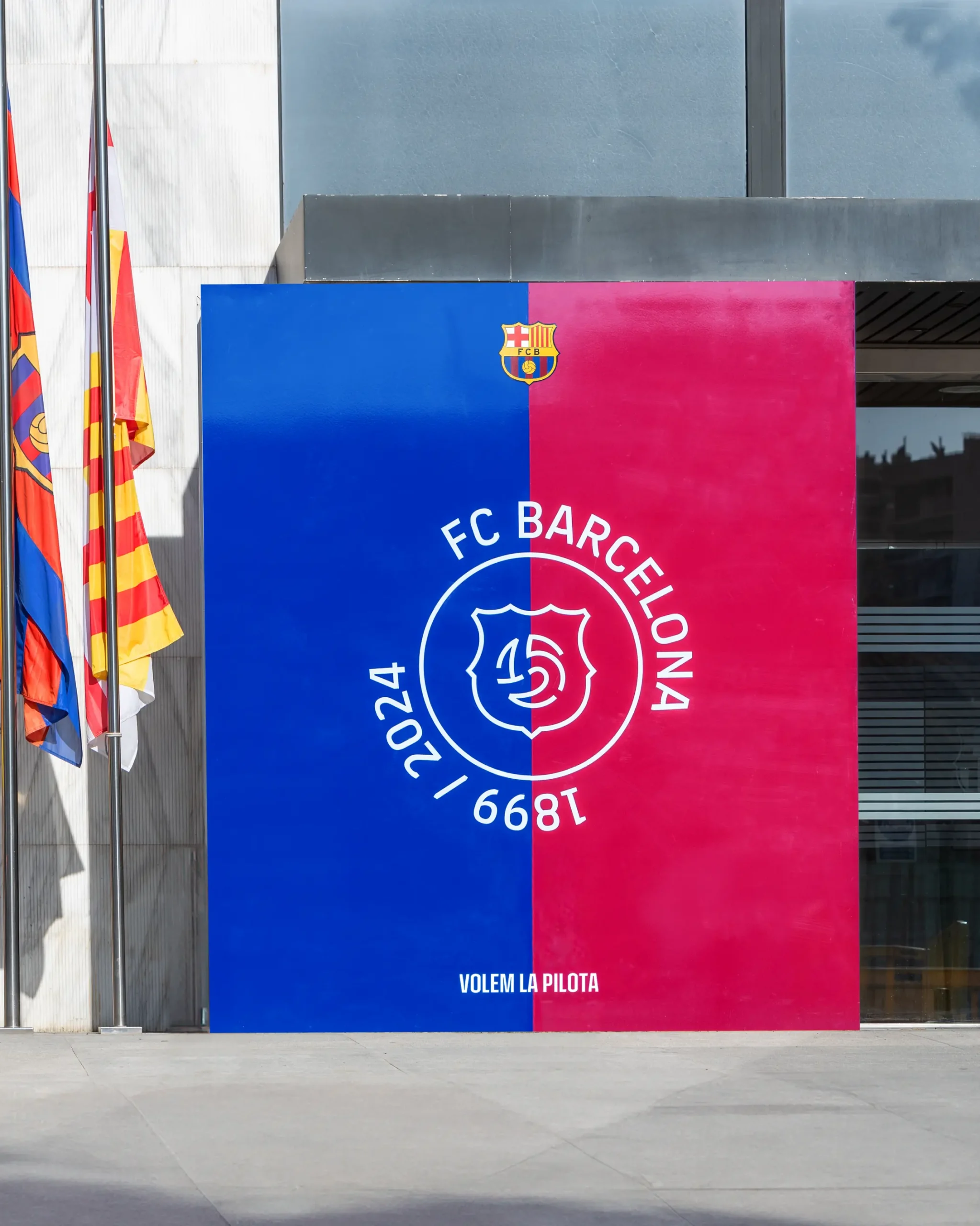
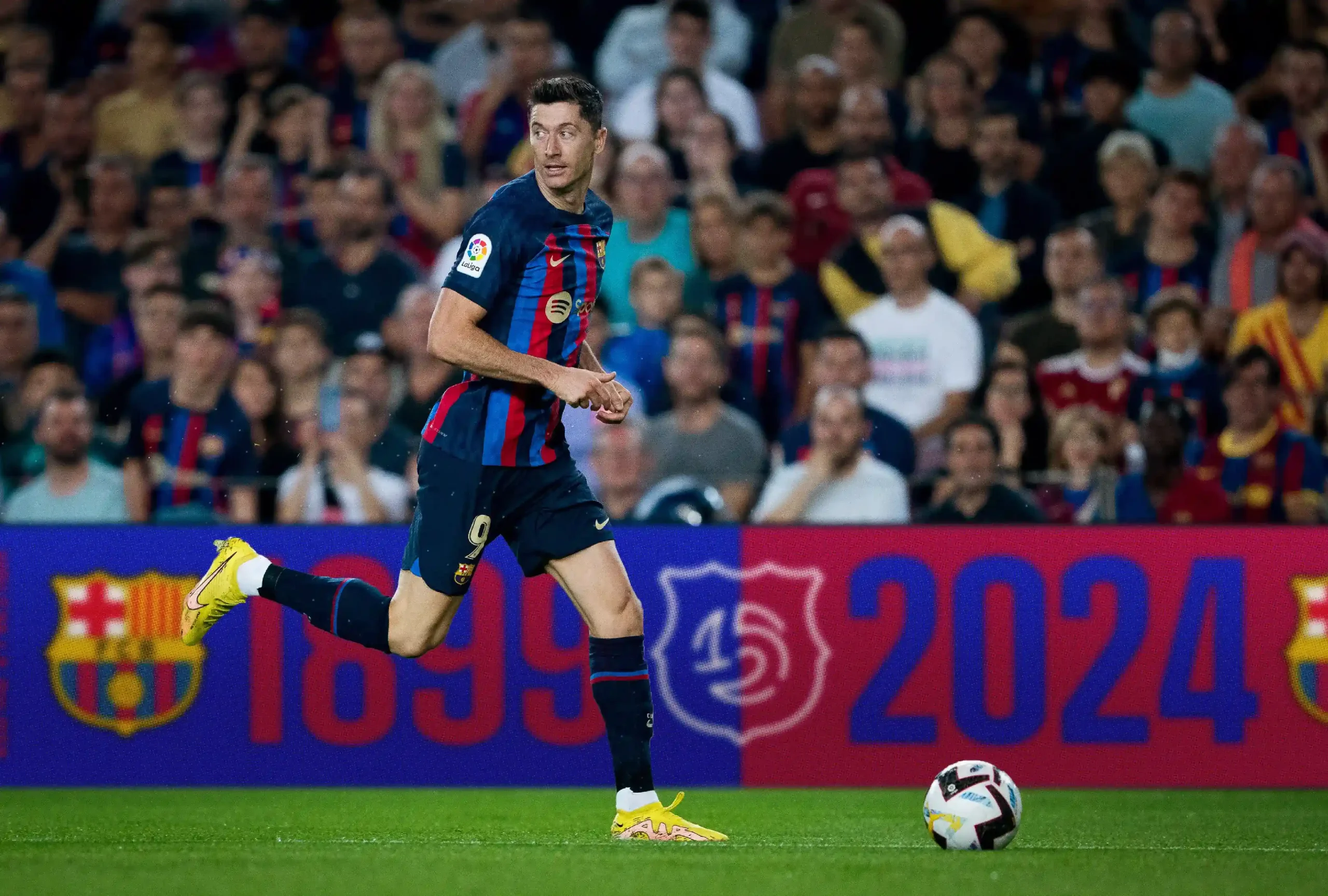
A responsive brand adapts its appearance across various platforms while preserving its essence. For this project, adaptability was crucial, so we created a system with different levels of complexity for various communication needs—from mobile screens to large stadium displays. We generated brand variations for every moment and occasion, like this video produced directly by Barça.
FIDE
FIDE World Championship: chess at its best
Scroll down