Jaime Beriestain
A rebranding for a renaissance man
Scroll down
We defined and created a monolithic identity for Jaime Beriestain that encapsulates his multifaceted personality in a packaging design infused with his multidisciplinary essence.
Challenge
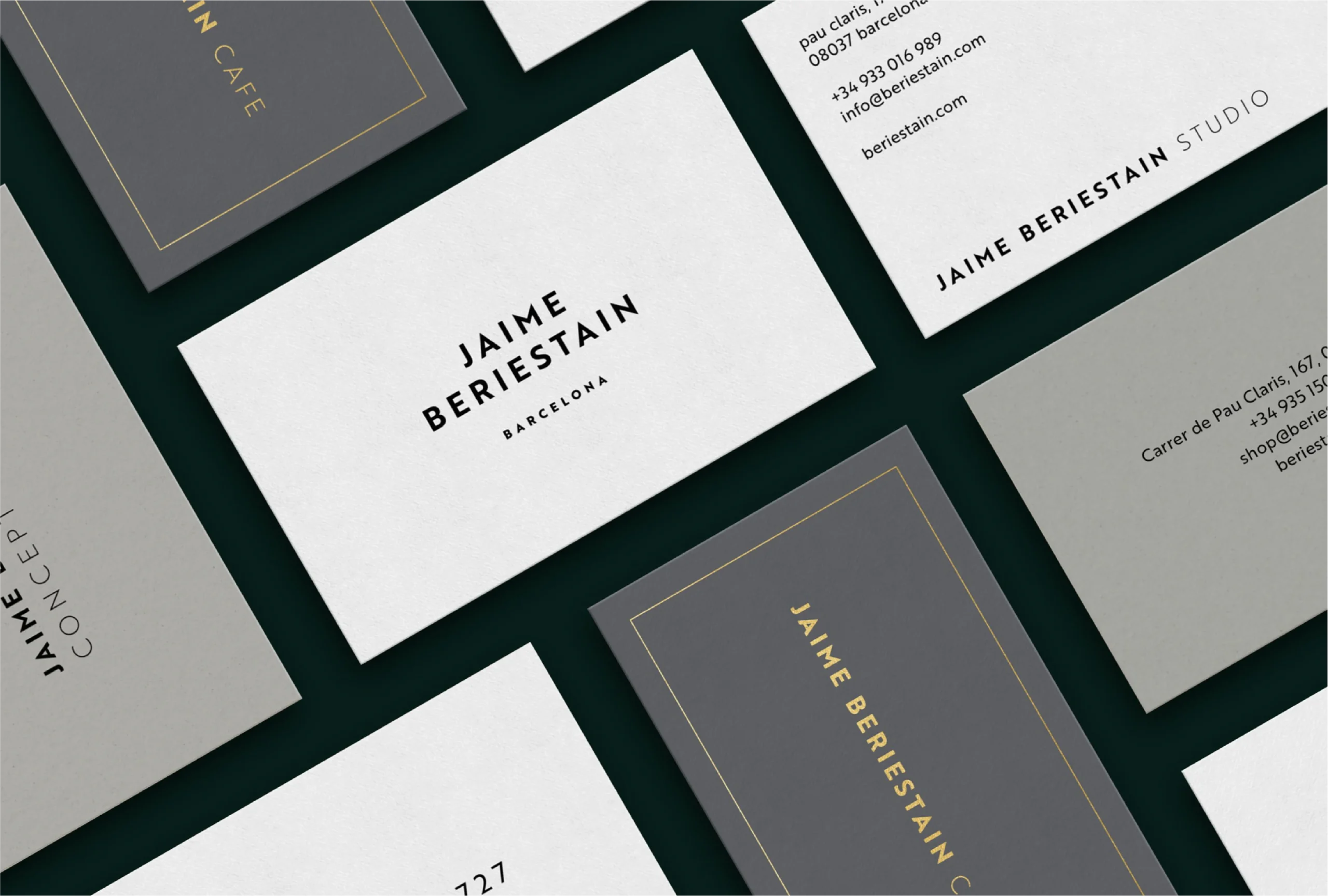
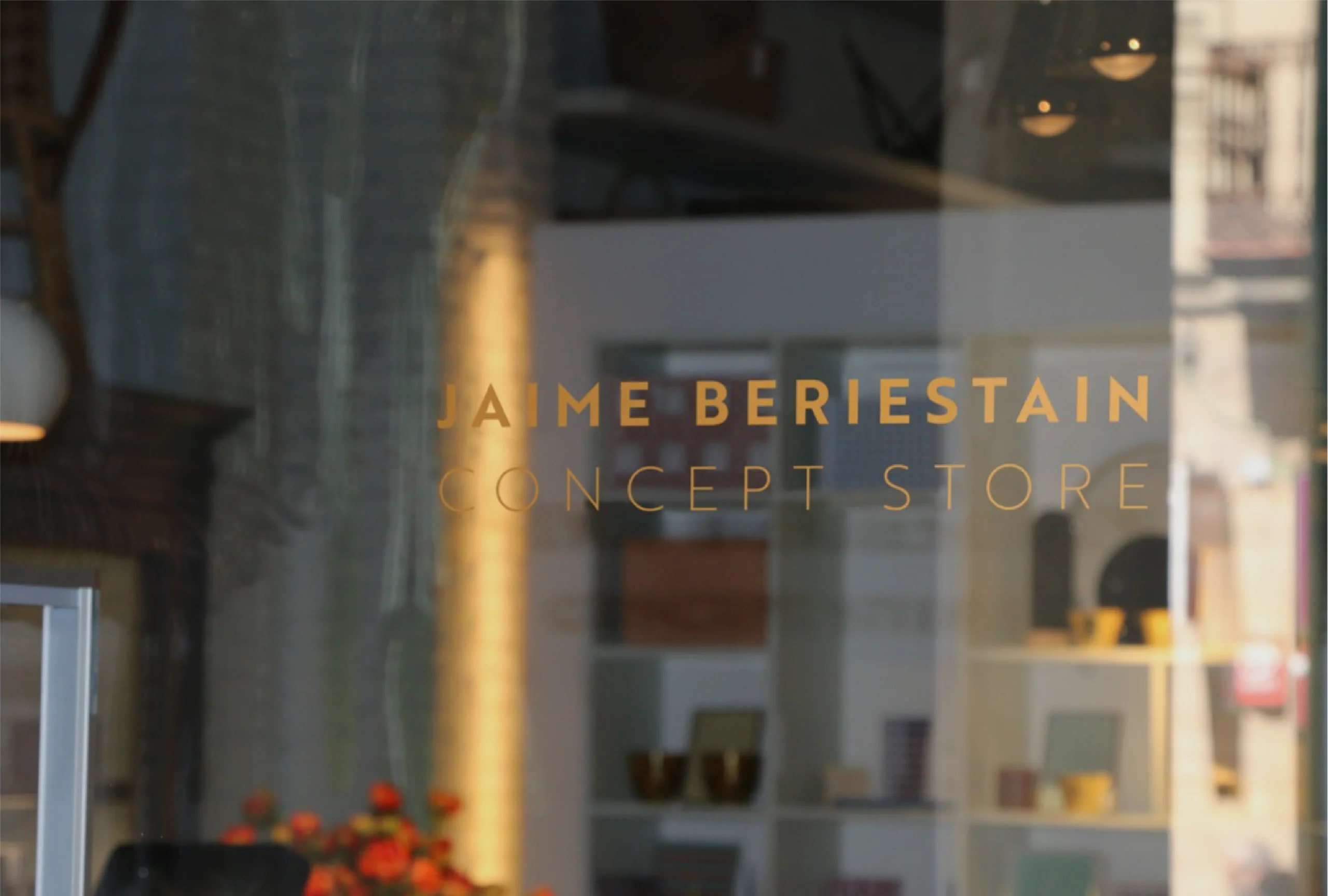
Jaime Beriestain is a famous Chilean interior designer who has not stopped growing since he arrived in Barcelona: he has created his own studio, a showroom next to Gaudí's La Pedrera and two successful ventures: the Concept Store and the Café.
Our challenge was to define and unify an authentically multi-faceted personality. Seeking and capturing its essence. Defining without limiting its growth. Quite a challenge, since it is not easy to encapsulate a prestigious interior designer, entrepreneur, restaurateur and celebrity in a single identity.
Approach
In Morillas, we tuned in to Jaime Beriestain’s concerns and in return, we received a fascinating challenge: to start from the person and create a brand that would work in truly different fields and with utterly different audiences.
To do this, we look not only at his adventurous and creative personality, but also at the values that guide him: curiosity, good taste, self-demand, closeness and authenticity. Although the connection among all of Jaime Beriestain's projects and their contact points is complex and multidirectional, we managed to define it through a monolithic identity, consistently applied according to recognizable and minimalist canons.
Solution
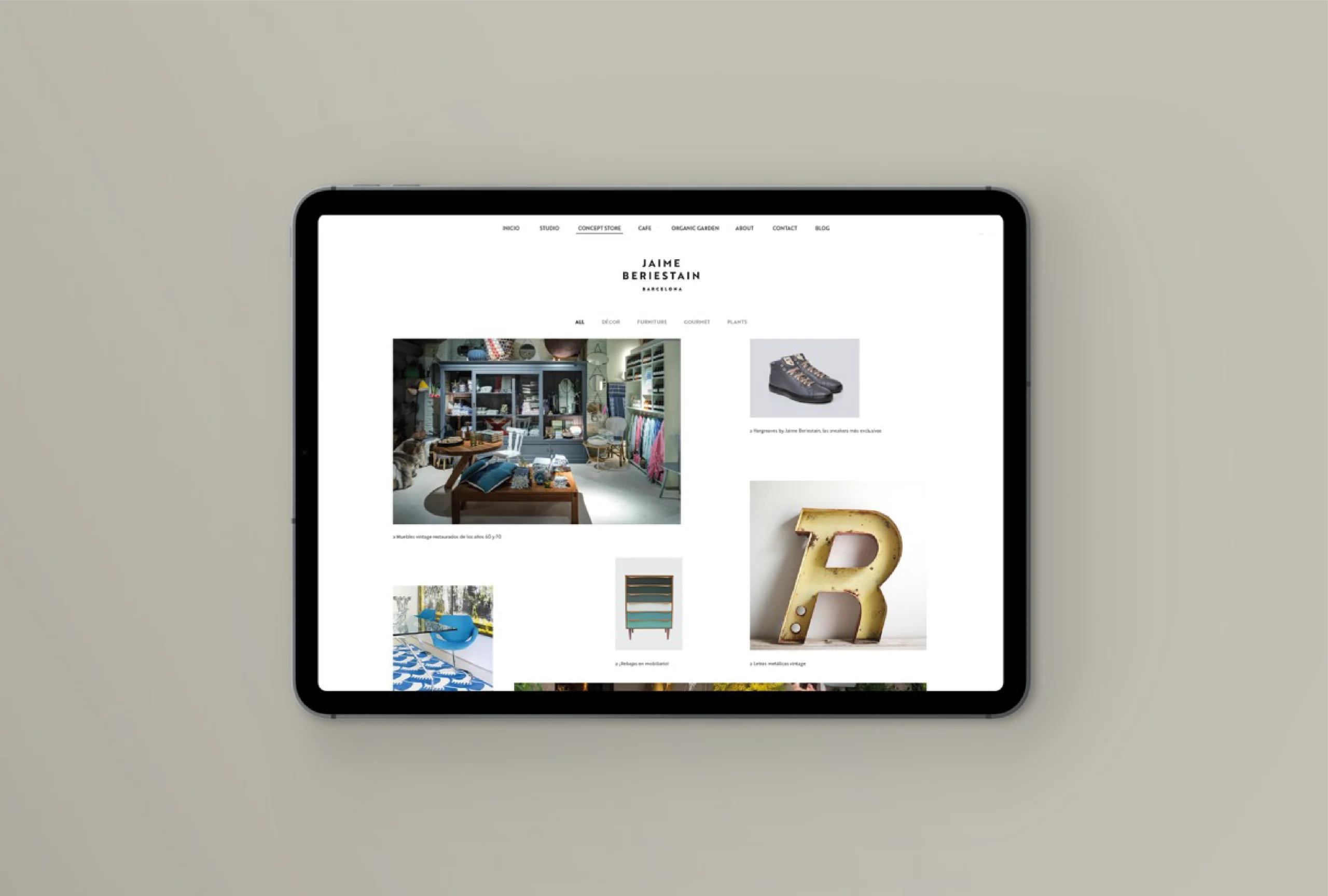
We unified the brands and placed them under the Jaime Beriestain brand umbrella, as all of them undoubtedly nurture his multifaceted personality. The new architecture is also reflected in the online presence, unifying contact points, such as the websites and social networks, and facilitating their interrelation, avoiding confusion and simplifying communication efforts.
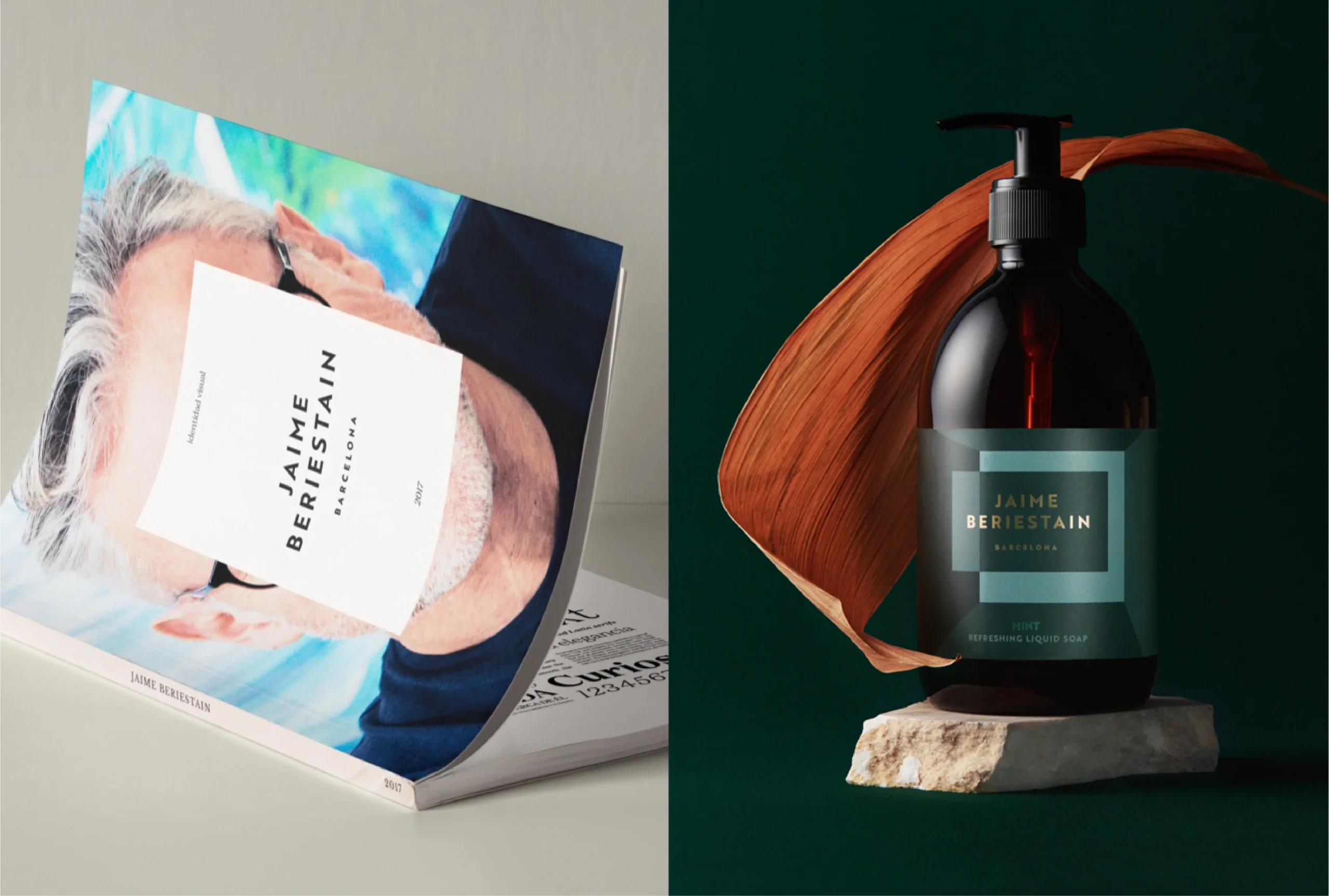
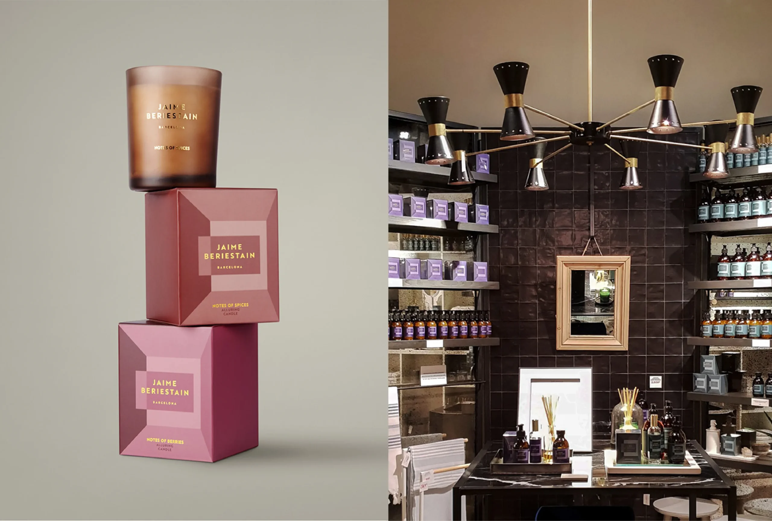
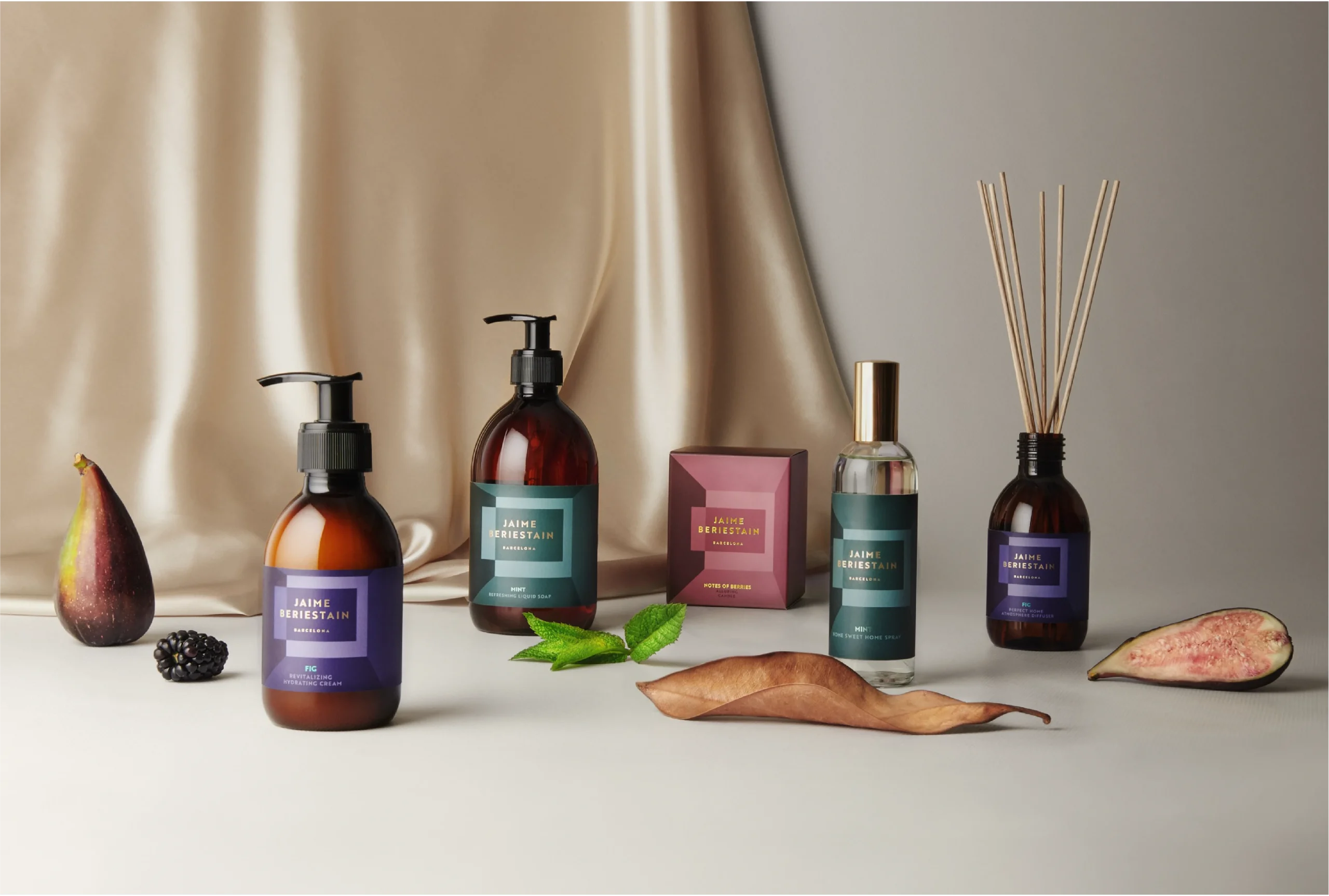
For the graphic language, we created this geometric play as a nod to the margins of architecture as if the pack were an interior designed by Jaime himself. Moreover, it can generate different products beyond the different formats, ranges and architectures, while remaining highly recognizable. The colour palette of the packs relies on dark and matte tones, defined alongside Jaime Beriestain himself, detaching premiumness through a minimalist presentation and applications in gold.

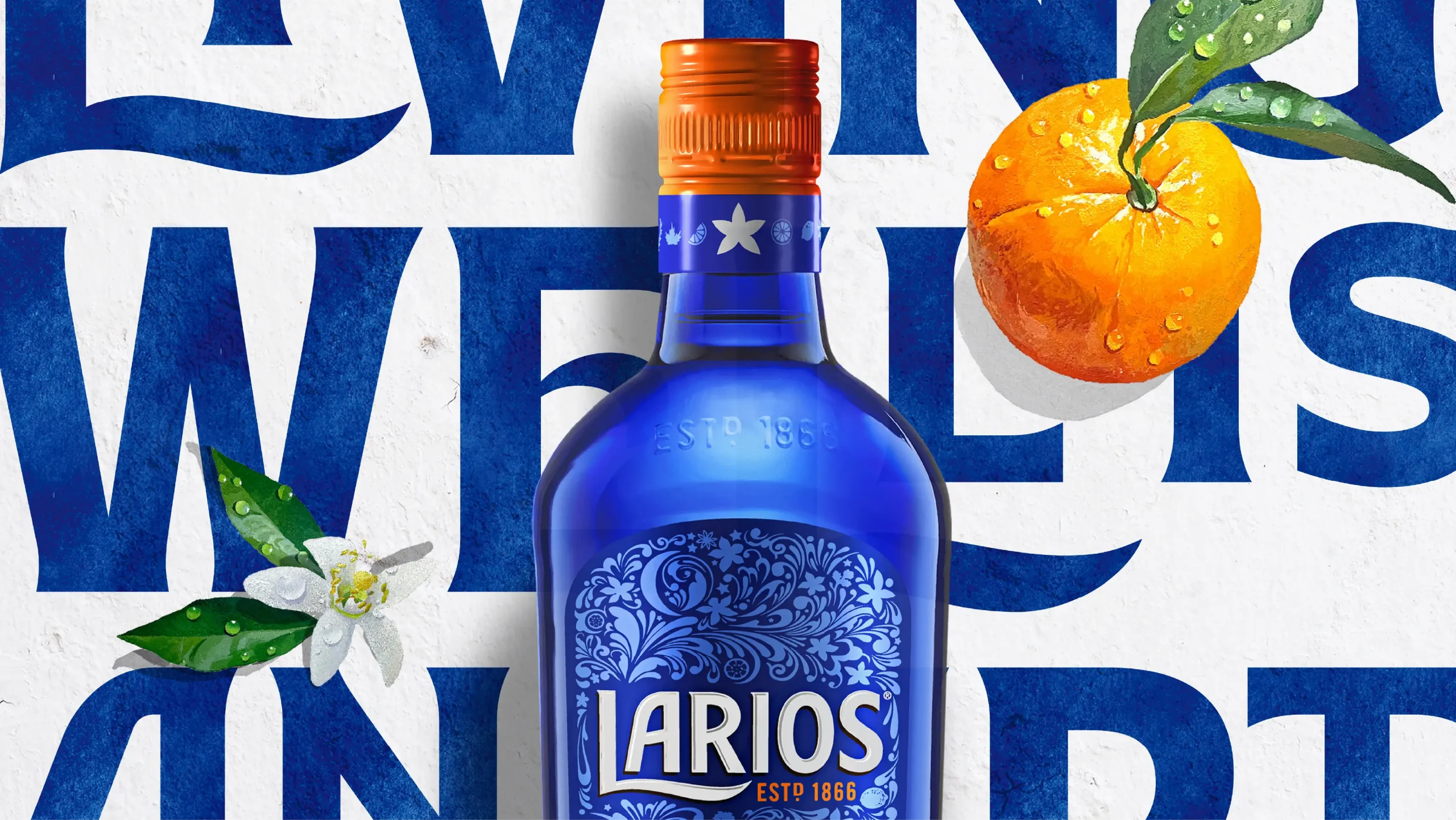
Larios 12
Larios 12: Pure Mediterranean essence
Scroll down