Larios 12
Larios 12: Pure Mediterranean essence
Scroll down
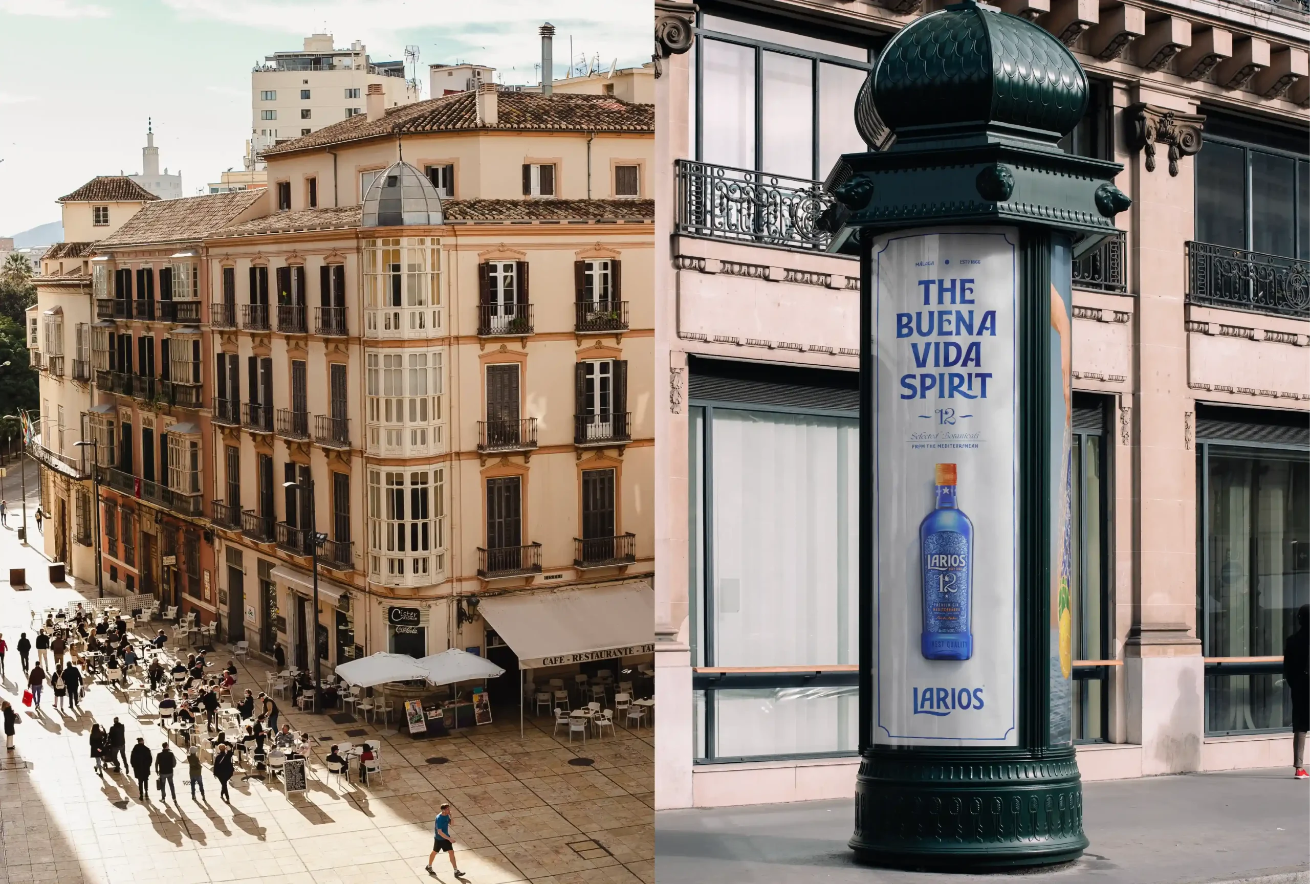
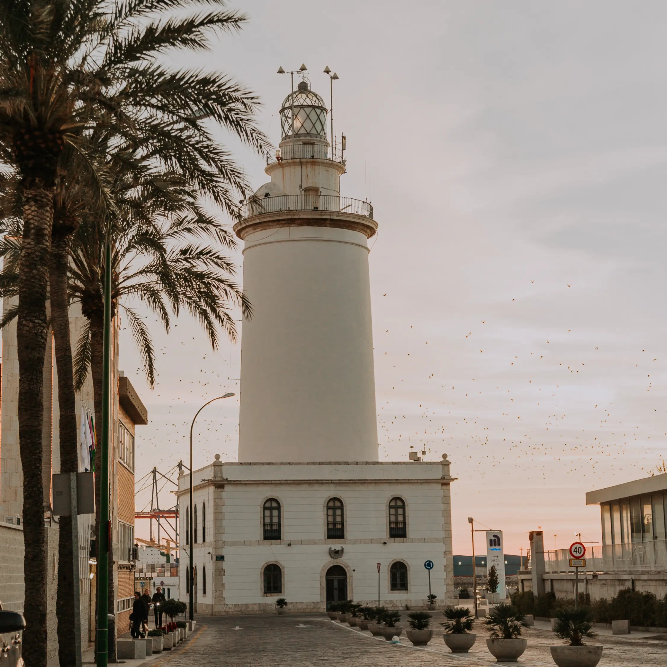
Larios hails from Málaga, where every moment invites us to enjoy life's simple pleasures. We positioned the brand as a reference point and driving force for a unique way of understanding life.
Challenge
Larios sought to strengthen its presence in Spain and prepare for international expansion through a unique and relevant brand positioning. The challenge was to create a versatile creative concept and build a cohesive visual identity with distinctive core elements. These assets needed to reflect Larios' Mediterranean essence—not just as a geographic location but as a way of life, embodying a distinctive approach to enjoying everyday pleasures.
Approach
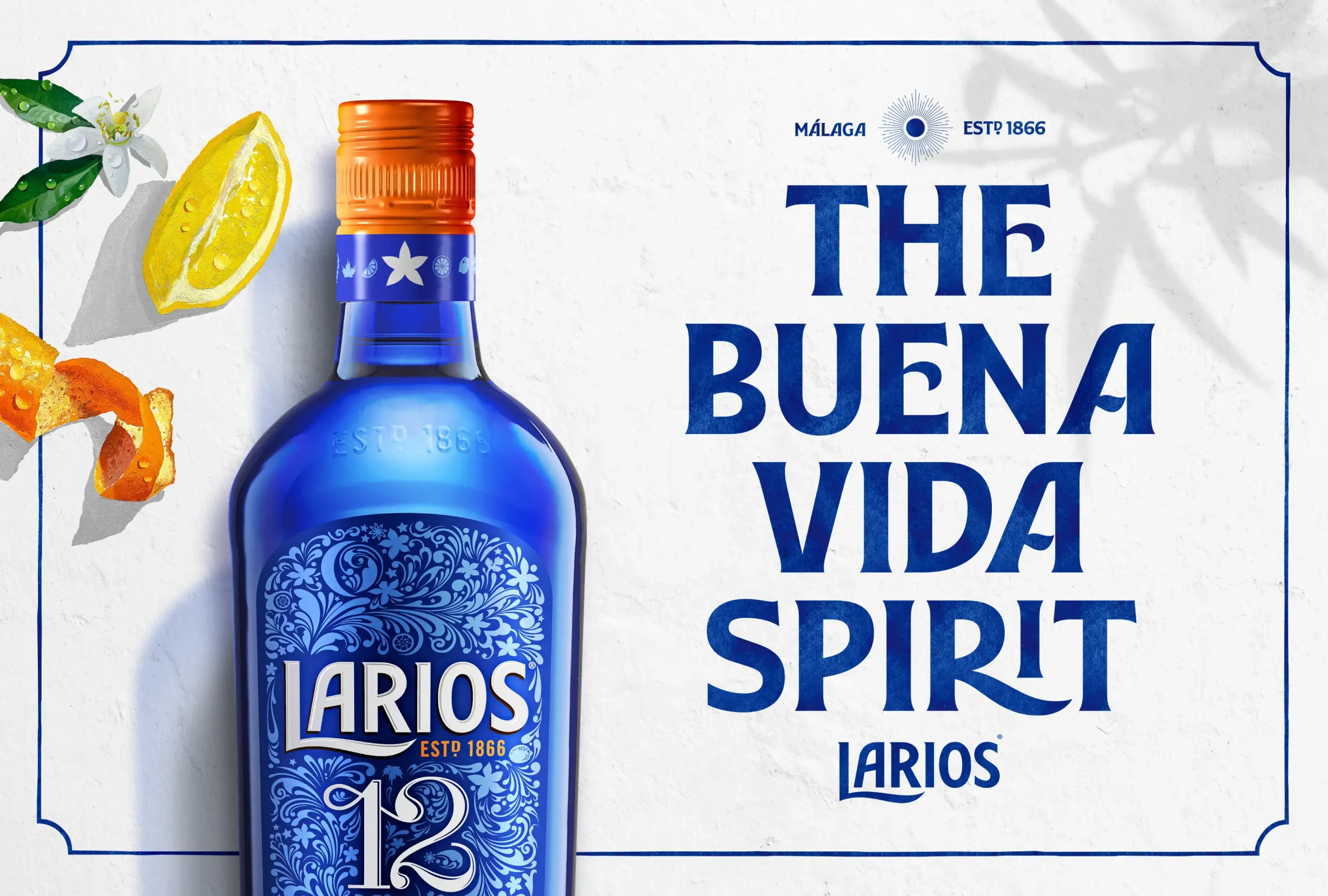
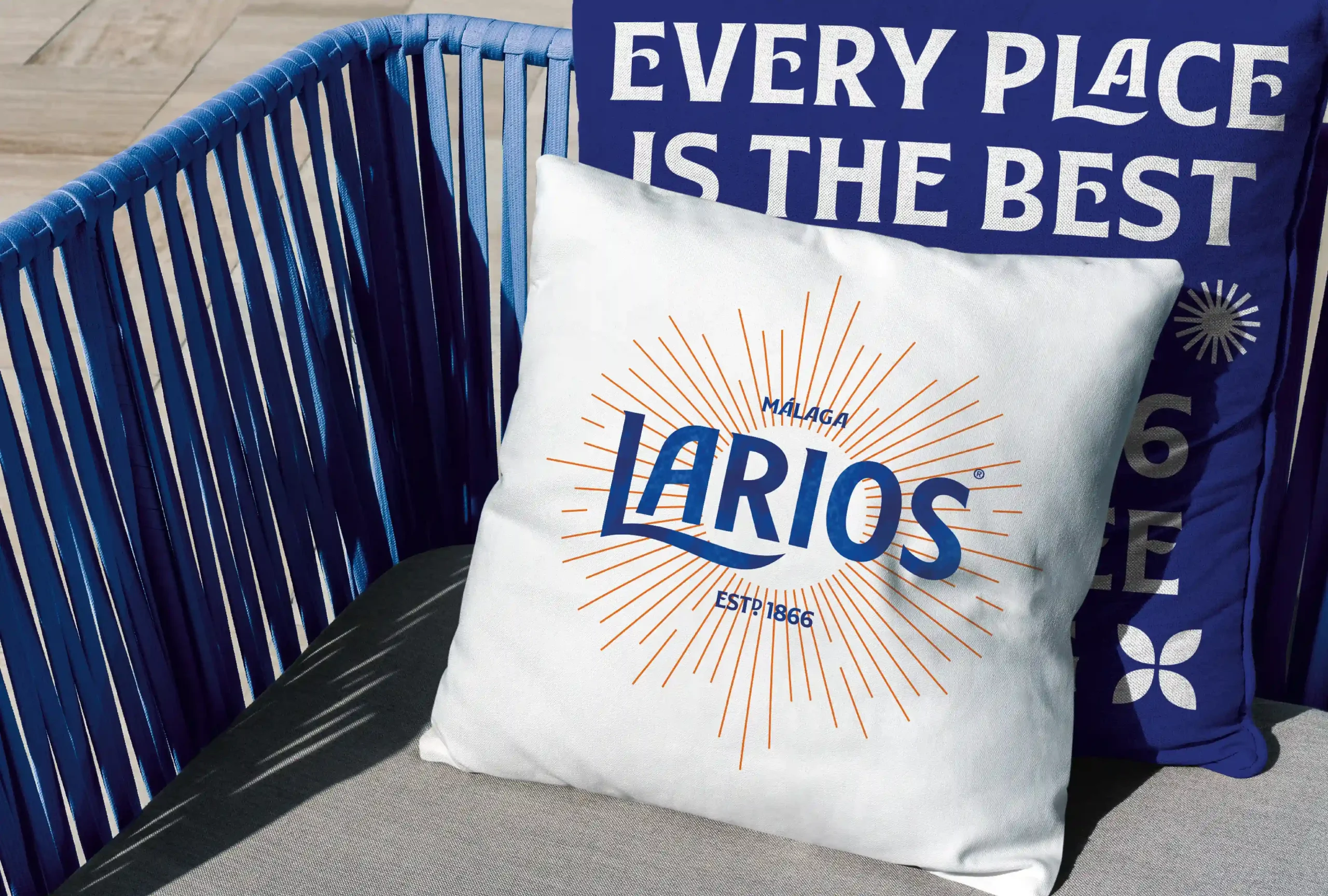
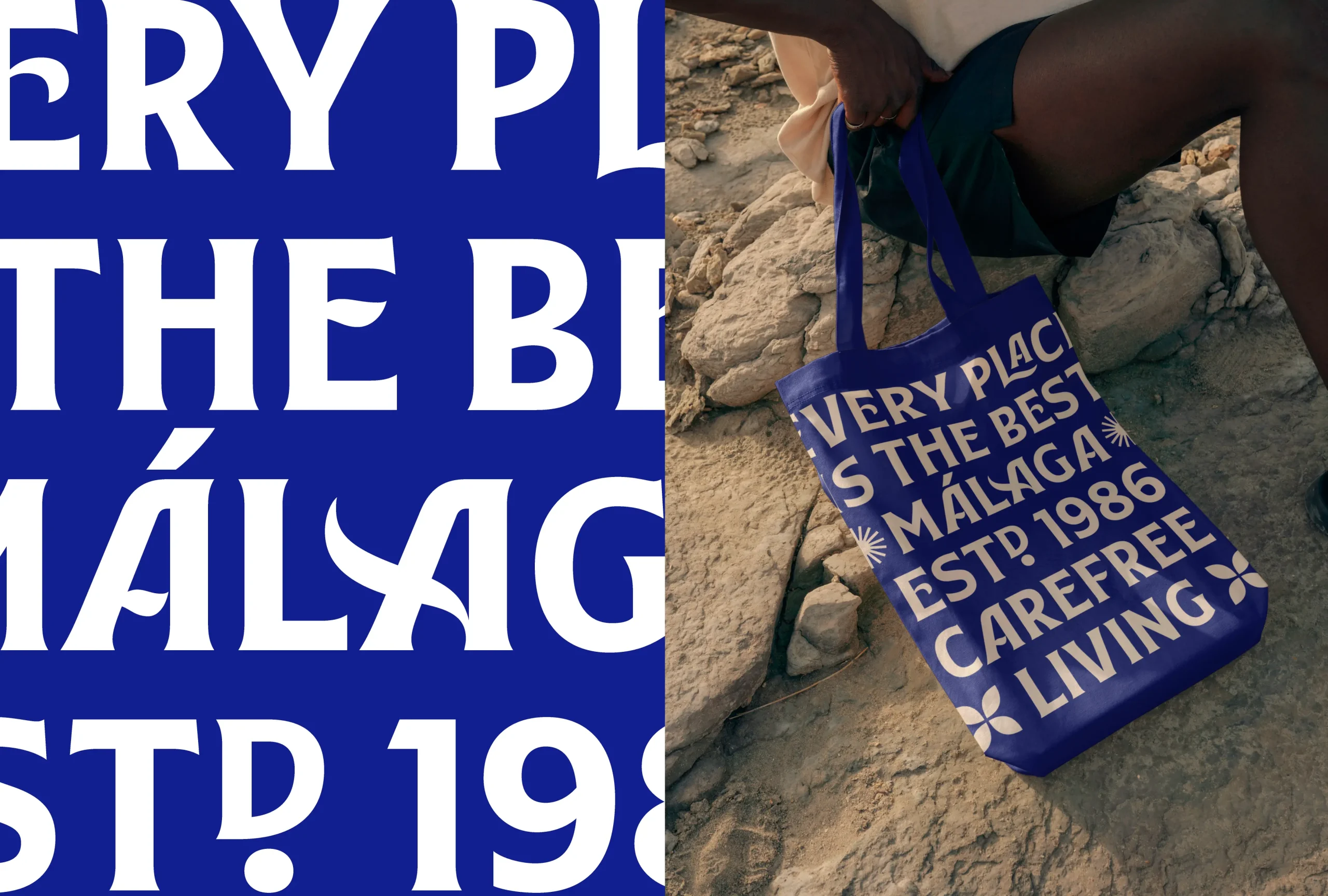
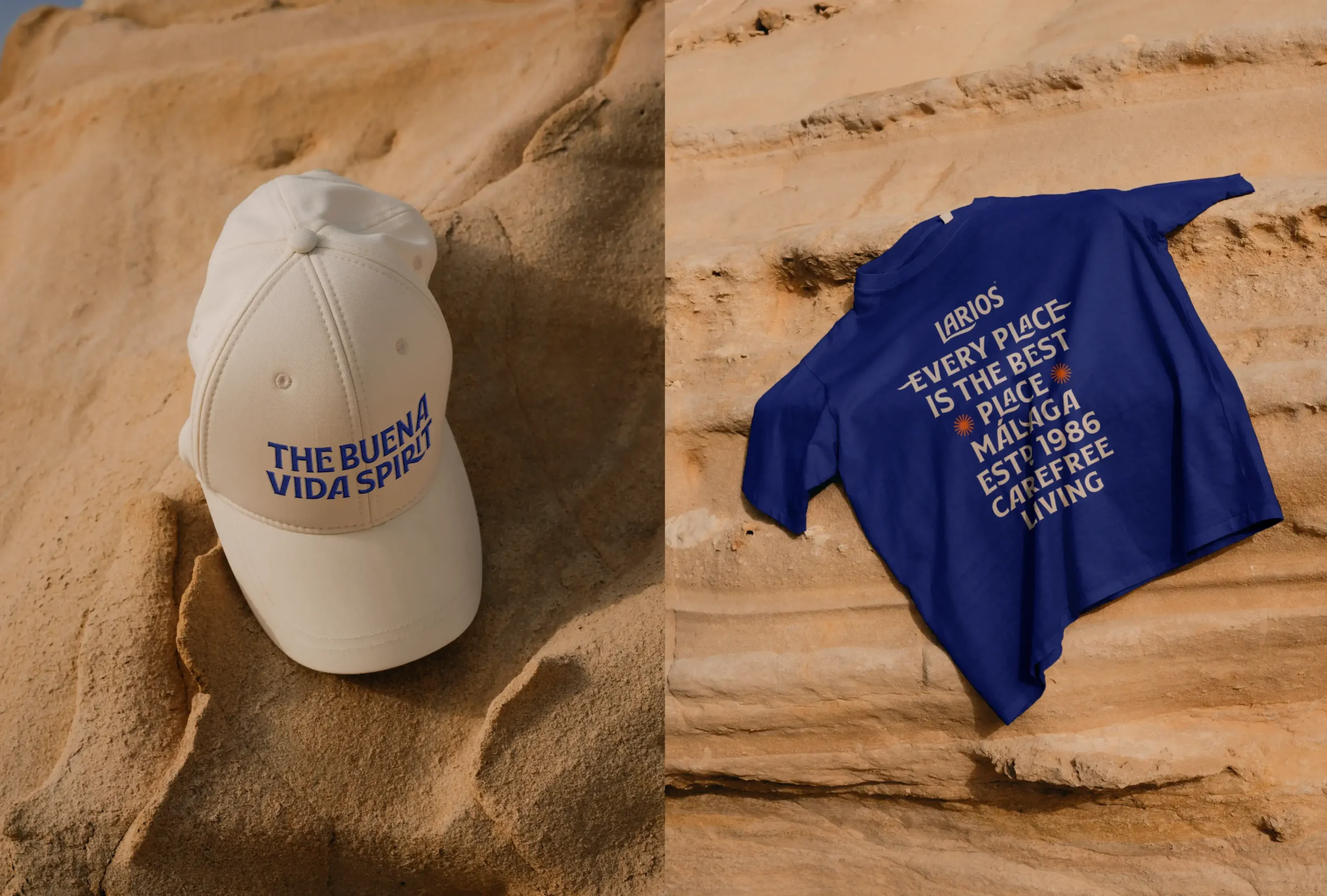
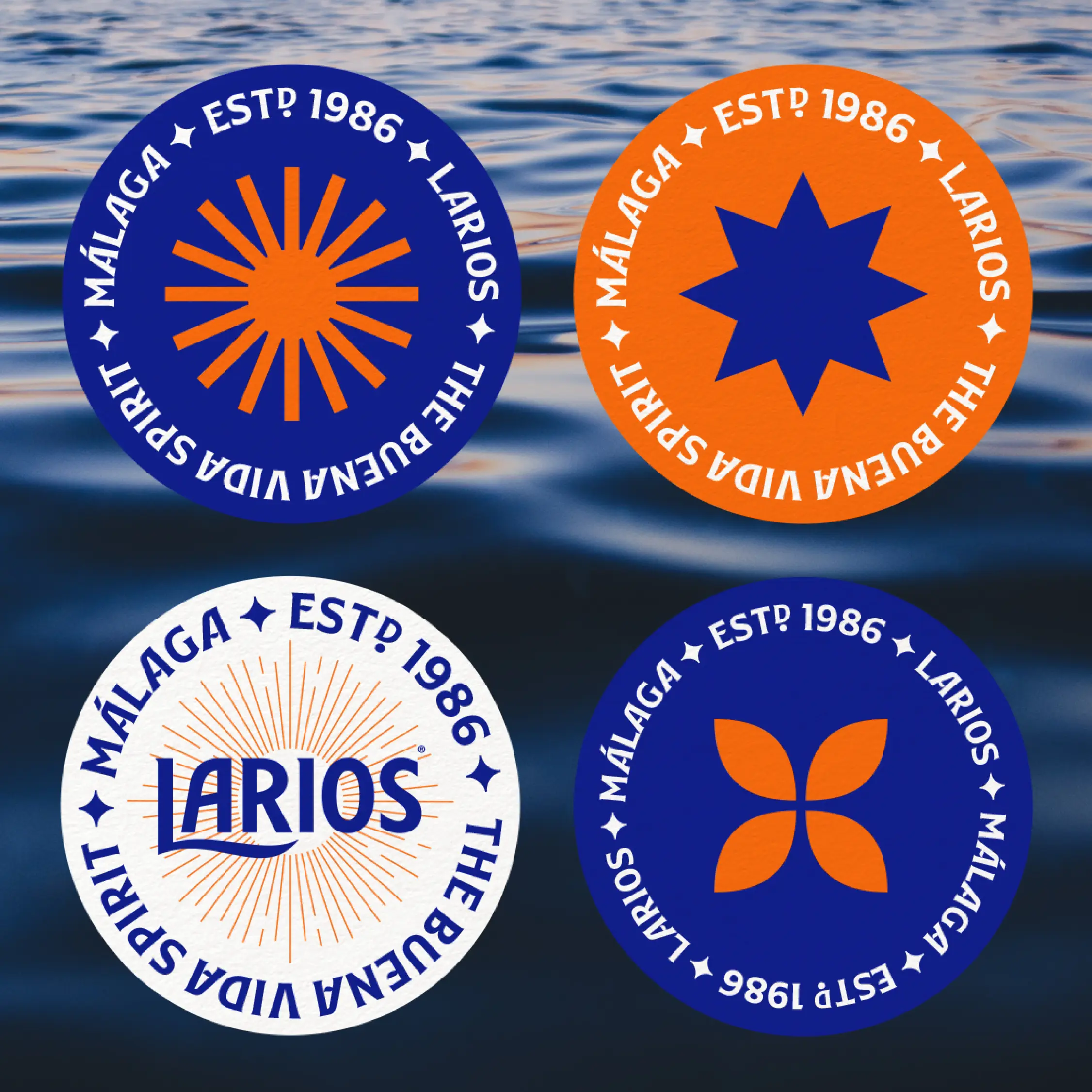
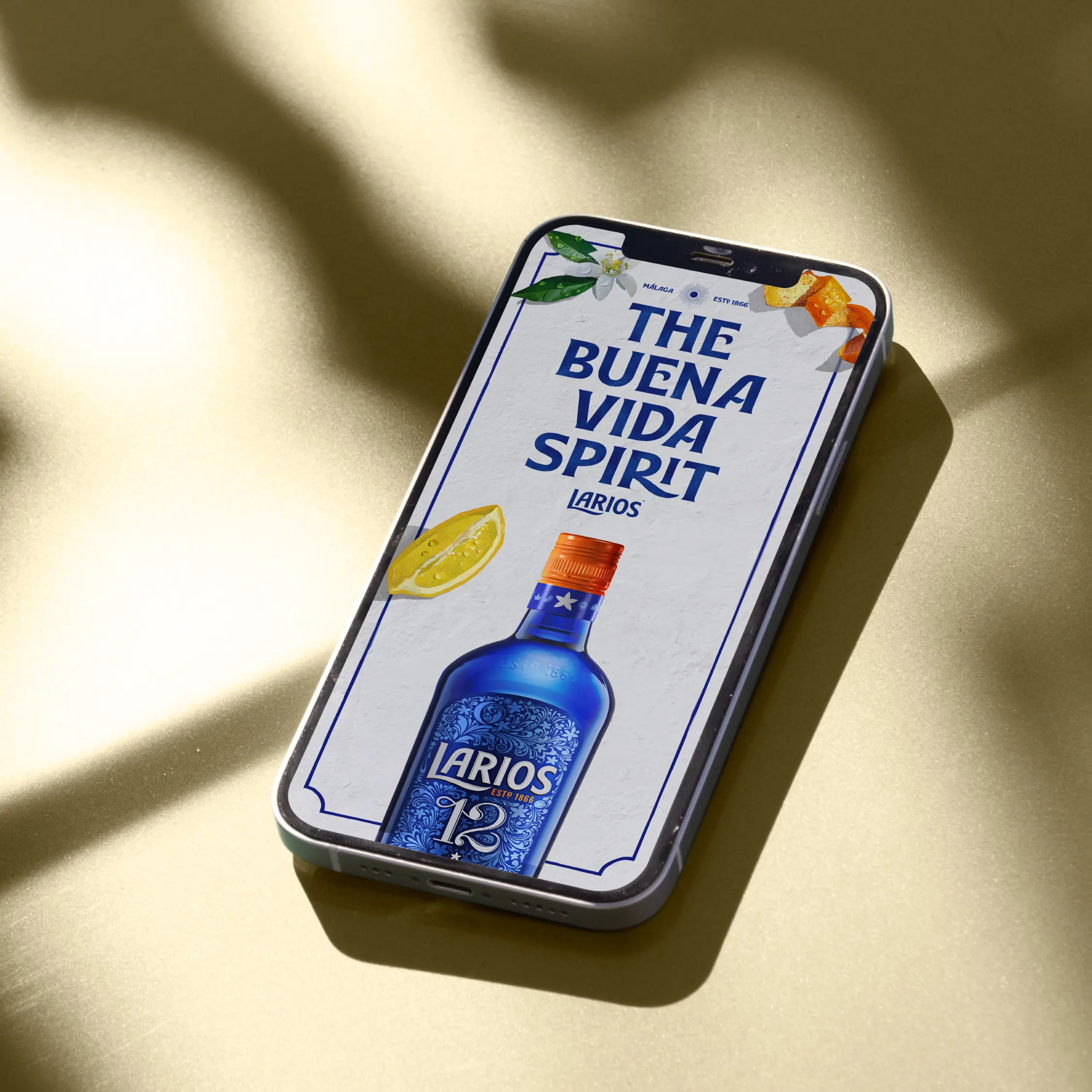
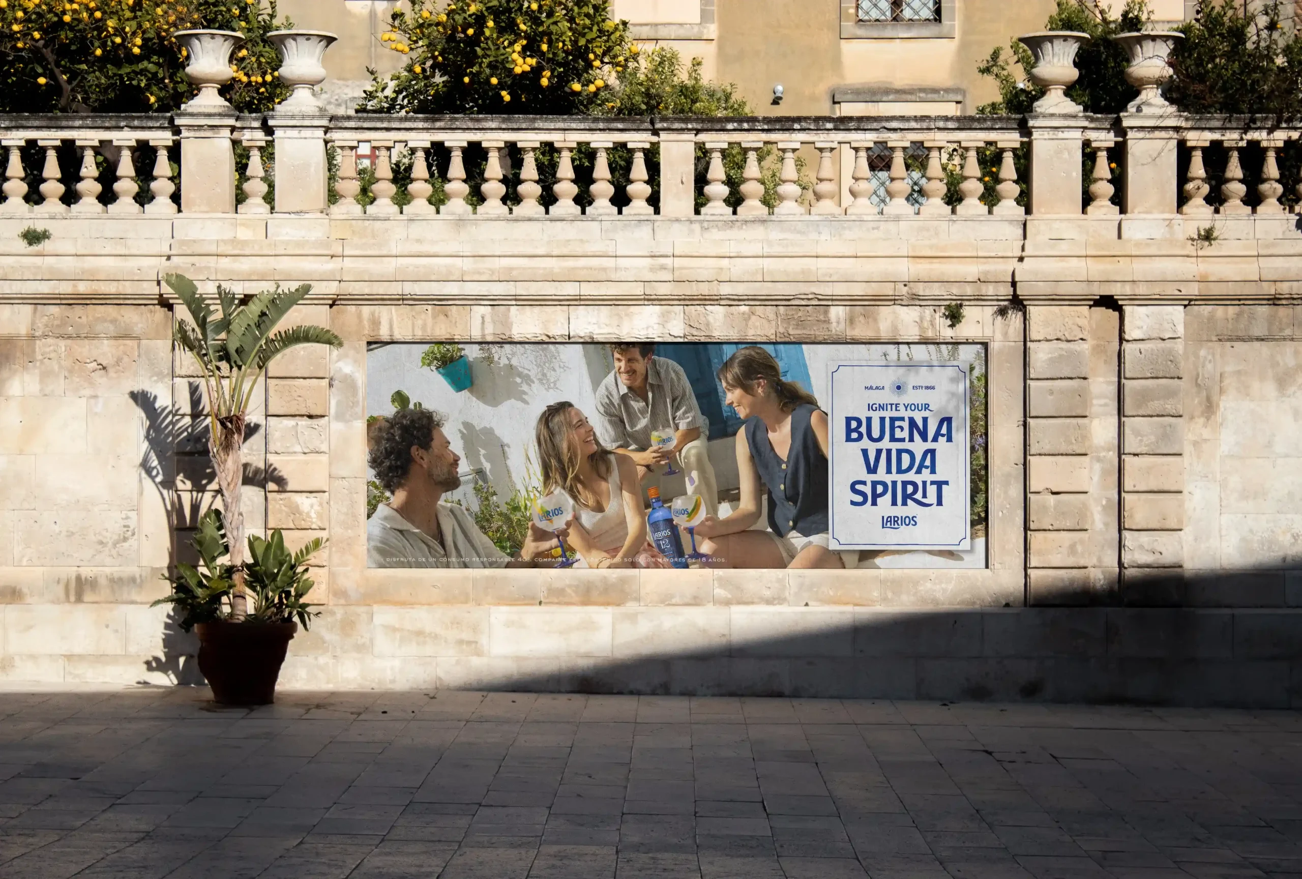
The “Buena Vida” spirit.
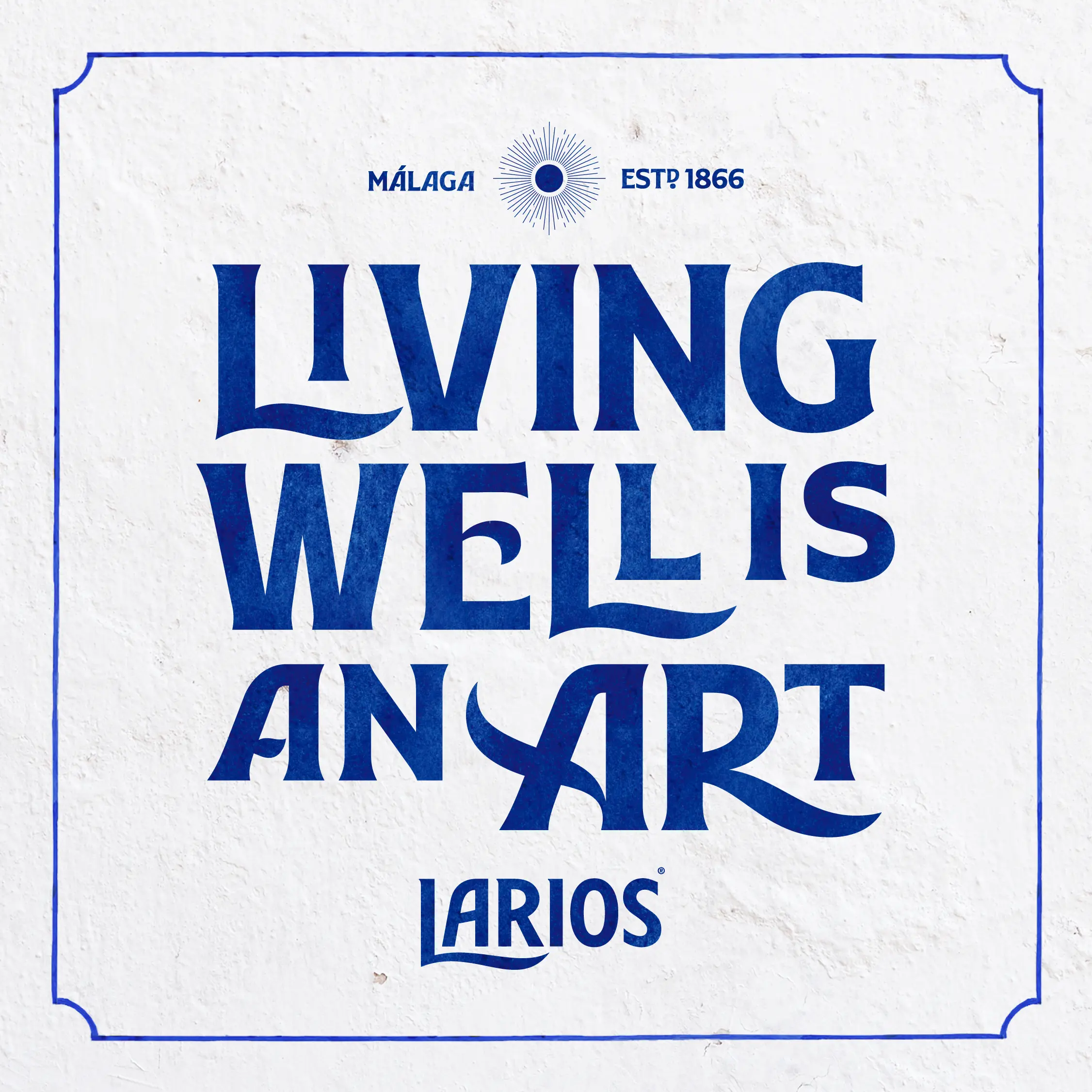
We defined and enriched the concept of "La Buena Vida," a relaxed and aspirational lifestyle philosophy that became the basis of Larios' new visual ecosystem design. Our goal was to convey a calm, fluid energy, inspired by the Málaga way of life.
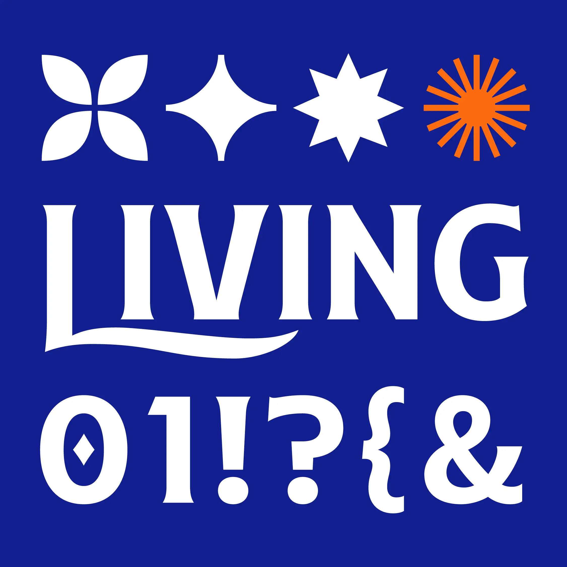
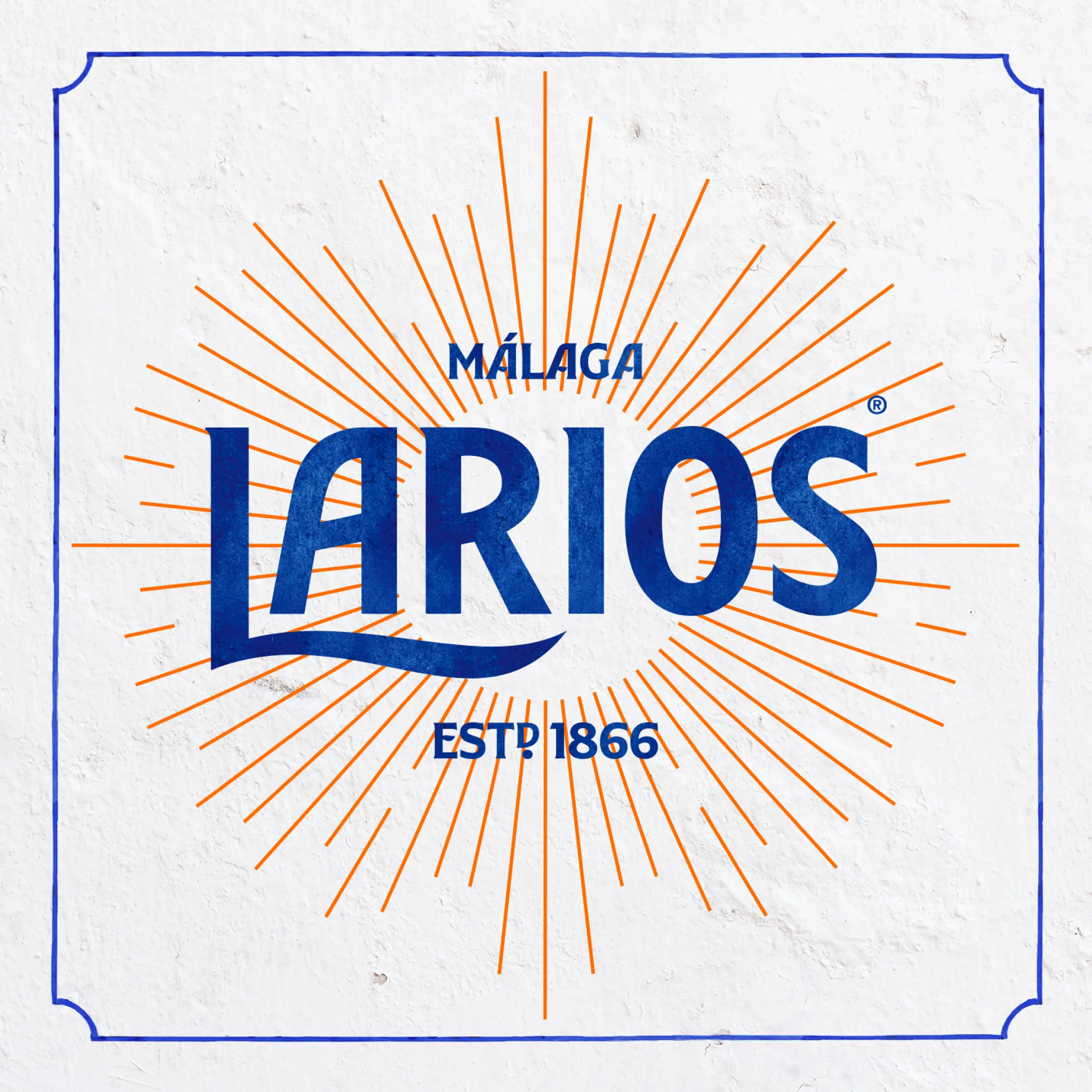
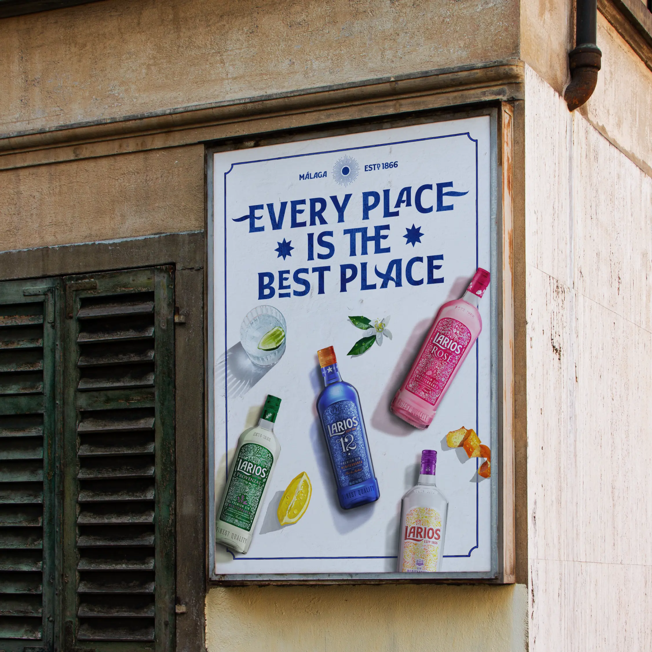
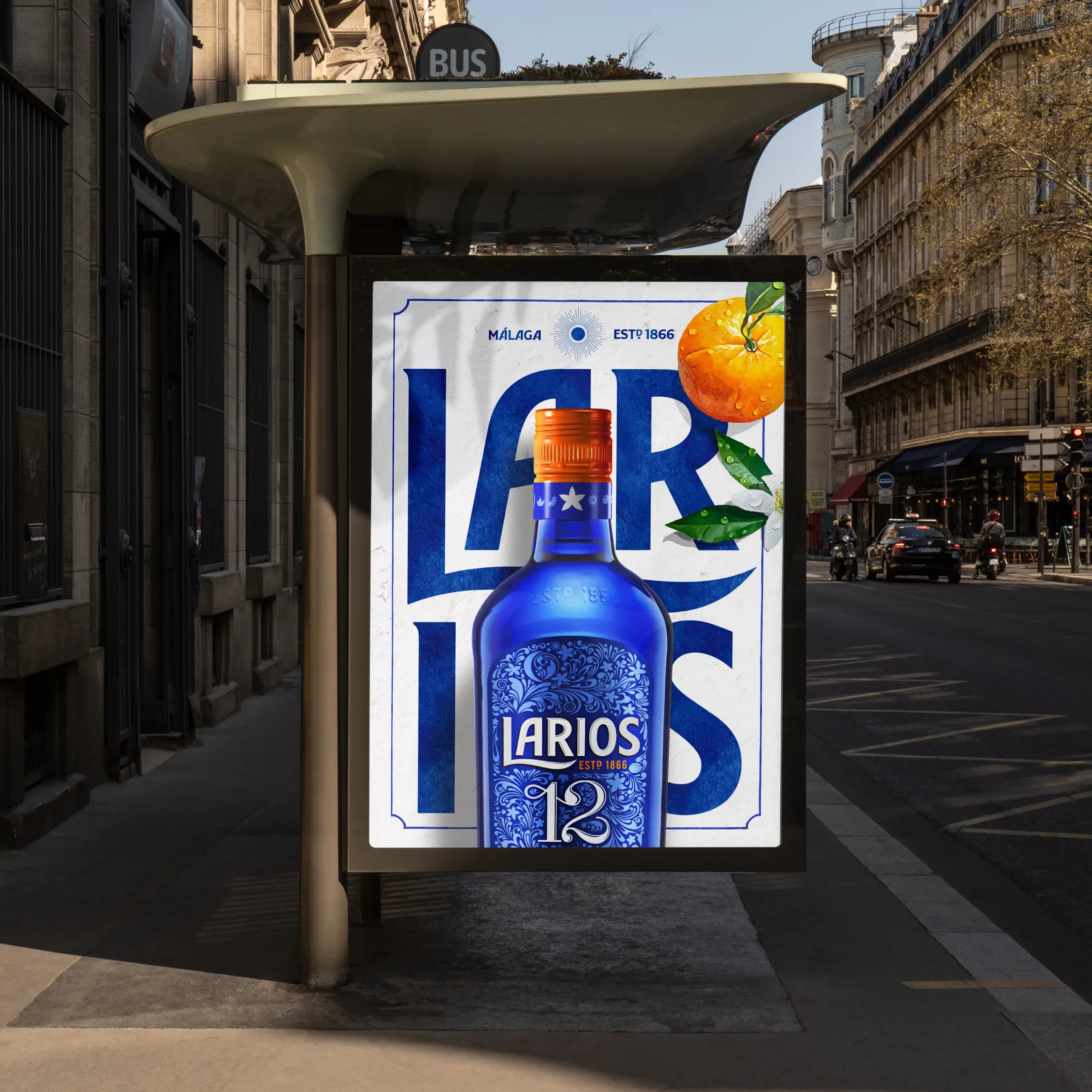
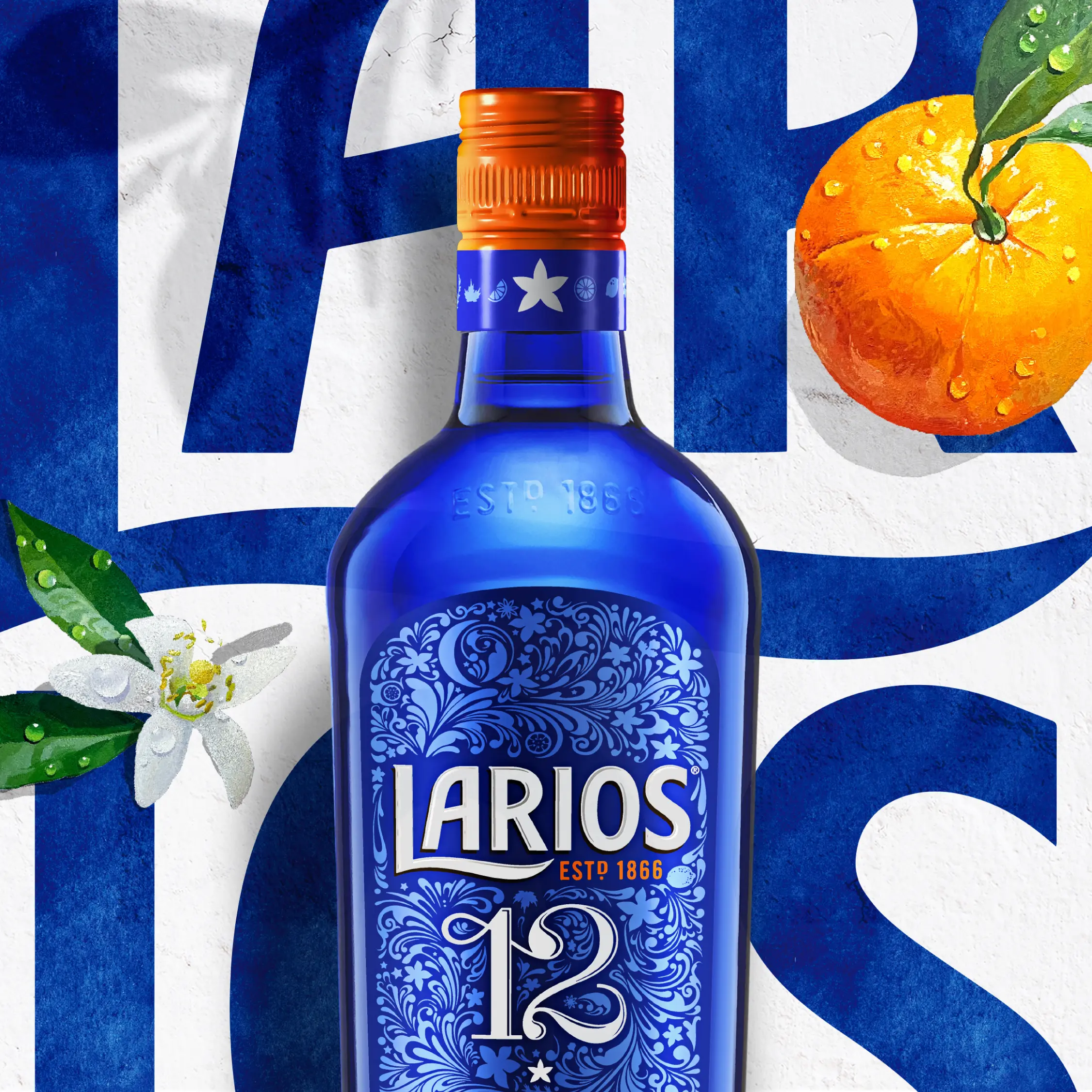
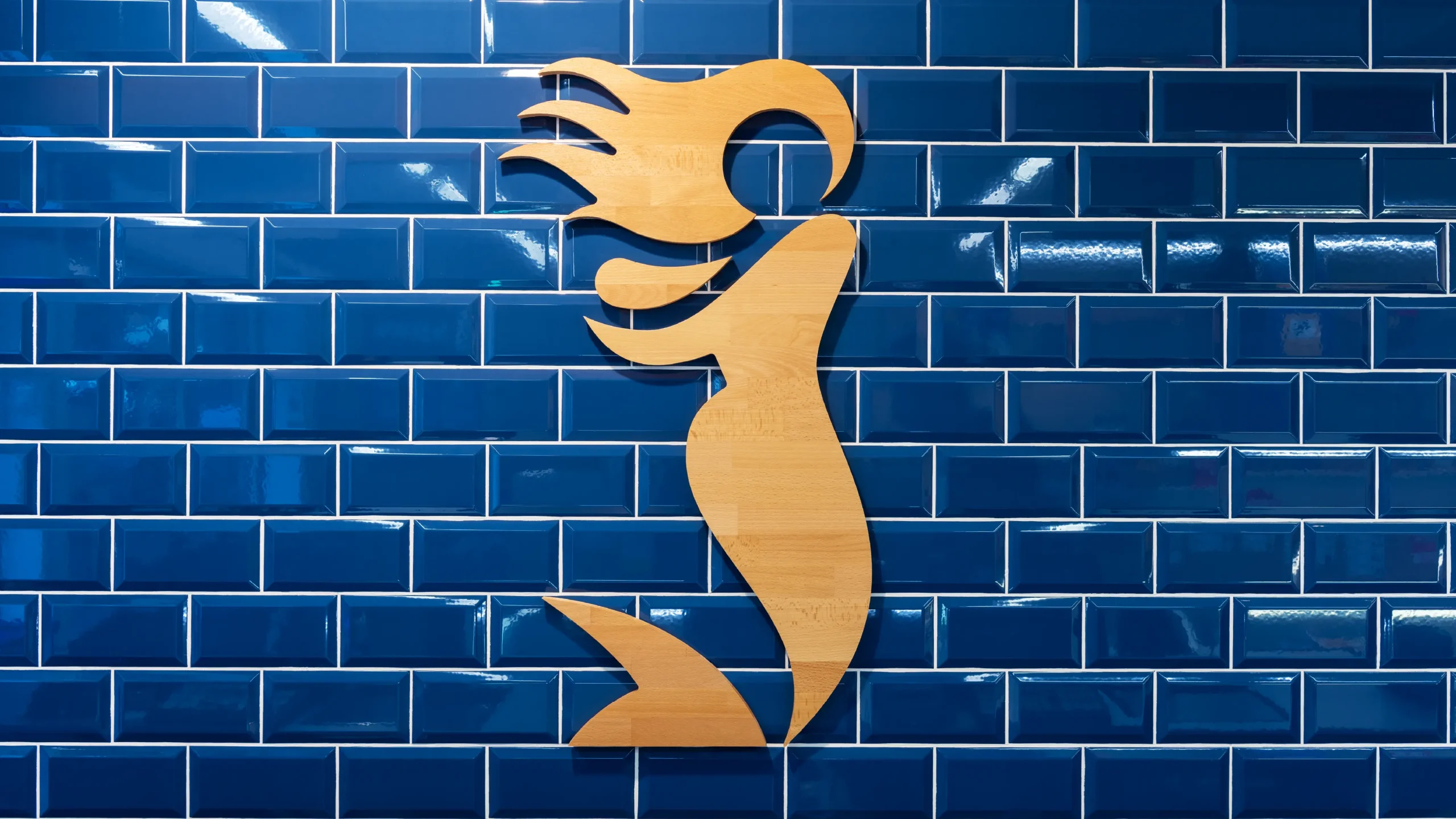
We simplified the Larios logo to a monochromatic version and another with a water-painted texture, evoking the tradition of Málaga tiles. The iconic "L" was transformed into a fluid symbol inspired by the Mediterranean's wavy forms. Meanwhile, the Larios Display typography, designed by Pedro Arilla Studio, reflects the vernacular style of Málaga street signs, with variations that add fluidity and sophistication.
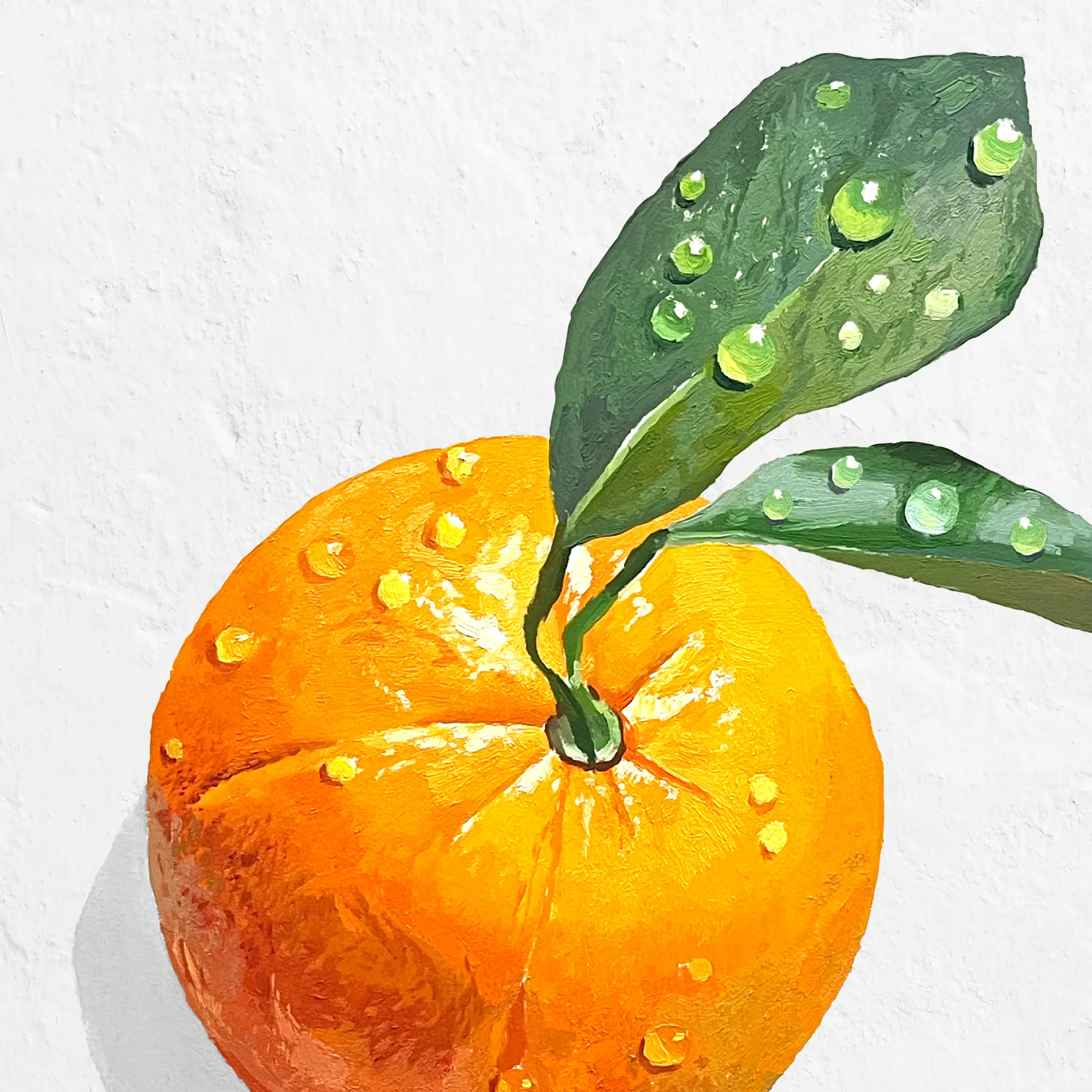
The color palette, stucco texture, and light play evoke the warmth of Málaga, transporting consumers to a relaxed state. Additionally, oil illustrations of botanicals by Antonio Barahona add a sensory dimension, highlighting the aromatic nuances of the gin.
Solution
The Buena Vida concept was also brought to life on Larios' website, where all elements of the new visual and brand universe come together, infusing every detail with Mediterranean spirit.

La Sirena
Redefining the La Sirena shopping experience
Scroll down