Ruavieja
Redesigning the taste of tradition
Scroll down
With the objective of revitalize the brand Ruavieja, we did a visual restyling process that would maintain a sophisticated balance in pack design, focusing on premiumness and sustainability.
Challenge
Ruavieja is a Spanish liqueur brand with more than 130 years of history that was born in Santiago de Compostela, Galicia. A company that has managed to stay alive in the minds and mouths of millions of Spaniards since 1889.
Even so, Ruavieja pinpointed the need to premiumize and update its brand to attract a younger audience after a spectacular rise in awareness triggered by its Christmas campaign in 2018. Morillas had to bridge the gap between its communication strategy, which was very emotional, close and warm, and its brand image, which was considered traditional, old and outdated. The new graphic identity had to be modern, attractive and sustainable in order to bring it closer to an audience that until then perceived Ruavieja as a liquor brand for a very mature audience.
Approach
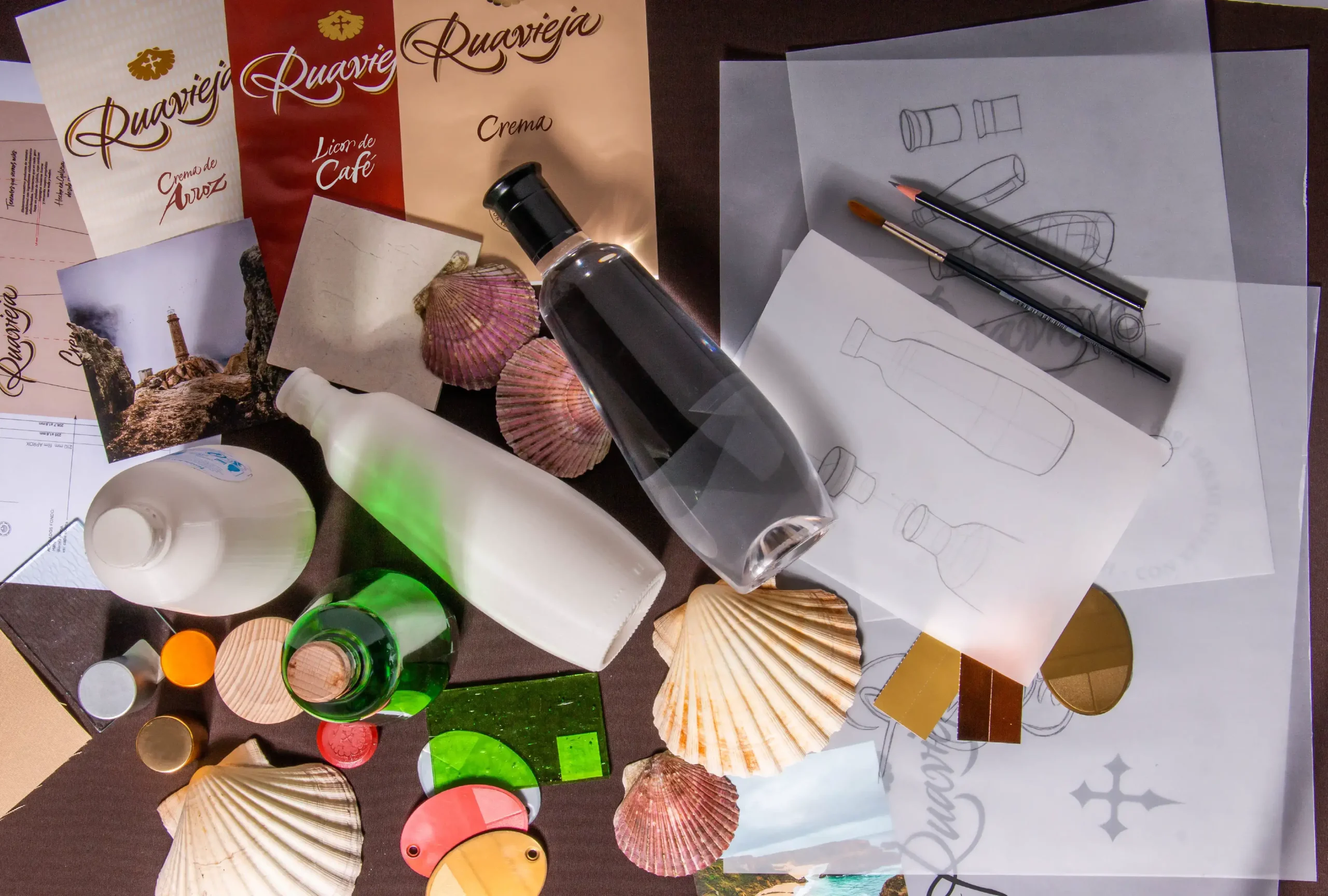
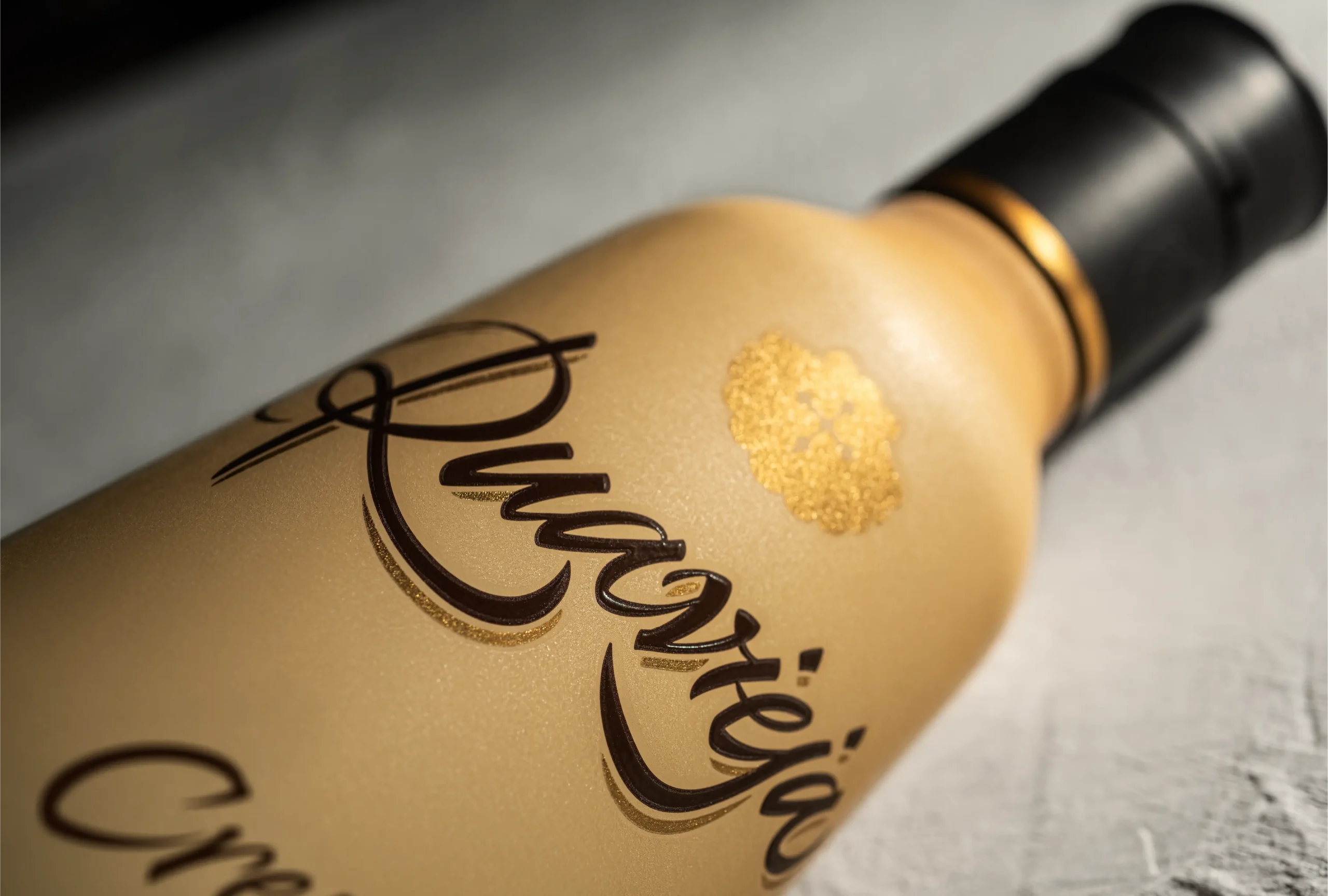
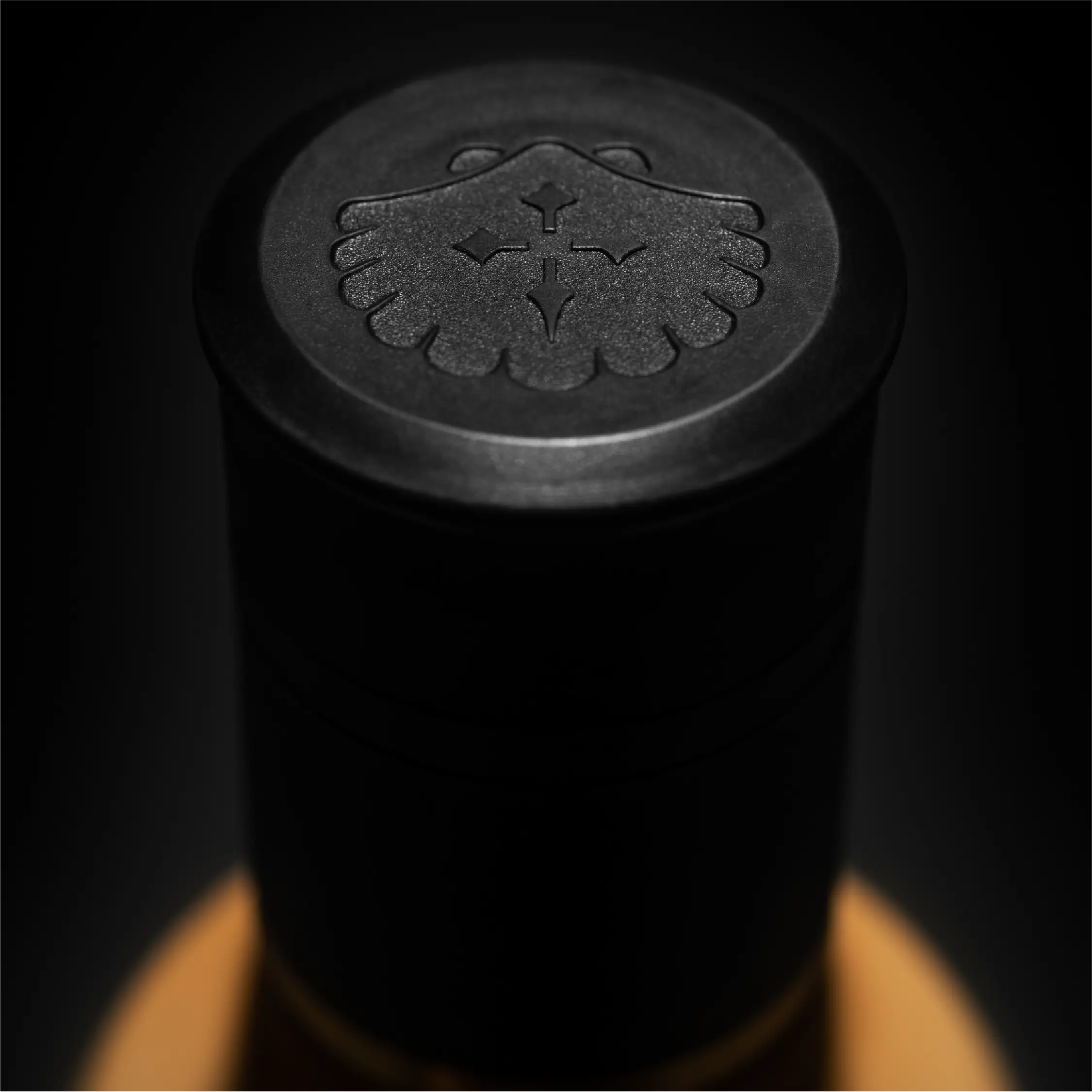
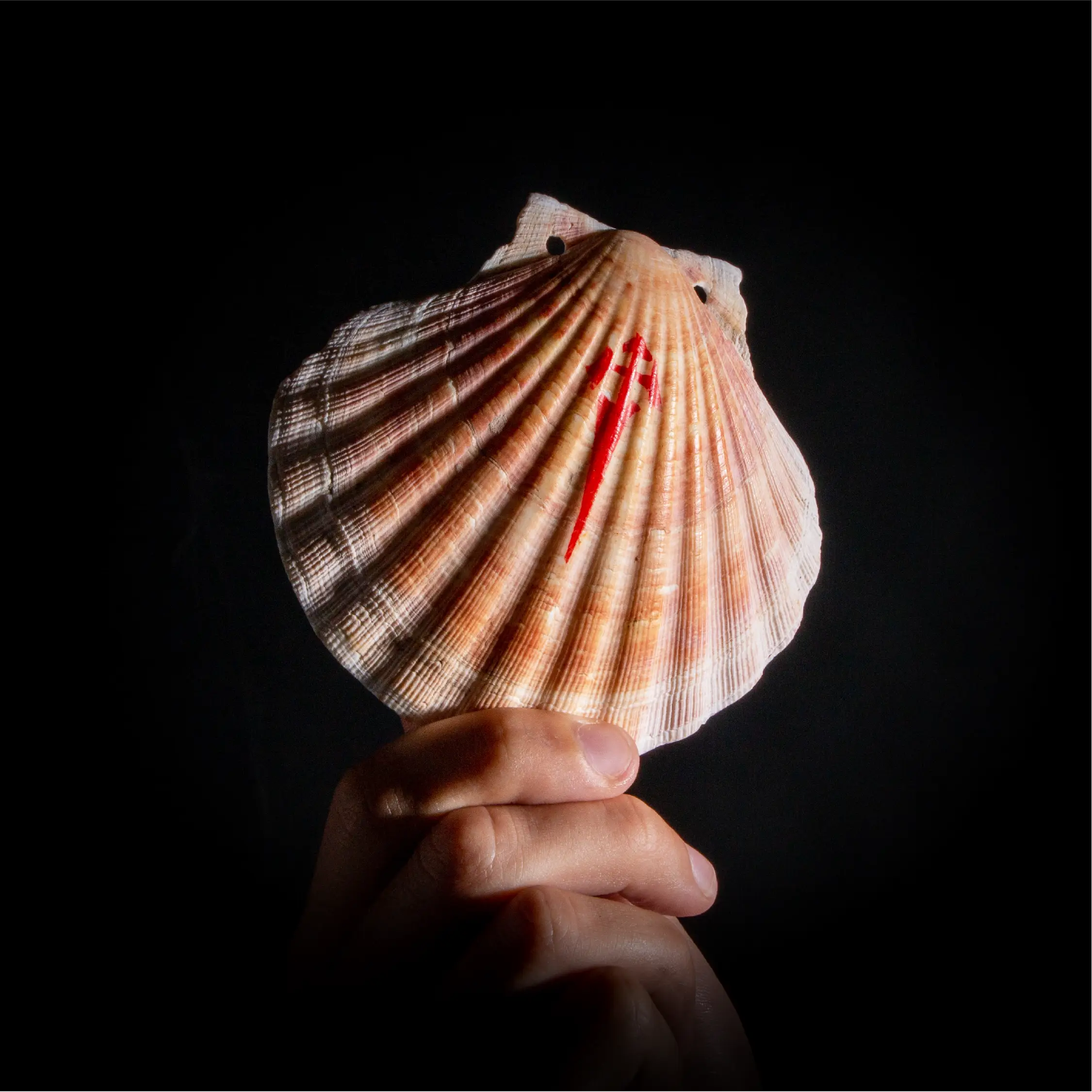
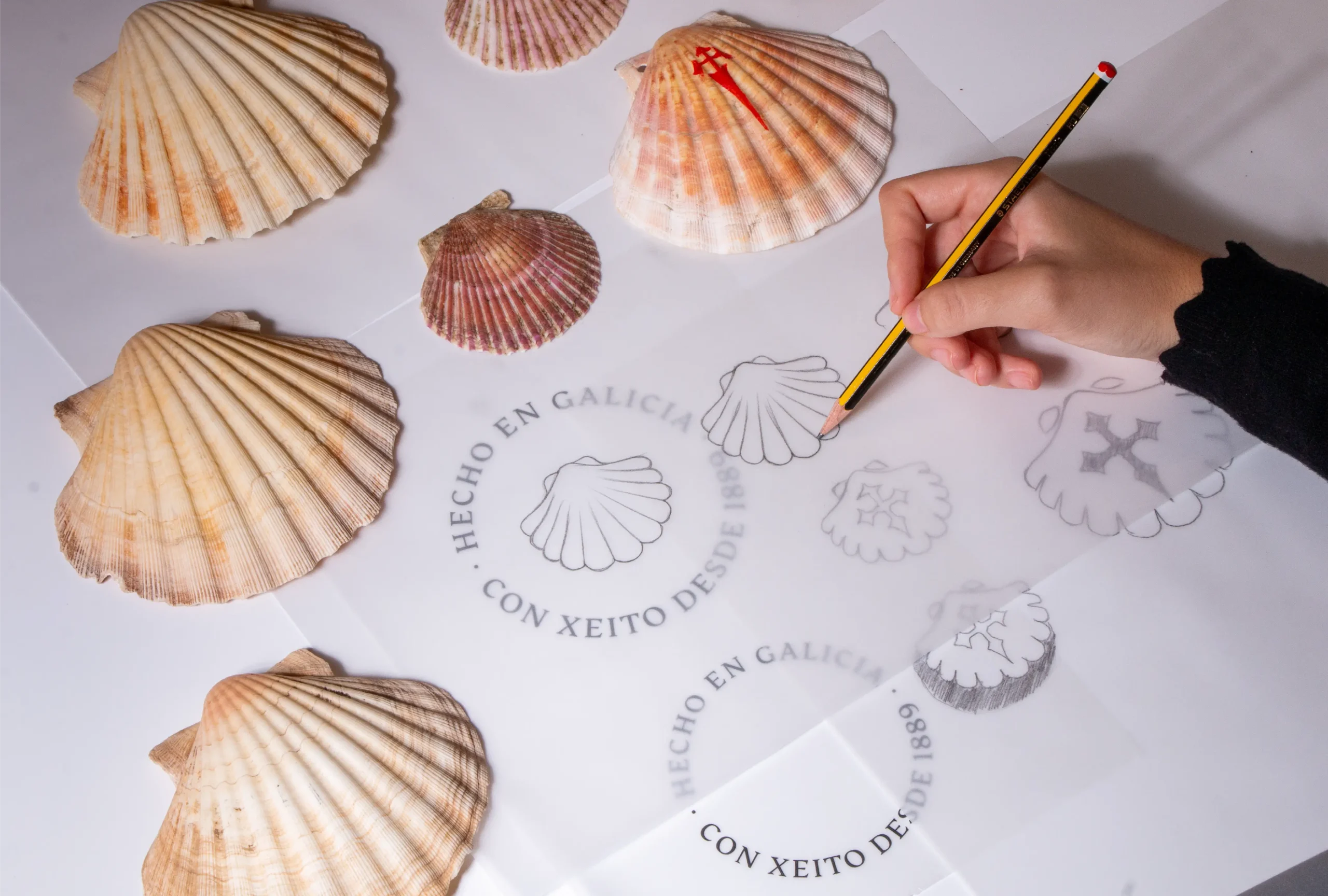
We updated the brand in such a way that it maintained continuity, making its evolution logical and its essence tangible. We worked in depth, rethinking elements ranging from its typographic logo to the iconic design of its glass bottles. Focusing on the power of a timeless symbol, we redesigned the classic emblem of the coat of arms for a symbol that would represent its Galician origins, tradition and quality in a simple and attractive way: the shell.
Solution
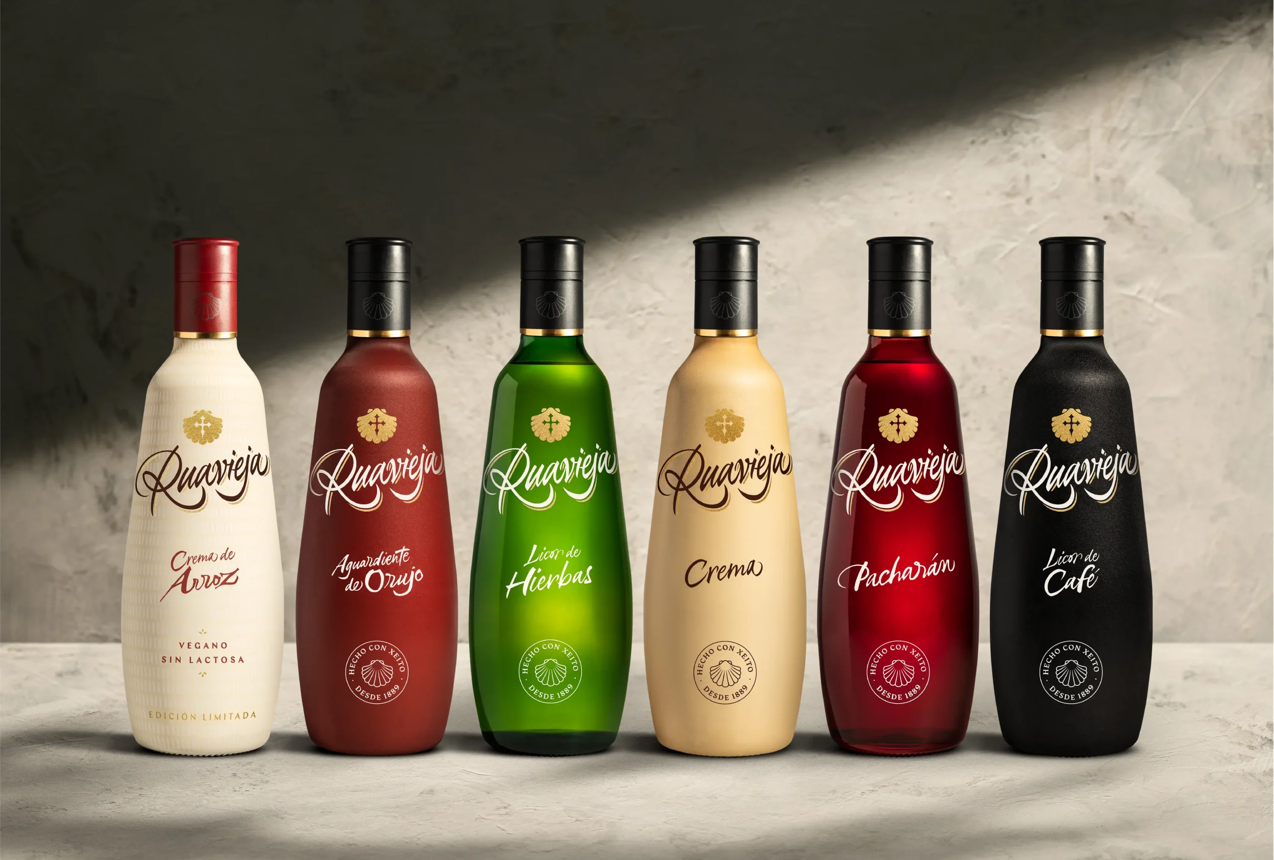
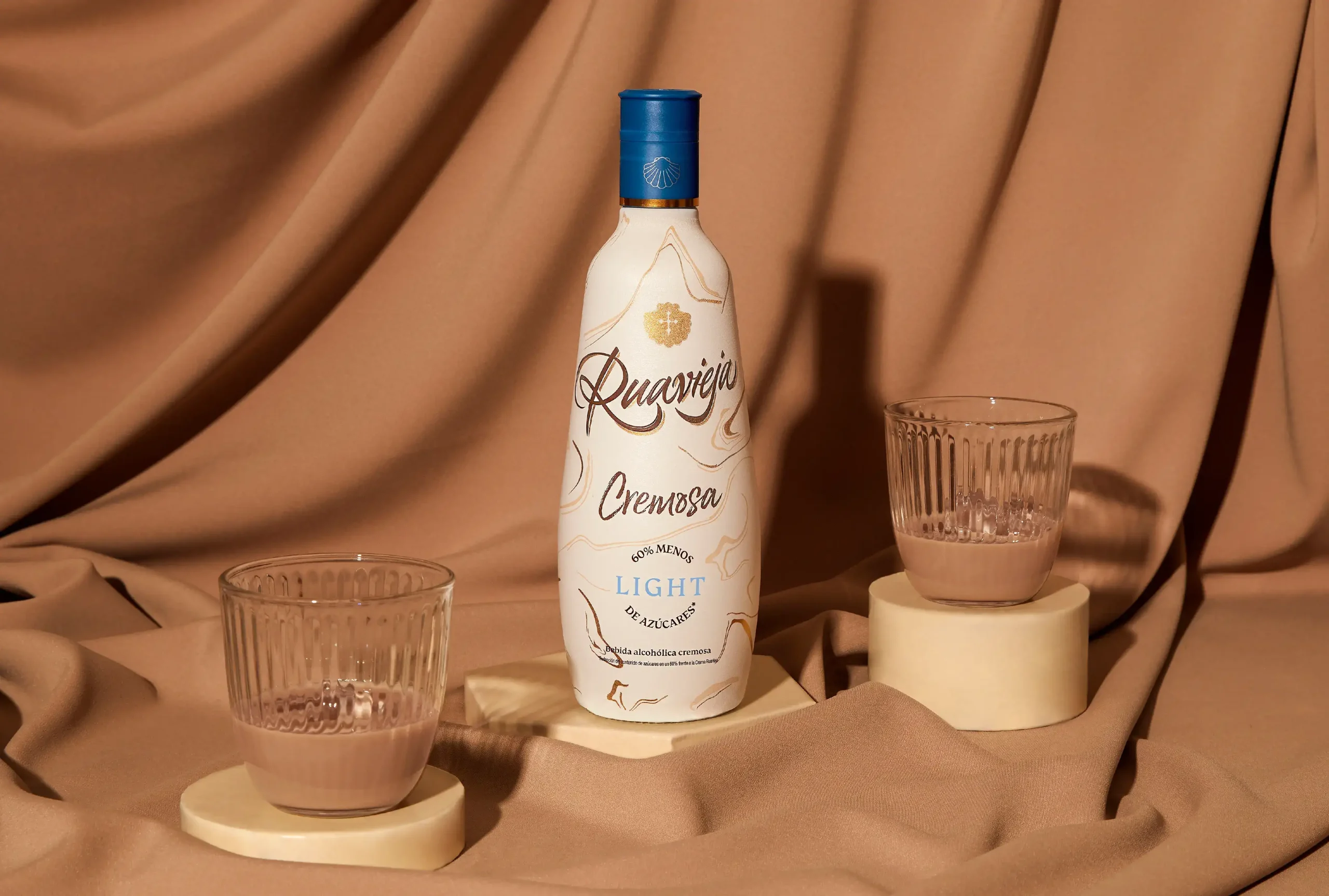
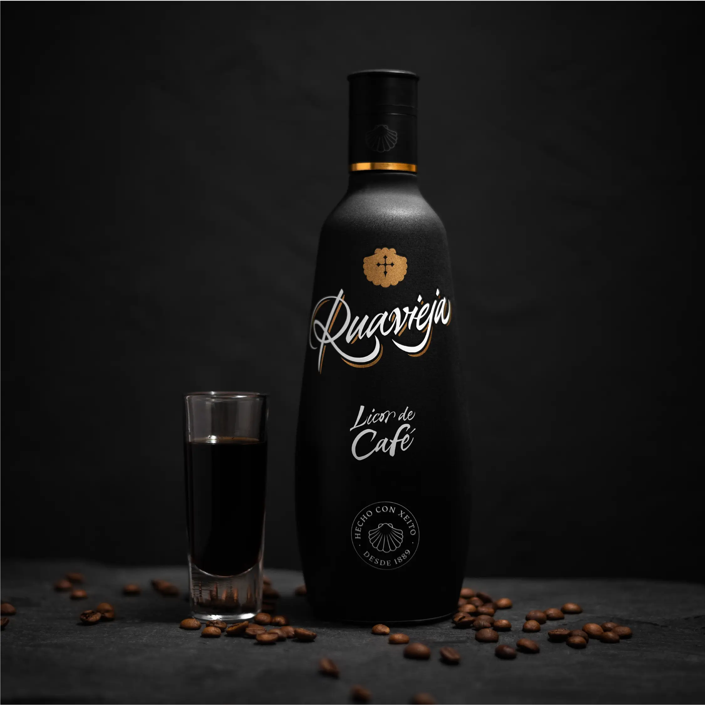
We also styled the iconic Ruavieja bottle while maintaining the balance between continuity and disruption to transform it into a revamped icon that would stand out on the shelf. Moreover, we used award-winning sleeves that allowed us not only to meet sustainability criteria but also to maintain the premiumness we were looking for with the restyling of the brand. They featured a ceramic texture, sophisticated, smooth and with grip.
To crown the brand renewal carried out in this ambitious project, we translated all these changes into a corporate identity manual that covered all aspects of the revamped brand: guidelines and criteria for the use of all brand assets, from colors and contrasts, to the typographic applications.
Tinted glass is not recyclable, so we looked for quality green alternatives.
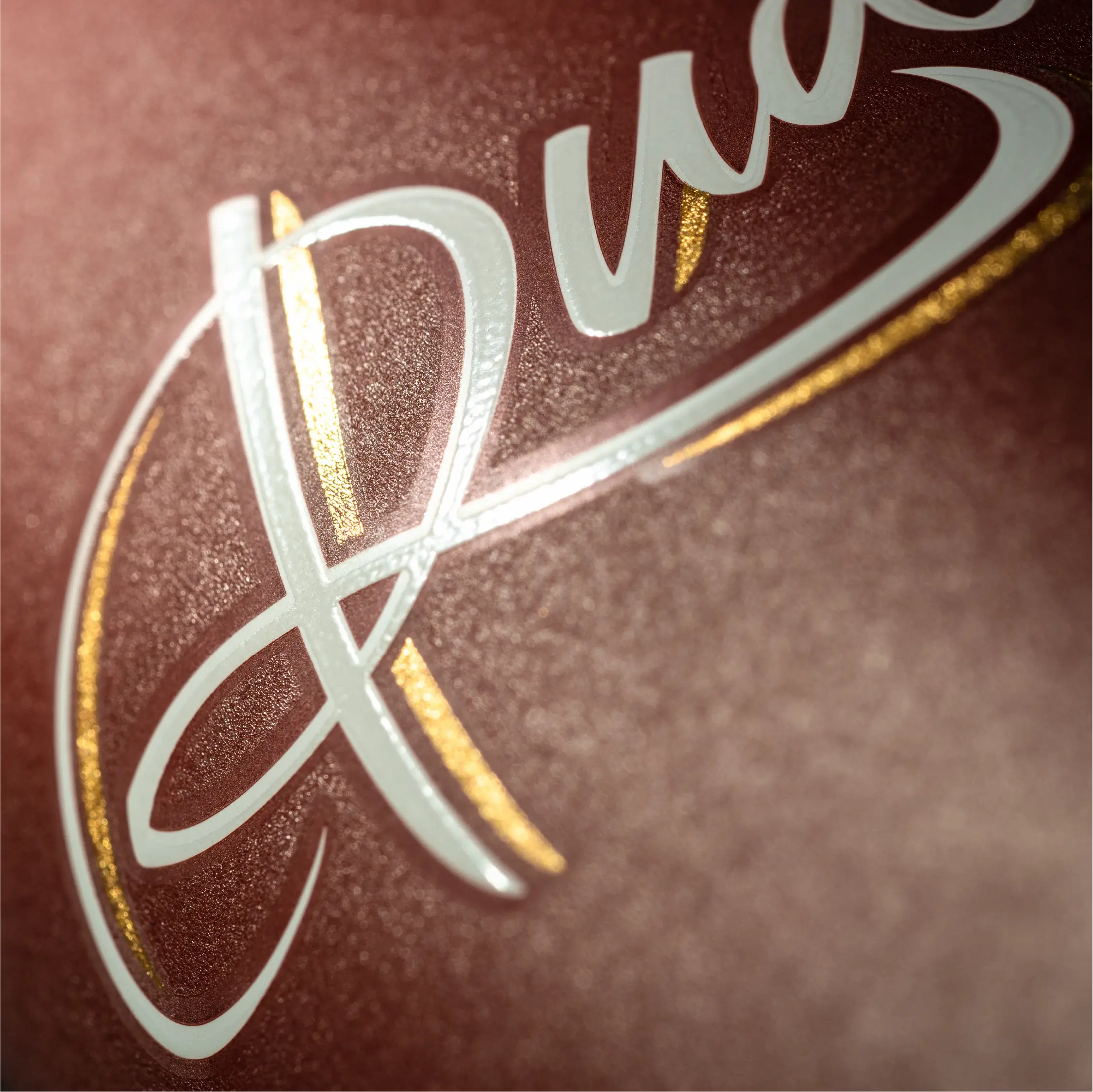
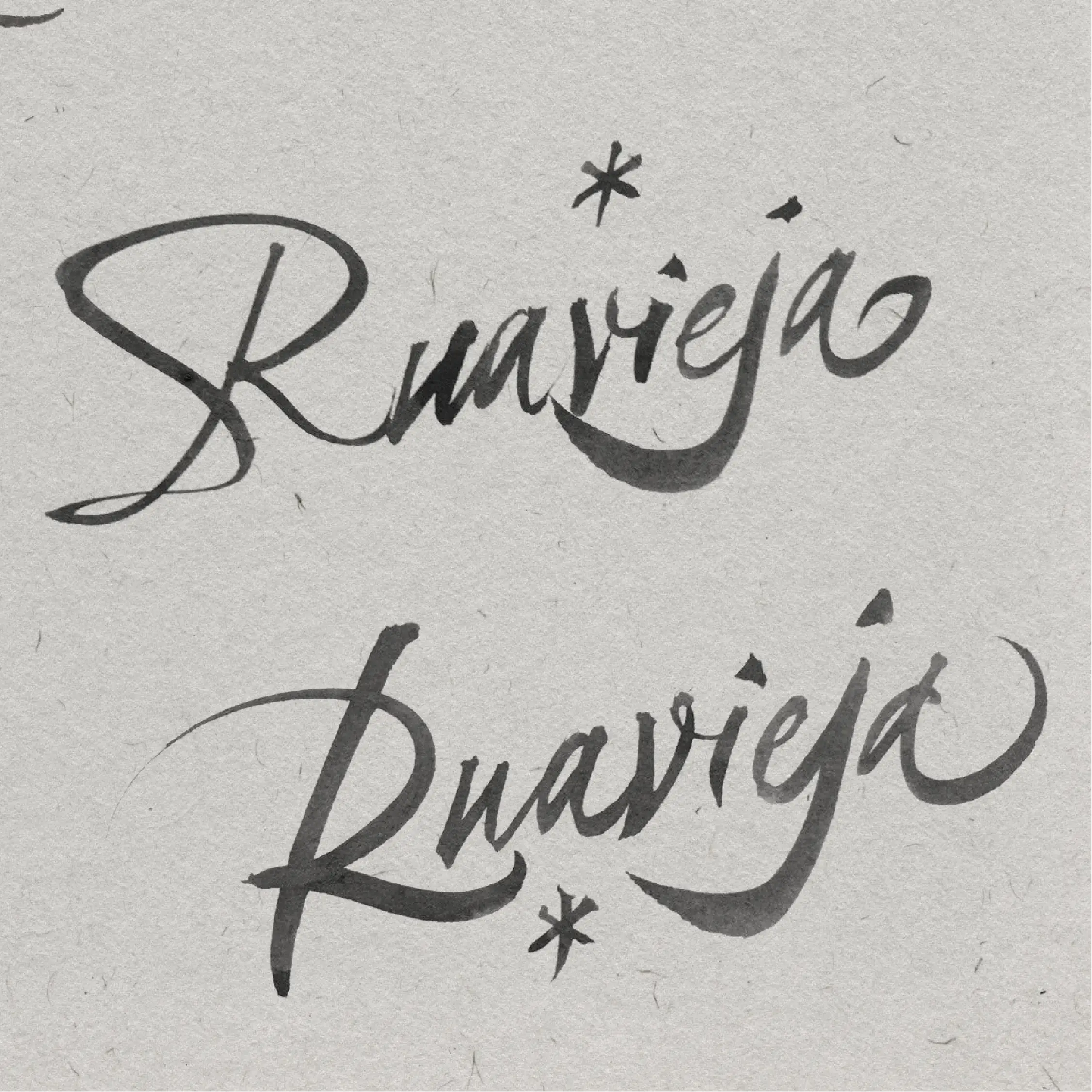
Redesigning the Ruavieja logo by its former creator, Oriol Miró.
We included innovative sleeves with recyclable packaging by Ovelar.
Ruavieja green glass bottle without sleeve
Sustainability criteria influenced the design and production process of the bottles.
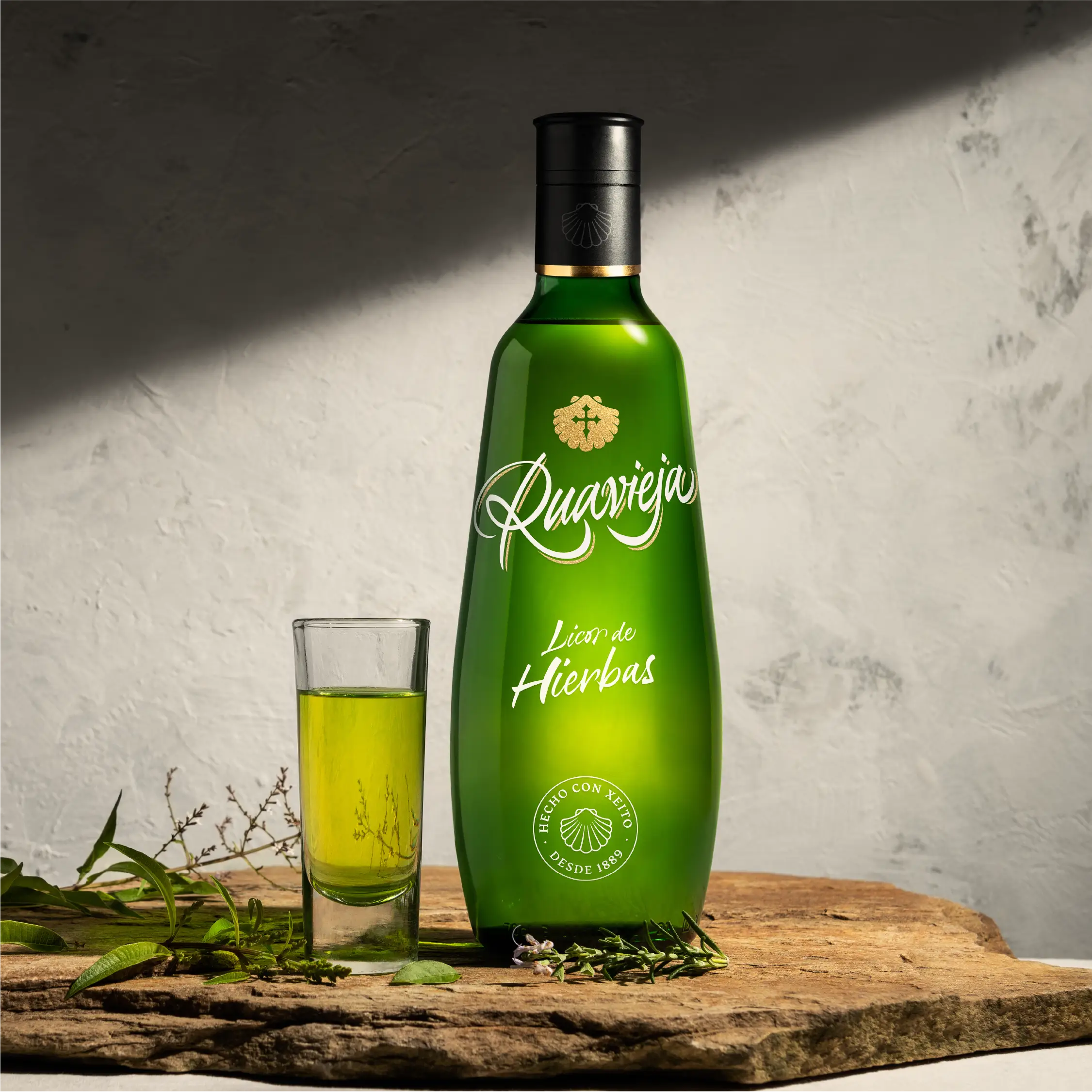
‘Made with Xeito since 1889.’
Symbolizes the tradition, craftsmanship and know-how of the Galician essence of its liqueurs.

Sofia
A hotel with polyhedric soul
Scroll down