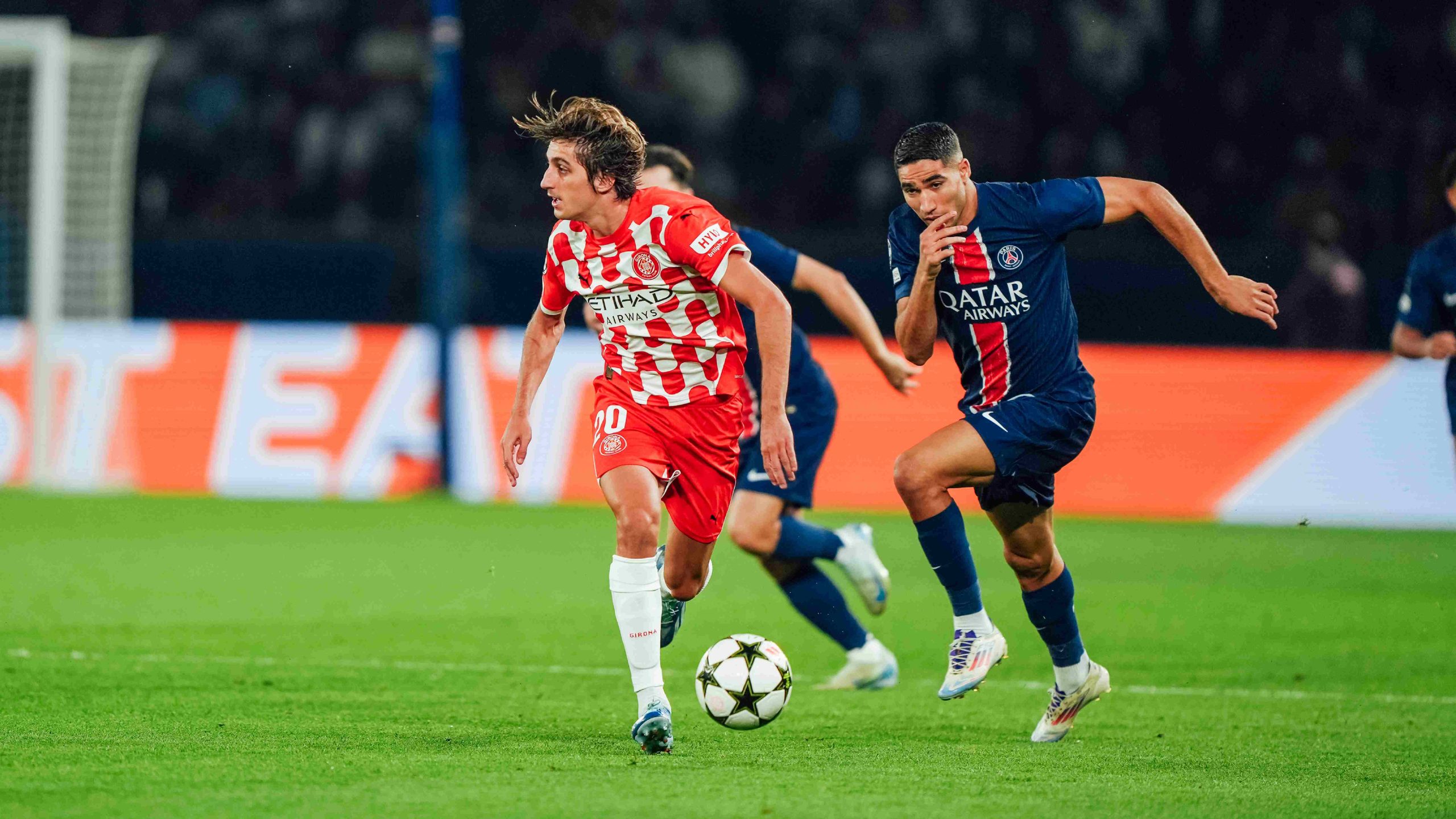
Girona FC
In a league of its own
Scroll down
Girona FC is a club on the rise. We've transformed its visual identity to deliver graphic versatility and support the brand across countless touchpoints, all anchored in coherence and cohesion.
Objective
Girona FC may not have the start-studded history of Europe's most famous football clubs, but it has something equally powerful: the epic quality of the underdog, the revelation, the grassroots entity that achieves extraordinary things with modest means. This philosophy has delivered many sporting triumphs, but at the brand level, it spurred a new challenge: the need to communicate better, across more touchpoints than ever before. This created a paradox: being more coherent yet more adaptable than ever.
Approach
Rather than conducting a traditional creative exploration, we took a consultancy-driven approach across multiple project fronts. The goal was never to question what had been working and defining the club for years, but to prepare all those visual assets for diversification in a new era of communication.
We pursued scalable solutions that constantly referenced the club's identity and history, prioritizing order, adaptability, and systematization.
Within this project framework, and with the goal of working on brand identity across all touchpoints,we also developed the entity's first verbal branding: emphasizing its humble side, seeking the David versus Goliath epic, and connecting with the territory and its roots.
Solution
The most striking results of this work are the visual system and the consolidated version of the Montilivi font, the club's corporate typeface co-created through a meticulous process with Bauer Type. Complex use cases and high visibility requirements demanded a bespoke solution, something which has become the new standard among elite teams.
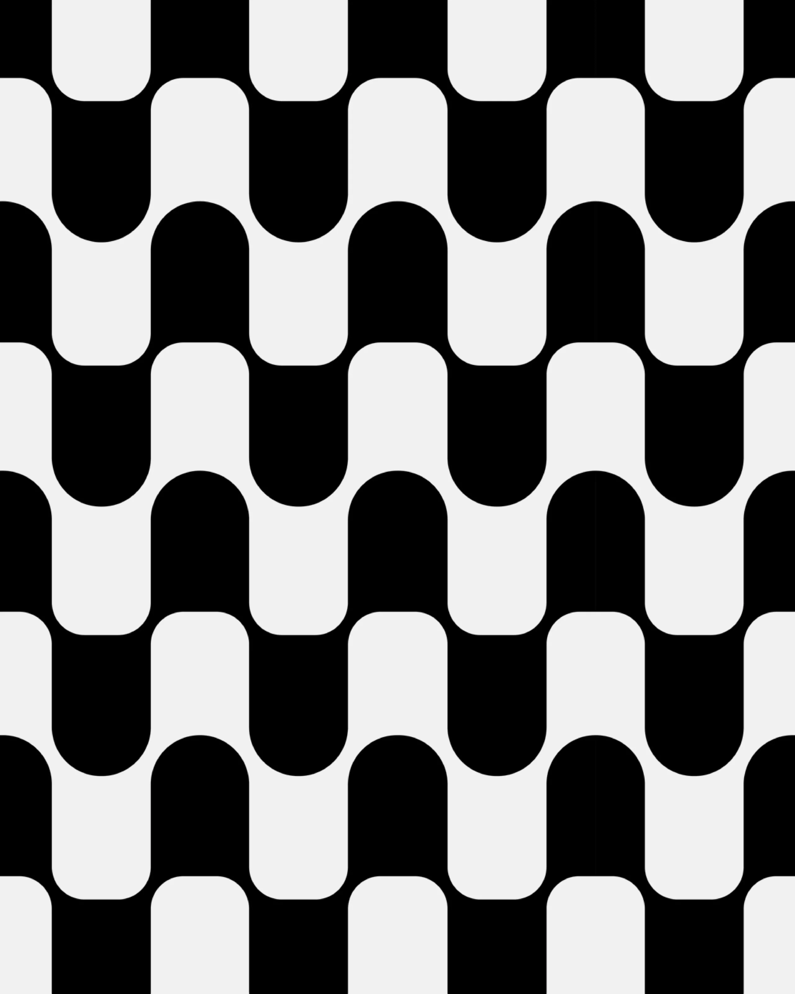
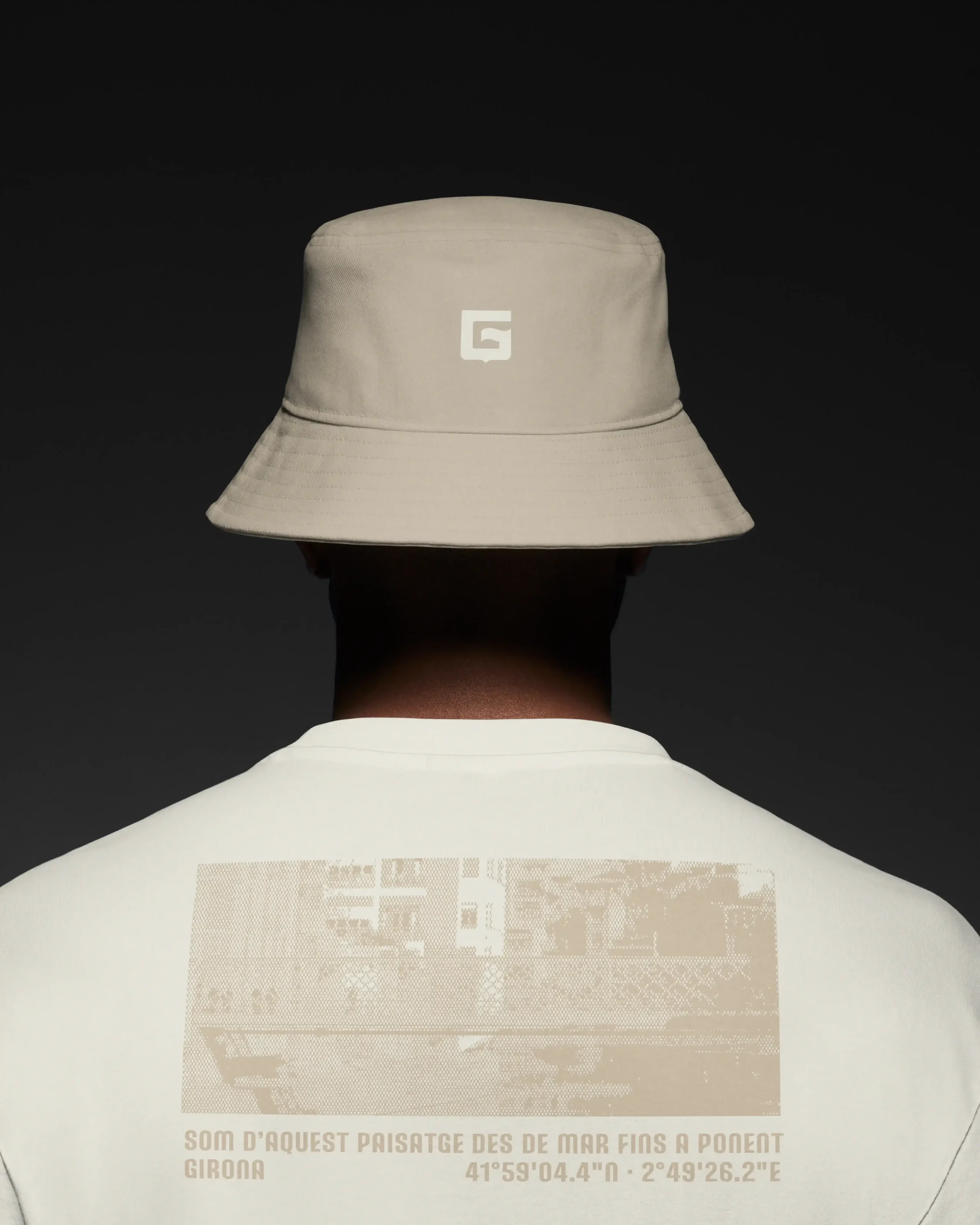
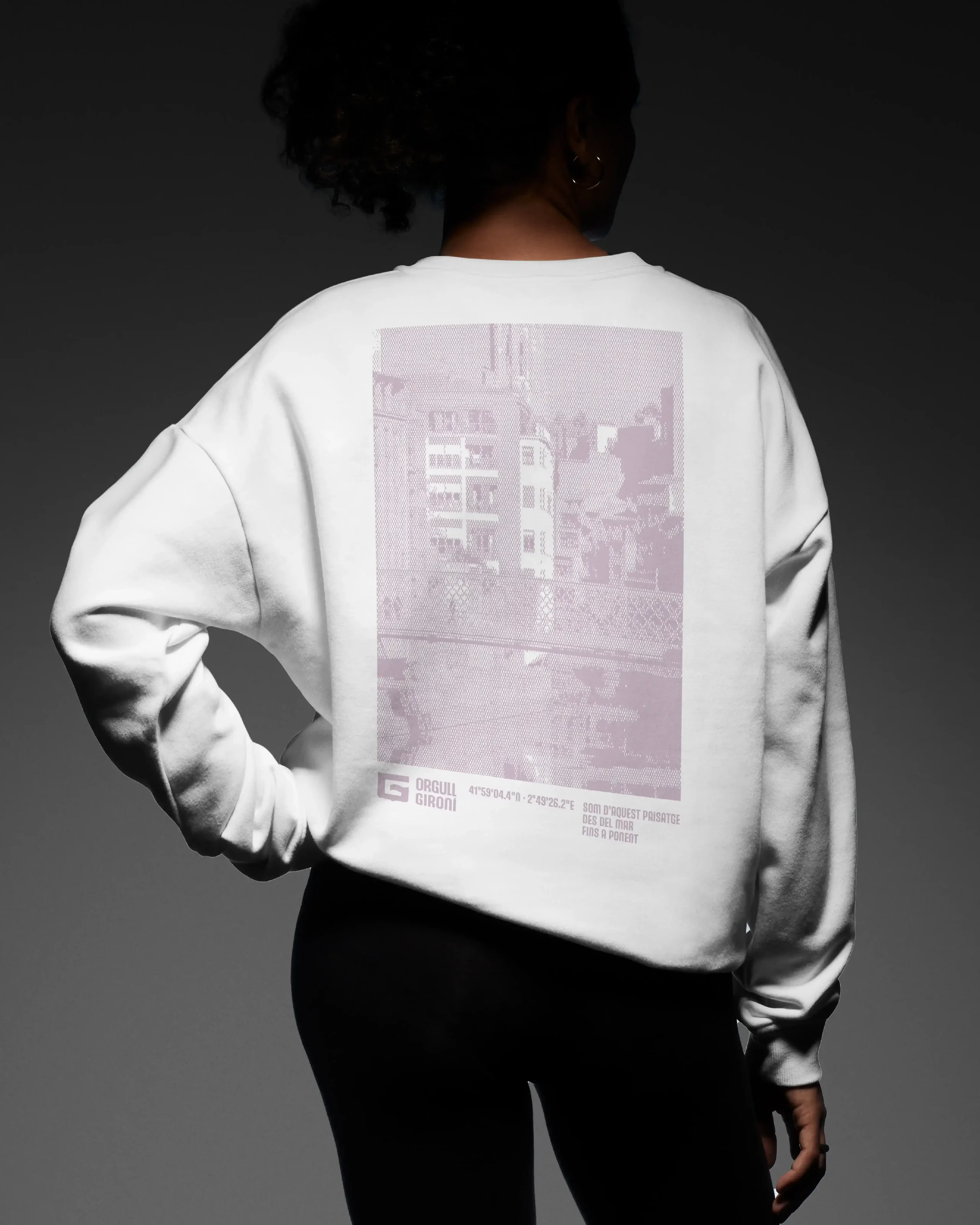
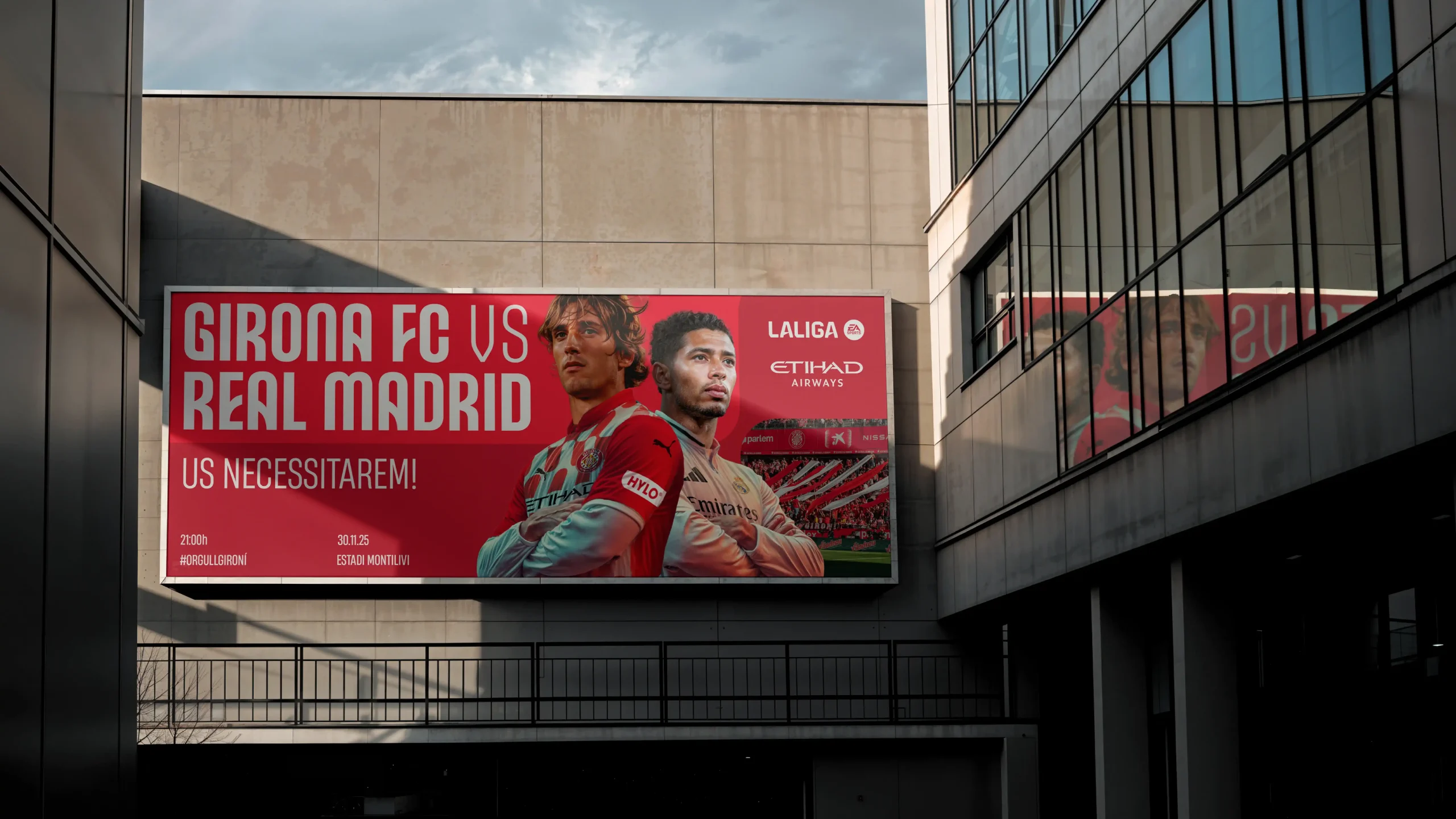
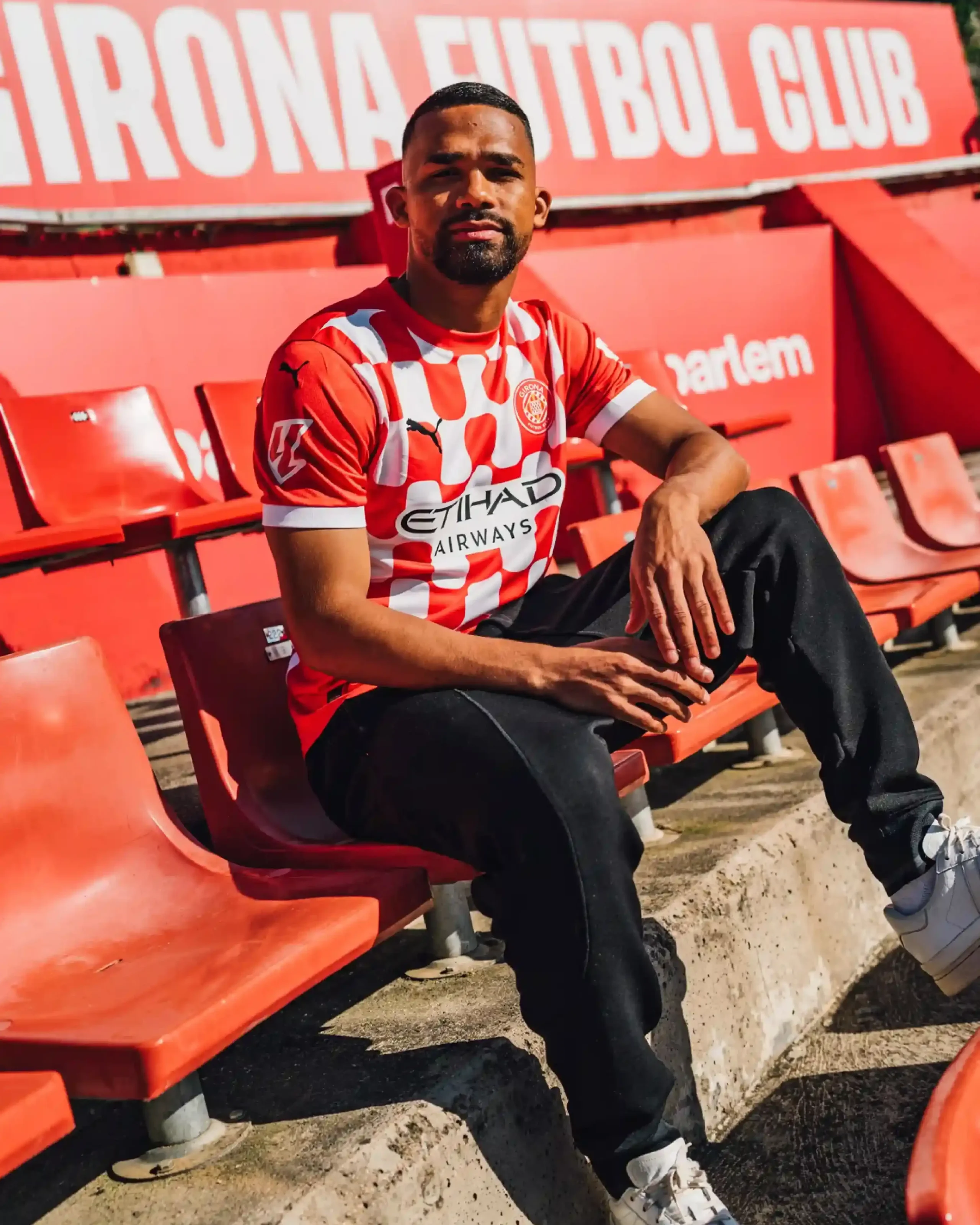
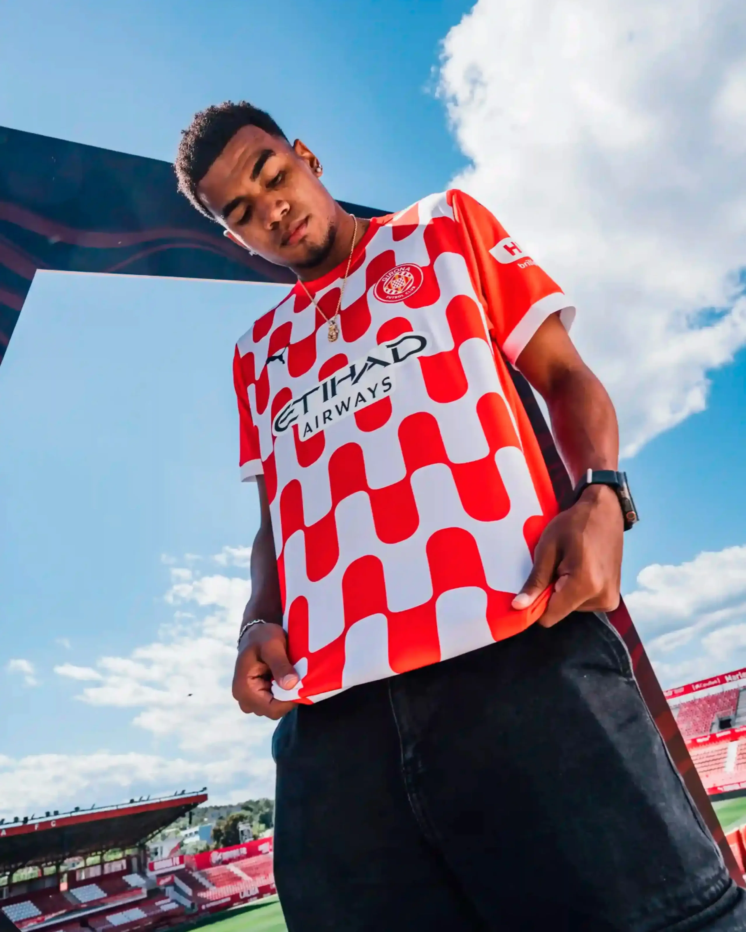
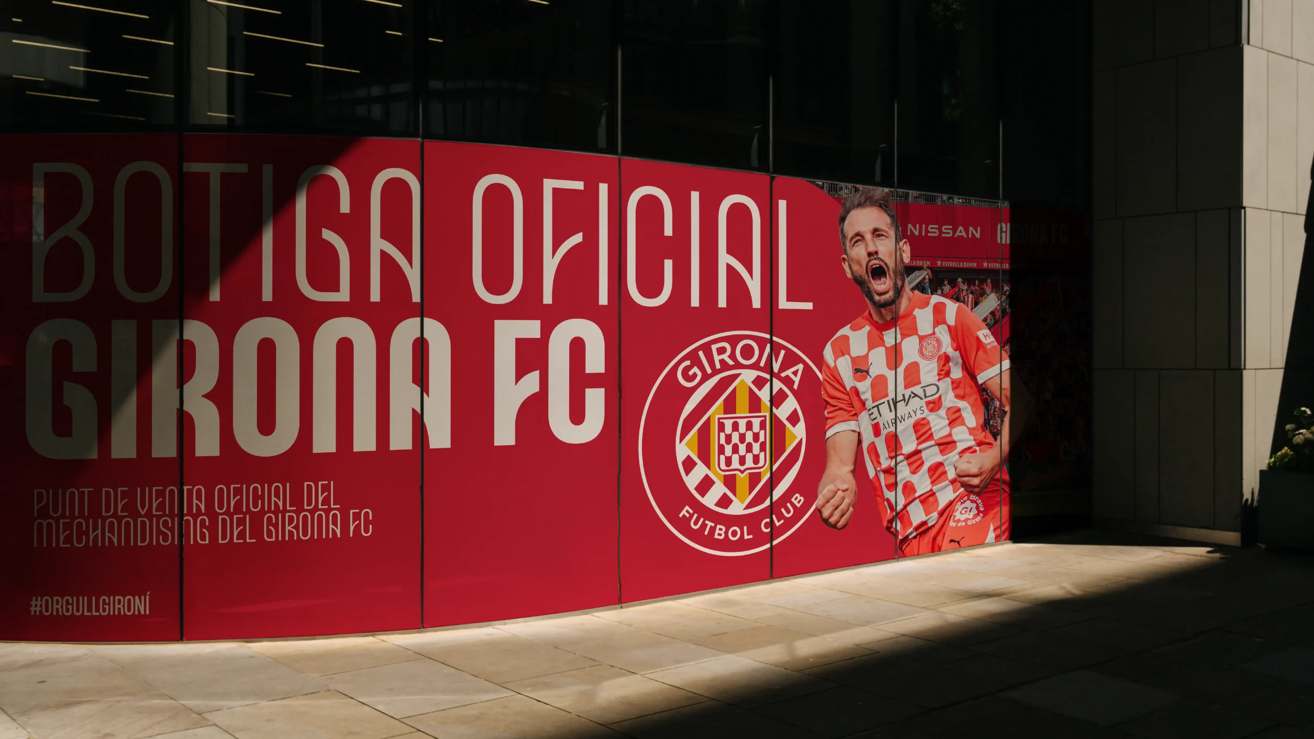
The visual system was based on the vair heraldic wave pattern from the Girona coat of arms, also present in the club's crest and already used as a motif on the first kit in the 2024/25 season.
This motif could function at both macro and micro levels, practically as a graphic texture, which not only brings fluidity and diversity to the vast quantity of content the club generates, but also keeps everything connected through a rich, signature visual motif. The leitmotif of the heraldic vair was subtly present in everything from signage to merchandising, and through to motion design. This animated language was specifically based on the movement of water: a tribute to the waves, as well as featuring in the sporting and digital codes with compositional elements in waves or stripes.
Finally, to manage this growing complexity involving multiple teams and partners, we provided a technological solution through Standards, which takes the conventional static brand manual to the next level. By maximizing the technical and visual possibilities of this platform, we created an interactive brand center updated to the finest detail, from which the club can resolve all its needs from a single point, gaining autonomy to compete graphically without sacrificing the coherence and precision of elite-level work.

A future facing font with a great history
The Montilivi font blends classical traits that honor Girona's heraldic motifs with contemporary touches. This combination creates a Display typeface that shines in large headlines across its five weights.
A colour palette inspired by the Girona region
Chromatically, while Girona remains red and white, the palette expands for complementary uses and is refined to connect with the territory, from the blue of the Mediterranean on the Costa Brava to the green of La Garrotxa in the Pyrenees. Even through details that stay off the pitch, the goal of the process was to consolidate a brand that transcends the city and province to become a team with followers across the country and the globe