1
2
3
4
5
6
7
8
9
10
11
12
00
Scroll down
en
Now Reading:
Cobus: An identity designed to take airport mobility further

Share:

Now Reading:
Cobus: An identity designed to take airport mobility further

Share:

Cobus: An identity designed to take airport mobility further
Branding
Design

Share:

Scroll down

COBUS:  An identity designed to take airport mobility further


For decades, Cobus has been moving people between terminals and aircraft in airports around the world. But when a company evolves, its brand also needs to show where it is heading.


Cobus was entering a new stage with a clear ambition: to evolve from a brand primarily recognised for its vehicles into a specialised airport mobility partner, bringing together product, service and deep industry expertise.


Our work started there: building an identity capable of supporting that evolution without losing everything Cobus had already built.
 

Services
Brand Strategy / Brand Positioning / Visual Identity / Verbal Identity / Art Direction 


Industry
Mobility / Aviation
Challenge


Evolving a leading brand without losing recognition.


Cobus did not need to become a different company. It needed its brand to express better the company it was becoming.


With more than 5,000 vehicles sold, a presence in around 350 airports across 115 countries, and a global market share of over 70%, Cobus already held an exceptionally strong position in its category.


The challenge was to evolve that product leadership into a broader mobility idea: a more contemporary and dynamic brand, capable of representing not only its vehicles, but also its services, expertise and relationship with airports.


It was not about changing who Cobus was. It was about making visible where it could go next.

Approach


The answer was already at the airport.


To build the new Cobus universe, we did not need to move away from its world. Quite the opposite: we looked closer.


We observed the movement that defines an airport. Vehicle trajectories. Intersecting lines. The routes connecting aircraft, terminals and people.


That system of movement became one of the starting points for the new identity. Its shapes draw from the lines of the vehicles themselves and from the flows that coexist across the airport apron, transforming movement and connection into a distinctive visual code.


But there was another idea just as important: partnership.


Cobus is not simply the vehicle that appears at one point in the journey. Its role is to be there consistently, supporting airports and their operations over time.


That relationship became the foundation for an identity built around moving forward together.

Solution


A brand in motion.


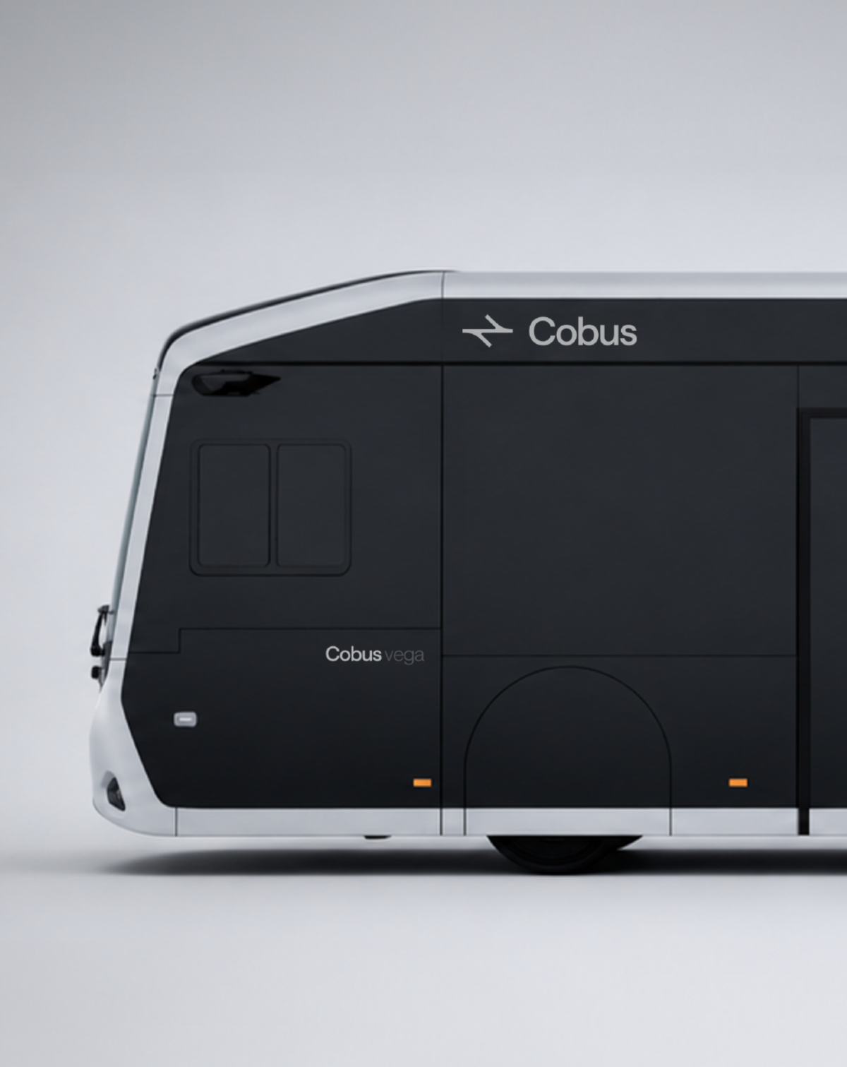
The new identity simplifies and updates Cobus while preserving the recognition it has built over decades and giving the brand a language designed for its next stage.


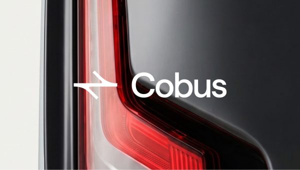
The symbol becomes the starting point for an entire graphic system. Its shapes expand, intersect, and generate compositions that make Cobus recognisable even when the logo itself is not present. Gradients and the new colour palette introduce a more contemporary and technological dimension to the brand.


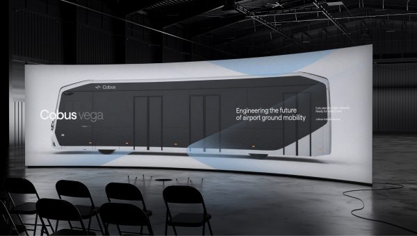
We also reorganised the product architecture through a more monolithic and coherent naming system.

From identity to the real world


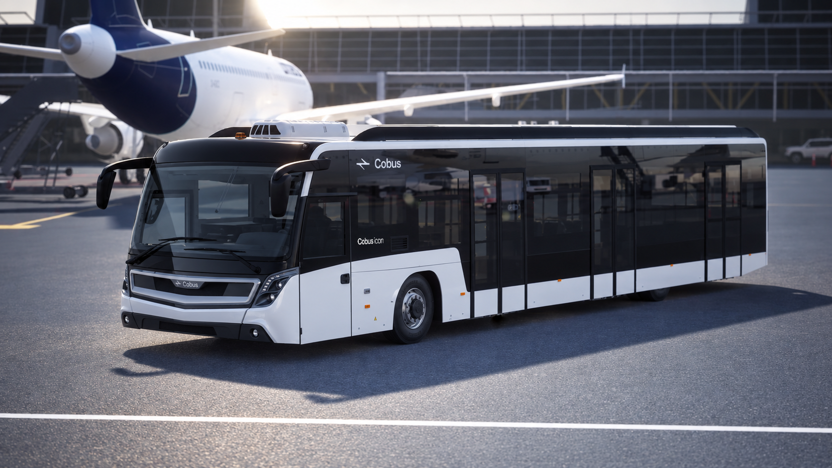
An identity for Cobus had to work where the brand truly lives: on the product, inside the airport, and around it.


That is why the system extends from the vehicles themselves to communications, digital environments, documentation, credentials, uniforms and brand spaces.


The art direction follows the same principle. For product imagery, precision, detail and control reinforce innovation and quality. For lifestyle photography, a more human and natural approach shows people looking ahead, conveying confidence, movement and a sense of future.


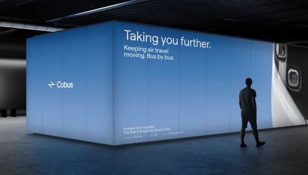
Taking you further.


The new Cobus identity is not designed to signal a break with the past.


It does something more difficult: it turns decades of recognition into the starting point for what comes next. A clearer, more dynamic and contemporary brand for a company broadening the way it understands airport mobility.


Because moving forward also means knowing what to preserve.


Cobus. Taking you further.


Screenshot
Screenshot
Branding
Design

Share: