BioSystems
The home of human-centred biotech
Scroll down
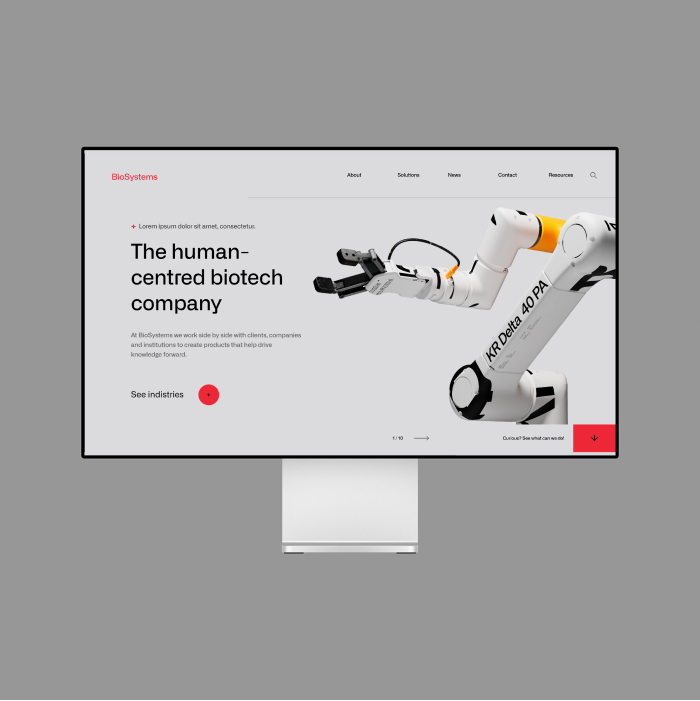
With BioSystems' global website, we created a brand and business asset by rethinking all the prior stages of their rebranding: strategy, verbal identity, visual identity, and digital strategy.
Challenge
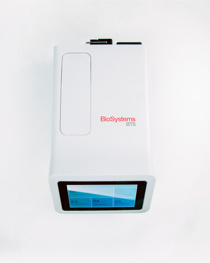
BioSystems, a global company with a Barcelona soul, has recently undergone a rebranding with Morillas, and its website needed to reflect its new visual identity and strategy. These, in turn, embodied a recent cultural shift focused on the user experience of the laboratory instruments the company manufactures and distributes. However, the new website also needed to be an asset, contributing to lead generation and serving as a regular reference point for users.
Approach
As expected, we conscientiously applied the previously developed brand strategy, visual identity, and verbal identity. A key feature is the use of a dynamic graphic language developed for the brand, inspired by the same spectrophotometry that ensures the functionality of all BioSystems instruments and reagents. The verbal identity is also reflected on the website, aiming for conversion without pressuring the user, using questions rather than imperatives.
Solution
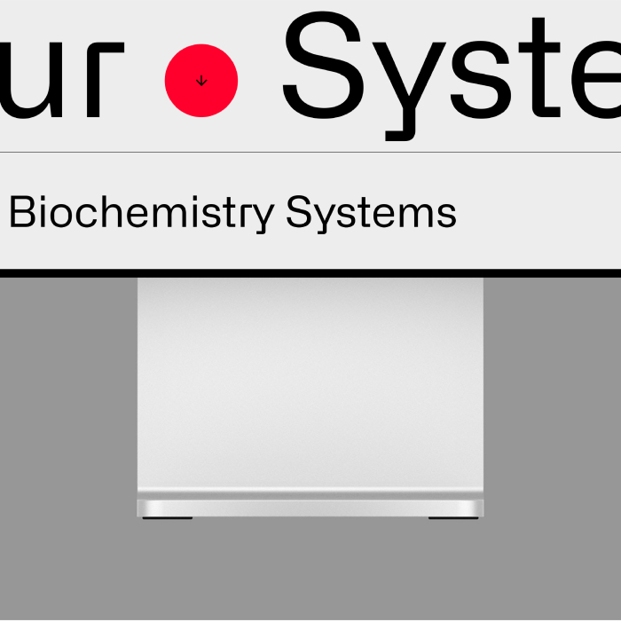
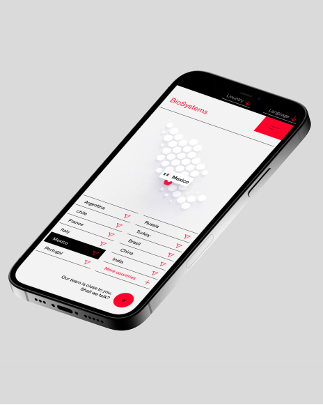
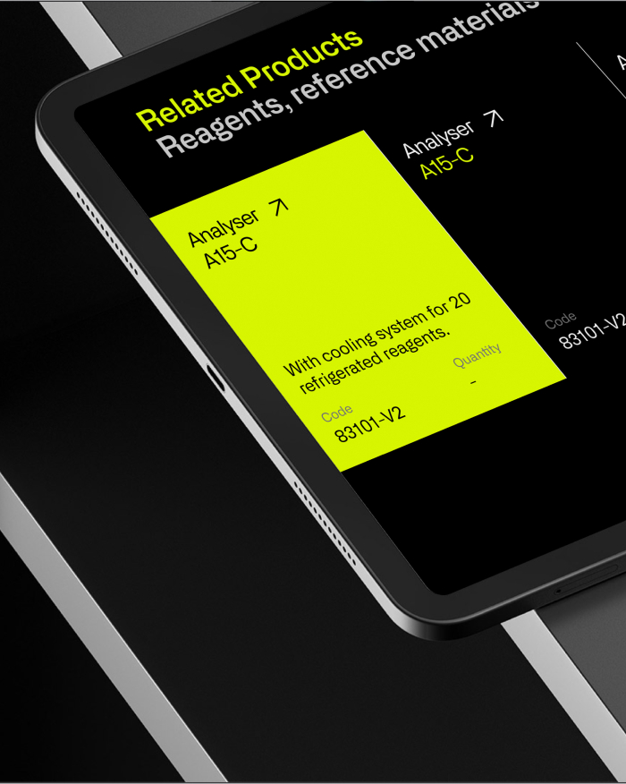
By incorporating tabulations, guides, and a humanistic layout into the visual language, we created a site with comprehensive information that is nevertheless easy to navigate and find what users are looking for.
Additionally, we expanded the colour palette to identify each sector BioSystems impacts, thus improving the website's clarity. We also opted for a refined and rigorous photographic art direction that allowed us to showcase the human and warm side of the brand, preventing it from being perceived as a mere industrial supplier.
